The Silent Drift Away from Sales
Picture this: You finally launch your shiny new website. The colors pop, the photos are crisp, the animations slide in like a Broadway production. You sit back and think, This is it. Then… nothing happens. A few months go by, traffic trickles in, but your sales? They’re flatter than a pancake in a steamroller. The truth is, somewhere between the initial vision and the launch date, your website stopped being a 24/7 salesperson and started acting more like an art project. And while art is great for a gallery, your site has a job - to turn visitors into buyers. If it’s not doing that, you’ve got a very expensive online business card.
Common Reasons Business Owners Lose Focus on Sales
The Aesthetics Trap
It’s easy to get hypnotized by design trends. You want your site to look modern, sleek, maybe even “award-winning.” But here’s the thing - an award for Best Website Design won’t pay your bills. A website can be drop-dead gorgeous and still fail to guide a visitor to click “Buy Now.” Design should be the outfit your salesperson wears, not the conversation they have.
Vanity Over Value
Business owners love to tell their story - and you should. But when the “About Us” section starts reading like a memoir and pushes your products or services to the background, you’re losing the plot. Customers care about your story only in the context of how it helps them. Otherwise, it’s just nice bedtime reading for your mom.
Information Overload
Here’s the cold truth: people don’t come to your site to learn everything about your company. They want to know one thing - can you solve their problem? If your homepage reads like a 10,000-word encyclopedia entry, you’ve buried the answer. Keep it lean, keep it clear, and keep it moving toward the buy button.
Shiny Object Syndrome
Sliders, pop-ups, parallax scrolling, background videos - they all sound impressive. But if a visitor spends more time figuring out how to close the floating chat widget than finding your product, you’re losing sales. Tech should enhance the buying process, not turn it into an obstacle course.
Fear of Selling
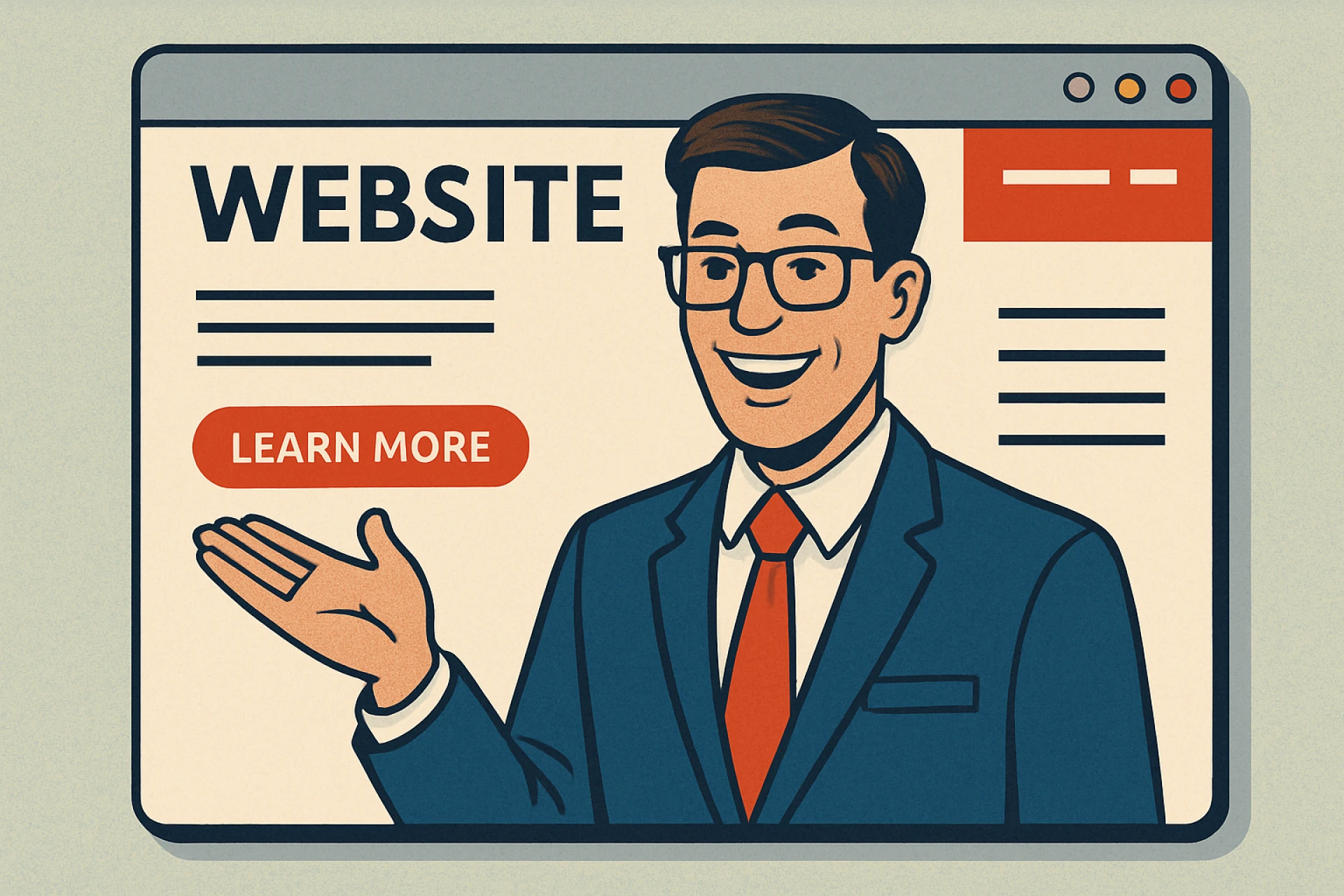
This is a sneaky one. A lot of owners don’t want to seem “pushy,” so they water down their calls to action until they’re barely visible. Instead of “Book Your Free Consultation Today,” you get “Learn More” buried at the bottom of the page. Subtlety may be charming at dinner parties, but online it’s a conversion killer.
The Hidden Costs of Forgetting to Sell
Every time your site fails to move someone toward buying, you’re not just losing a sale - you’re throwing away the marketing dollars that brought them there in the first place. That Facebook ad you paid for? Wasted if the visitor can’t figure out what you offer in under 10 seconds. That SEO work you invested in? Useless if the first click leads to confusion. And while you’re busy explaining your mission statement, your competitor is walking away with the customer because their site made it ridiculously easy to buy. The damage isn’t just to your bank account - it’s to your brand reputation. Visitors don’t think, Oh, their site was unclear. They think, This company doesn’t seem professional.
How to Keep Sales at the Core Without Losing Brand Personality
Start With the End in Mind
Before a single pixel is placed, decide what action you want visitors to take. Is it to buy a product? Book a call? Join your email list? Every design choice, every piece of copy, should be pushing them toward that outcome.
Make Your Call-to-Action Unmissable
Don’t hide your sales buttons like they’re state secrets. They should be bold, clear, and repeated. If a visitor has to scroll to find them, you’re losing conversions. Think of your CTA like a good waiter - they don’t just take your order once; they check in and make sure you’re ready to commit.
Balance Beauty and Utility
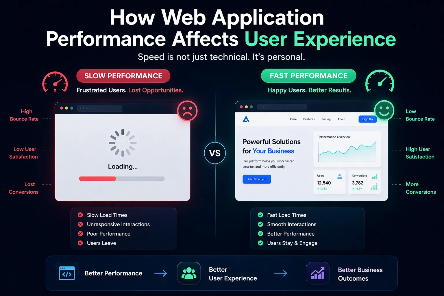
There’s no reason your site can’t be both attractive and effective. But function wins over form every time. A fast, mobile-friendly site that’s easy to navigate will outsell a slow, “fancy” site every day of the week. Your customer isn’t here to admire the font pairing - they’re here to solve a problem.
Guide, Don’t Dump
Structure your pages like a conversation with a customer, not like a data dump. Lead them through the problem, show them the solution, prove it works, then make the buying step obvious. Too much choice or information can actually paralyze a visitor.
Test and Review Regularly
Websites aren’t “set it and forget it.” Just like you’d review your sales team’s performance, you need to check your site’s conversion health. Run quarterly reviews, use analytics, and don’t be afraid to tweak. What worked last year might be stale today.
At the end of the day, you can’t deposit compliments into your bank account. A beautiful website that doesn’t sell is like a gorgeous storefront with locked doors. Treat your site like your best salesperson - give it the right tools, the right message, and clear marching orders. And ask yourself regularly: If my website were a member of my sales team, would I give them a bonus - or fire them? The answer will tell you everything you need to know.










Sign in to leave a comment.