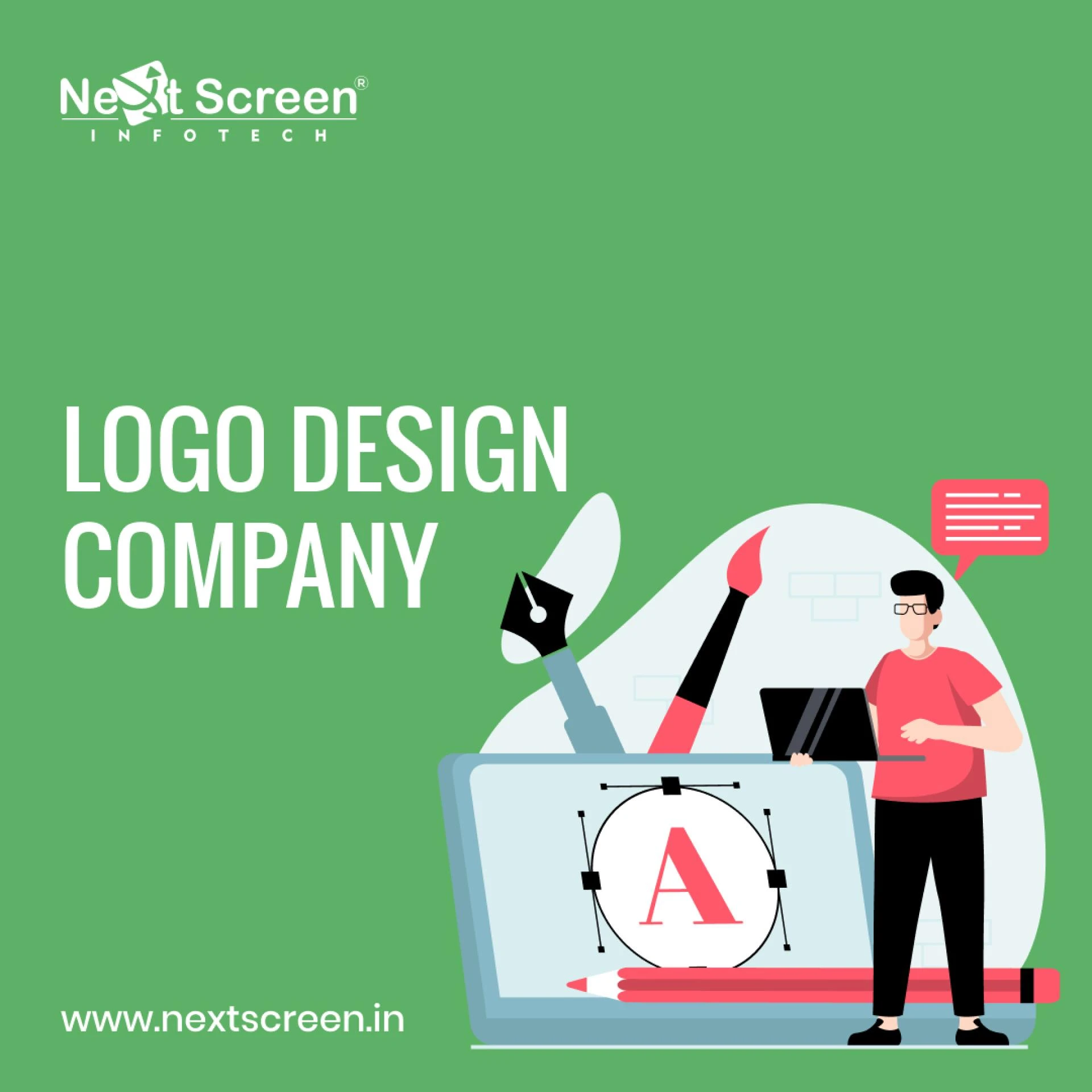
A logo is much more than just a pretty picture. It’s the face of your brand, an instant recognition tool that speaks volumes about who you are and what you stand for. In today’s fast-paced world, where consumers are bombarded with choices, having a memorable logo can set your business apart from the competition.
Think about it: when you see the iconic swoosh of Nike or the apple silhouette from Apple Inc., you instantly connect with their values and quality. Logos have remarkable power—they evoke emotions, create trust, and foster loyalty among customers.
In this blog post, we\'ll explore some fascinating case studies of successful brands and their unique journeys in logo creation. Whether you\'re a startup seeking to make your mark or an established company looking to refresh your image, understanding these logo creation company examples will provide valuable insights into effective branding strategies. Let’s dive deep into what makes these logos so impactful!
Case Study #1: Nike and the Swoosh logo
Nike\'s Swoosh logo is one of the most iconic symbols in the world. Created in 1971 by graphic design student Carolyn Davidson, it represents movement and speed. The simple yet powerful design reflects the brand’s athletic spirit.
When Nike first introduced the Swoosh, it faced skepticism. Many questioned its appeal and relevance. However, with strategic marketing and endorsements from top athletes, the logo quickly gained recognition.
The beauty of the Swoosh lies in its versatility. It adapts easily across various platforms—apparel, shoes, or digital media—while retaining a strong identity. This adaptability makes it memorable.
Nike embraced minimalism when developing their emblem—a decision that paid off handsomely over time. The simplicity allows consumers to associate emotions like victory and determination with just a glance at this remarkable symbol.
Case Study #2: Apple and the evolution of their logo
Apple\'s logo journey is a fascinating tale of simplicity and evolution. Originally designed in 1976, the first logo depicted Isaac Newton sitting under an apple tree. It was intricate and complex.
As the brand grew, so did the need for a more iconic representation. In 1977, Apple introduced the rainbow-striped apple silhouette that symbolized creativity and innovation. This vibrant design captured attention and resonated with consumers during a time when color screens were becoming popular.
By 2003, Apple shifted to a sleek monochrome version of its logo. This minimalist approach reflected sophistication while aligning perfectly with their product designs — clean lines and elegant aesthetics became synonymous with Apple\'s identity.
Each iteration not only marked growth but also reinforced its status as a tech leader. The evolution showcases how effective branding adapts over time without losing its core essence or message.
Case Study #3: McDonald\'s and the golden arches
McDonald\'s golden arches are more than just a logo; they symbolize fast food culture globally. The iconic design, introduced in the 1960s, was originally part of the restaurant\'s architecture. It quickly evolved into a standalone emblem.
The simplicity of the arches is captivating. Their bold yellow color stands out against any backdrop, evoking feelings of happiness and hunger simultaneously. This clever use of color plays a significant role in brand recognition.
Over time, McDonald\'s has embraced these arches as integral to its marketing campaigns. They represent not only meals but also shared experiences and childhood memories for many customers worldwide.
The logo adapts well across various mediums—packaging, apparel, or signage—maintaining strong visual impact regardless of size or format. This versatility underlines why it remains one of the most recognizable symbols today in branding strategies crafted by any logo creation company.
Common themes among successful logos
Successful logos often share several common themes that contribute to their effectiveness. Simplicity stands out as a key characteristic. A clean and uncomplicated design allows for easy recognition.
Memorability is another crucial aspect. Logos that leave a lasting impression often employ bold colors or unique shapes, making them instantly identifiable.
Versatility also plays an important role. The best logos adapt well across various platforms—whether on a website, product packaging, or promotional merchandise.
Timelessness cannot be overlooked either. Great logos resist trends and remain relevant over time, ensuring ongoing brand recognition without the need for frequent redesigns.
Storytelling enriches successful logos. Many top brands infuse elements into their designs that reflect their history or values, creating deeper connections with consumers. This emotional resonance elevates the logo from mere imagery to a powerful symbol of identity.
Factors to consider when creating a logo for your brand
When embarking on the journey of logo creation, think about your audience. Your logo must resonate with them. Understand their preferences and values.
Simplicity is key. A clean design often stands out more than a complicated one. Aim for something that’s easy to recognize and remember.
Colors play a crucial role too. Each hue evokes different emotions, so choose wisely. The right palette can enhance brand perception significantly.
Versatility matters as well. Your logo should look great across various platforms—be it print or digital media.
Ensure uniqueness in your design. In a crowded marketplace, standing out is essential for brand recognition and longevity in consumers’ minds.
Conclusion
Creating a memorable and effective logo is essential for any brand aiming to make an impact in today\'s competitive market. Here are some tips to guide you on your journey:
First, keep it simple. A cluttered logo can confuse potential customers. The most iconic logos are often the simplest ones, making them easy to recognize.
Next, consider versatility. Your logo should look great across various platforms and sizes—from business cards to billboards. Test its adaptability in different contexts before finalizing it.
Color choice matters significantly as well. Different colors evoke distinct emotions and associations; choose wisely based on your brand’s personality and target audience.
Don\'t forget about originality! While it\'s tempting to draw inspiration from successful brands, strive for uniqueness that sets you apart from competitors.
Seek feedback during the logo creation company design process. Engaging with peers or even potential customers can provide valuable insights that improve your concept.


Sign in to leave a comment.