

As the world gets more mobile, your website needs to be ready to handle the different kinds of devices that are out there. But just because your website design should be responsive, doesn’t mean it needs to be adaptive or even mobile-first. While all three share some similarities, each has its own benefits and drawbacks that require different technical approaches, which we’ll cover below. Let’s take a look at how mobile-first web design is different from adaptive and responsive design.
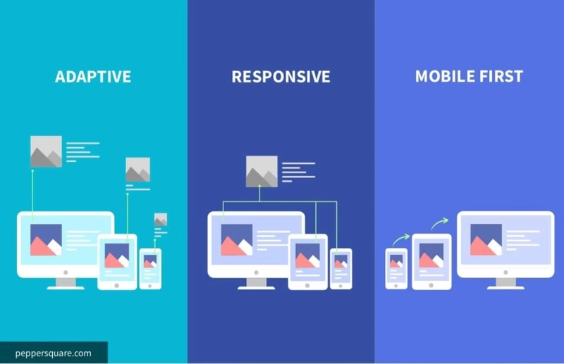
What Is Responsive Web Design?
It’s common knowledge that we live in a mobile world these days. People are spending more time online using their smartphones than ever before, so it makes sense to design websites that cater to smartphones first. But what about tablets? And what about desktops? A lot of people think responsive web design means your website will look different on every type of device. It’s not quite as simple as that. The term responsive web design refers to an approach that allows you to create one set of content (text, images, video) and have it adapt based on screen size or other variables like orientation or touch input. In fact, there are three main types of responsive web designs: fluid layouts , which adjust proportionally; fixed layouts , which stay at a specific size; and elastic layouts , which change shape but don’t scale up or down in size.
What Is Adaptive Web Design?
The term adaptive web design doesn't roll off your tongue or trip easily off your fingers. It's a mouthful of words that make sense once you define them. Here's what it means: Adaptive refers to how a website responds to different screen sizes, like mobile phones, tablets, desktops, etc. An adaptive website uses media queries in CSS to serve up different styles for different devices (mobile phones versus desktop computers). Media queries are simply CSS rules that apply differently depending on specific conditions—in our case, based on device size.
What Is Mobile-First Web Design?
The mobile revolution continues to move along in a rapid fashion, with most websites quickly adding some form of mobile presence. And while responsive design makes it easy to provide content for visitors using mobile devices, mobile-first web design takes it one step further. By focusing on usability for smaller screens first, you’ll end up improving your experience on larger screens as well. There are three key components to consider when thinking about building a site with a mobile focus: content, navigation, and formatting. These elements should be prioritized based on how they’re used by mobile users. For example, if you have a long scrolling page that would be hard to navigate on a small screen, then add links or buttons that make it easier for users to find what they need more easily. Content should always come first, followed by navigation options and formatting.
Which one to Choose?
Like a lot of things in life, there’s not necessarily one true answer to which design option is best for your project. It depends on what you want to accomplish with your website and how you intend to achieve it.
Wrapping UP
With so many different kinds of mobile sites, layouts, and applications available, it’s important to understand how they all differ in function. While they may seem similar, there are important differences between responsive design and adaptive design that will help you make an informed decision on your next project.
If you’re looking for a mobile UI/UX design company to help you with your next app or website project, feel free to reach out. We love working with brands that share our values—treat your users well, don’t overcrowd their screens, and design products that are easy to use on any device. Our expert teams can help you in mobile app development, software development whatever site or application best meets your needs so that users can enjoy what you have to offer.
Also Read: How is mobile-first web design different from adaptive and responsive design?
0