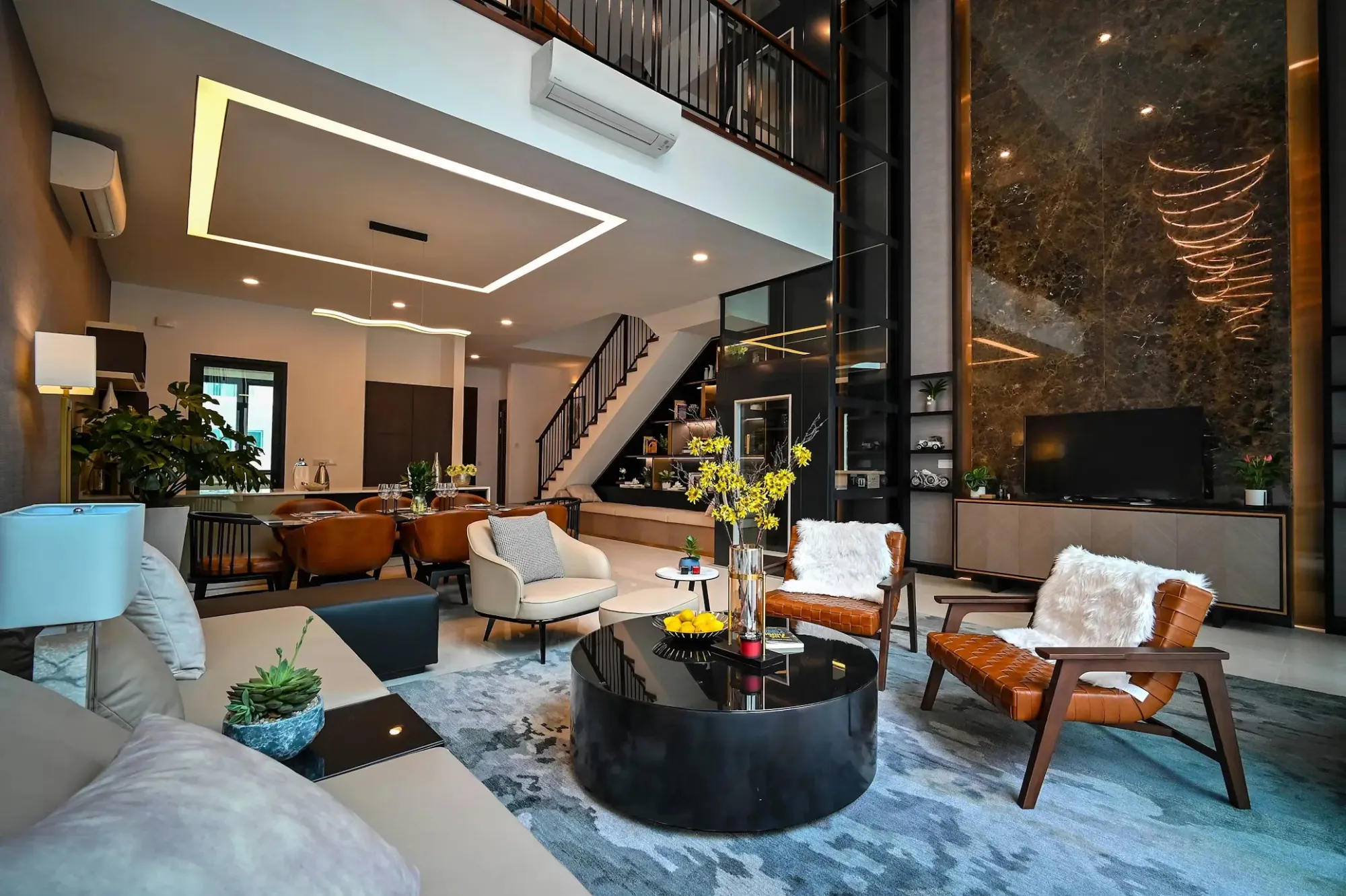

Choosing paint colours for a Hampstead home involves more than selecting an attractive shade. Natural light, ceiling height, original features and the age of the property can all change how a colour appears. A warm neutral that works in a modern apartment may look heavy inside a Victorian room. Careful testing helps create a balanced finish that belongs naturally within the property.
Choose Paint Colours That Suit the Property’s Character
Hampstead includes Georgian houses, Victorian terraces, mansion flats and modern apartments. Each property type responds differently to colour.
Period homes often suit layered, slightly muted shades. These colours can complement decorative cornices, timber mouldings, fireplaces and panelled doors without making the interior feel dated.
Contemporary flats may benefit from cleaner neutrals, controlled contrasts and simple colour transitions. The objective should be to support the architecture rather than follow a short-lived trend.

Check How Natural Light Changes Interior Paint Colours
The same paint can appear different from one room to another. North-facing rooms usually receive cooler light, which can emphasise blue or grey undertones. Warmer neutrals, soft clay shades and gentle off-whites can help balance this effect.
South-facing rooms receive stronger, warmer light. They can usually accommodate cooler neutrals, deeper greens and stronger accent colours.
Always test samples on more than one wall. Review them during the morning, afternoon and evening. Artificial lighting should also be considered because warm and cool bulbs can alter the finished colour.
Match Paint Finishes to Each Room
Colour is only one part of the decision. The paint finish affects durability, appearance and how easily the surface can be cleaned.
A flat or matt finish can soften imperfect walls and create an elegant appearance in living rooms and bedrooms. Kitchens, bathrooms and busy hallways may need a more washable, moisture-resistant product.
Woodwork also needs careful consideration. A subtle eggshell finish can give doors, skirting boards and fitted joinery a refined appearance without the strong shine of traditional gloss.
Avoid Choosing Colours from a Small Sample Card
A small colour card cannot show how a shade will behave across a full wall. The surrounding floor, furniture, curtains and artwork will also influence the result.
Apply large sample areas or use movable painted boards. This allows the colour to be tested beside different features without covering several walls.
Before deciding, compare the chosen wall colour with the ceiling, woodwork and neighbouring rooms. A successful scheme should create a natural visual flow through the home.
Colour Planning for Hampstead Period Properties
Consider a typical Victorian sitting room near Fitzjohn’s Avenue. The room has a bay window, decorative cornicing and dark timber flooring. A fashionable cool grey may make its shaded areas feel flat and cold.
A more suitable approach could use a warm stone shade on the walls, a softer off-white above the picture rail and a deeper complementary tone on selected joinery. The scheme would preserve the room’s character while making it feel comfortable throughout the day.
Similar decisions often arise in homes around Belsize Park, Hampstead Village, South End Green, Frognal and Hampstead Heath. However, two neighbouring properties may still require different palettes because of their orientation, proportions and interior materials.
Primrose Hill Painters brings more than 20 years of hands-on experience to period and high-end residential properties. Our work includes modern and traditional finishes, heritage-aware decoration, joinery painting and careful surface preparation.
If you are considering new colours, explore Primrose Hill Painters to review our services and approach. A professional colour consultation can help you compare practical options before committing to a complete repaint.
























Sign in to leave a comment.