

Mixing poster colors is a simple way to create many new shades without needing a large collection of paints. For students and beginners looking for School poster colors in Pakistan, learning a few basic color combinations can make school projects, charts, drawings, and craft activities more creative and interesting.
You do not need to be an expert artist to get started. With a few basic colors, a palette, a clean brush, and some practice, you can experiment with different shades and learn what works best.
1. Understanding the Basic Colors
Before mixing colors, it helps to understand the three primary colors: red, yellow, and blue. These colors are commonly used as a starting point for creating other colors.
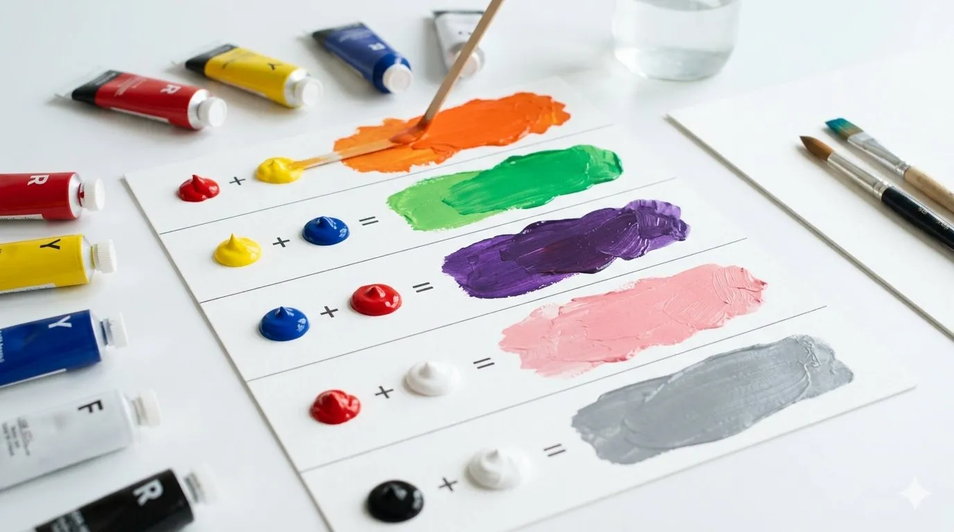
When two primary colors are mixed, they can create secondary colors:
| Colors Mixed | New Color |
|---|---|
| Red + Yellow | Orange |
| Yellow + Blue | Green |
| Blue + Red | Purple |
The amount of each color also matters. For example, mixing more yellow with red can produce a yellowish orange, while adding more red creates a stronger orange.
This is the basic idea behind color mixing: small changes in the amount of paint can produce noticeably different results.
2. How to Mix Poster Colors Correctly
 Getting a good shade is easier when you mix your colors gradually instead of adding everything at once.
Follow these simple steps:
- Start with a small amount of paint. Put a little of your first color on a palette.
- Add the second color slowly. Use a small amount at first.
- Mix thoroughly. Make sure there are no visible streaks of the original colors.
- Test the shade. Apply a little to a spare piece of paper.
- Adjust it if needed. Add more of either color until you get the shade you want.
It is always easier to make a color stronger than to correct a mixture that has already become too dark or muddy.
3. Easy Poster Color Combinations for Beginners

Once you understand the basics, you can experiment with more combinations.
Orange
Mix red and yellow. Use more yellow for a lighter, warmer orange and more red for a deeper orange.
Green
Mix yellow and blue. More yellow gives you a fresh yellow-green, while more blue creates a deeper green.
Purple
Combine blue and red. A little more red can give the purple a warmer appearance, while extra blue produces a cooler purple.
Pink
Mix red with white. Start with a small amount of red and gradually add white until you reach the desired pink.
Brown
Mix red and yellow to make orange, then add a small amount of blue. Add the blue carefully because too much can make the mixture look dull.
Peach
Start with red and white to make a soft pink, then add a little yellow. Adjust with more white if the color becomes too strong.
Sky Blue
Mix blue with white. Add white gradually until the blue becomes light enough. A tiny amount of another color can be used for experimentation, but white should remain the main color for creating a lighter blue.
Dark Green
Start with green and add a very small amount of blue or another dark color. Mix slowly until you reach the desired depth.
Maroon
Start with red and add a small amount of blue or brown. Add the darker color little by little so the red does not become too dull.
Grey
Mix black and white. More white creates light grey, while more black produces a darker grey.
Beige
Mix white with a small amount of brown, then add a tiny touch of yellow if you want a warmer beige.
Skin-Tone Shades
There is no single skin tone. You can experiment with combinations of white, yellow, red, brown, and a very small amount of blue to create different shades. Start with white and add the other colors in tiny quantities.
4. How to Make Colors Lighter

The easiest way to make most poster colors lighter is to add white. The resulting lighter version of a color is often called a tint.
For example:
- Red + white = light pink
- Blue + white = pastel blue
- Green + white = light green
- Orange + white = peach or a lighter orange
Always add white gradually. If you add too much at once, the original color may become much weaker than you intended.
If you are working on a school chart or painting, test your new shade on a small piece of paper before applying it to the final project.
5. How to Make Colors Darker
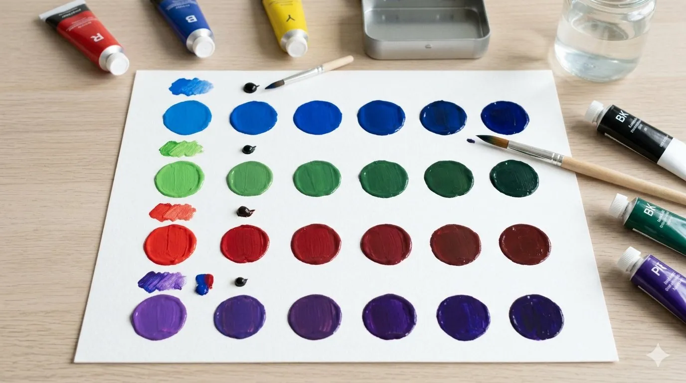
Darkening colors requires a little more care. Beginners often add too much black and end up with a dull or overly dark shade.
Instead, add a tiny amount of black or another suitable darker color at a time.
For example, you can experiment with:
- Blue + a little black = dark blue
- Green + a little blue = deeper green
- Red + a little brown = deeper red
- Purple + a little blue = darker purple
Mix after every small addition. This gives you much better control over the final shade.
6. How to Create Different Shades of One Color
You can create several versions of the same color simply by changing the proportions.
For example, if you have blue:
- Light blue: mostly white + a small amount of blue
- Medium blue: a balanced amount of blue with little or no white
- Dark blue: blue + a tiny amount of a darker color
The same method can be used with green, red, purple, orange, and other colors.
This is especially useful when creating backgrounds, patterns, landscapes, flowers, or school artwork where using only one flat shade may make the painting look less interesting.
7. Tips for Getting the Right Shade
A few simple habits can make color mixing much easier:
- Mix small quantities first. You can always make more later.
- Add colors gradually. Strong colors can quickly change a mixture.
- Clean your brush between colors. This prevents unwanted colors from entering your mixture.
- Use a palette. It keeps your colors separate and makes mixing easier.
- Record successful combinations. Write down what colors and approximate amounts you used.
- Test before applying. Try your mixture on scrap paper first.
- Let the paint dry. A wet shade can sometimes look different after drying.
Keeping a small color-mixing chart is also a useful activity for students. It can become a handy reference for future art projects.
8. Common Poster Color Mixing Mistakes

Color mixing becomes easier when you know what to avoid.
Adding too much paint at once
Large amounts are difficult to adjust. Start with small quantities instead.
Mixing too many colors
Combining several colors without a plan can produce a muddy or dull shade. Try two colors first and add another only when necessary.
Using a dirty brush
A brush containing leftover paint can change your mixture unexpectedly. Clean it before switching colors.
Adding too much black
Black is powerful and can quickly overpower another color. Use only a tiny amount when darkening a shade.
Using excessive water
Too much water can make poster paint thin and difficult to control. Add water carefully when the paint needs adjustment.
Judging only while the paint is wet
Always allow your test patch to dry before deciding whether the shade is right for your final artwork.
9. Choosing Good Poster Colors for School Projects

For school artwork, students usually need colors that are easy to mix and apply. When comparing School poster colors in Pakistan, look for a useful selection of basic colors, a manageable consistency, and paints that are suitable for the type of project you are making.
A basic set containing colors such as red, yellow, blue, green, white, and black can already provide plenty of opportunities for mixing. Additional shades can be useful, but learning to create your own colors can also save space in your art supplies.
If you prefer shopping from home, you can Buy poster colors online in Pakistan and compare different sets before choosing one that suits your school or art requirements.
10. Poster Colors for Art and School Activities
Poster colors are useful for much more than ordinary drawing. Students can use them for:
- School charts
- Science projects
- Geography projects
- Greeting cards
- Educational posters
- Drawing activities
- Craft projects
- Classroom artwork
For example, students making a geography project can mix different shades of green and brown for land areas, while blue can be adjusted to create different shades for water. Similarly, students making greeting cards can create custom pastel shades instead of relying only on the colors available in a basic set.
Parents and students can compare different stationery options when deciding where to Buy poster colors in Pakistan, especially when they need colors for several school activities.
Conclusion
Learning how to mix poster colors is mostly about experimenting with small amounts and understanding how different colors affect one another. Start with primary colors, practice making secondary colors, and then experiment with white and darker shades to create your own variations.
Do not worry if your first few mixtures are not perfect. Keep a record of combinations that work well, test your colors before using them, and gradually you will become more confident at creating exactly the shade you need.
















Sign in to leave a comment.