
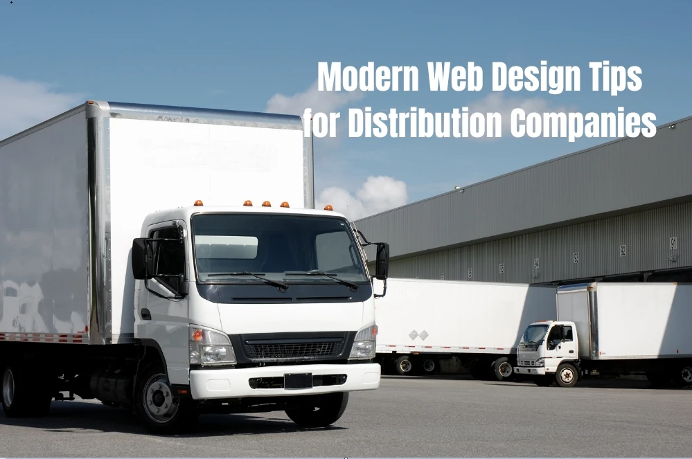
Why distributors can’t ignore digital presence anymore
If you run a distribution company, chances are your day-to-day is filled with logistics, orders, and supply schedules — not tinkering with your website. Fair enough. But here’s the thing: in 2025, a weak online presence is costing you deals.
I’ve seen it first-hand. I was helping a client in wholesale packaging, and the first thing we did was visit their website… which hadn’t been updated since the Gillard era. Buyers couldn’t even tell if they served their area.
The fix? A redesign focused on clarity and functionality. Within weeks, their site became a 24/7 rep that worked. If you're in a similar boat, investing in a distribution company website is not just a nice-to-have — it's a growth tool that keeps you in the game.
It’s not about looking cool — it’s about being useful
Let’s get one myth out of the way: your website doesn’t need to win design awards.
You’re not trying to impress teenagers — you're helping procurement officers, warehouse teams, and B2B clients get the info they need, fast.
A strong distribution site should:
- Show what you supply and where you deliver
- Explain how to get a quote or open an account
- Share certifications or case studies
- Let users find documents or specs easily
I worked with a regional distributor who cut their homepage content by half and doubled leads. All we did was make it easier to find order thresholds and freight regions. No gimmicks. Just utility.
Support the whole buyer journey (not just the first click)
Here’s something most distributors miss: B2B buyers rarely buy after one visit. Their process is long — sometimes weeks — and involves approvals, specs, and internal chats.
So, your site should gently support that journey, not rush it. Think:
- Downloadable capability statements or service areas
- Clear contact paths to sales reps
- Industry-specific landing pages
- Tech sheets or catalogue PDFs
If someone from a local council or hospital is vetting suppliers, they’ll appreciate a little extra effort. This is especially true in Australia’s evolving supply chain industry, where digital maturity is becoming a must-have, not a bonus.
Mobile-friendly isn’t optional anymore
I get it — B2B feels like a desktop-first world. But look closer: many people research suppliers on their phones during site visits, in minutes, or while travelling.
If your site’s mobile version is clunky or slow, they won’t stick around.
What helps?
- Clickable phone numbers and emails
- Menus that fit a screen
- Compressing PDF downloads so they open fast
- Speeding up load times (under 3 seconds is ideal)
I once had a client where mobile users made up just 35% of traffic, but they converted at 2x the rate once we fixed mobile usability. That’s not a small win — that’s business growth.
Use real-world trust signals — not stock buzzwords
Buyers don’t care if your homepage says “innovative solutions” or “logistical excellence.” They want proof.
So, use the kind of trust builders they can verify:
- Logos of clients or partners
- Accreditation badges (like ISO or HACCP)
- Testimonials from real businesses
- Google reviews (if available)
- Transparent delivery terms
One simple trick? Add an FAQ section addressing freight zones, lead times, and return policies. It’s basic — but it answers questions your sales team gets every week. Fewer emails, faster decisions.
Don’t sleep on content — even if it’s not your “thing”
There’s more nuance when it comes to logistics website design, especially when you’re dealing with large SKUs, compliance constraints, or perishable goods. It’s worth unpacking in detail.
Here’s where a lot of distribution websites miss the mark: no blog, no news updates, nothing educational.
I get it. You're not a media company. But even a few well-placed articles can:
- Help buyers understand your offering
- Boost your Google rankings for niche terms
- Build authority in your vertical
Say you serve the construction industry. Writing a piece on regulatory changes or “how to choose the right supplier” gets you in front of people before they’re ready to buy.
Real-life example: What one site overhaul delivered
And for broader UX inspiration? Lessons from leading B2B ecommerce UX case studies can help you streamline catalogue views and ordering flows without bloating your build.
Let me paint you a quick picture. One of our clients — a distributor of niche industrial parts — had a website with no search function, a buried contact form, and outdated product info.
Buyers were getting frustrated. Worse, they were calling support just to ask if they still stocked Item X.
We redesigned the site with:
- A simple nav bar and part finder
- A quote request tool with just three fields
- Spec sheets for top-selling SKUs
- A “delivery schedule” calendar for each region
The result? Email inquiries jumped 60% in the first month. And their inside sales team saved hours every week, not by answering repetitive questions.
What to do next (without getting overwhelmed)
Redesigning or launching your website doesn't need to be a massive, stressful project. Start with:
- A clear goal (more leads, less admin, better trust)
- A basic sitemap (5–7 pages that matter)
- Honest feedback from 2–3 buyers or staff
- A realistic timeline — and a team that gets B2B
And if you already have a site but it’s collecting digital dust? Focus on fixing one thing at a time — mobile speed, clearer CTAs, better forms.
Even small tweaks can have a big impact.
Final thoughts: useful beats “cool” every time
If there's one message to leave with: don’t chase flashy. Chase functional.
A good distribution company website should be fast, clear, and built for real business use. It's not about standing out — it’s about standing up as a reliable partner in a complex supply chain.
Invest in clarity. Invest in usability. That’s the modern edge in a traditional industry.


Sign in to leave a comment.