

Perfecting the art of custom packaging creation involves more than just a digital to tangible transformation. It's important to avoid packaging prepress mistakes to ensure an outstanding production process.
For trade shops or brands new to in-house packaging, the complexities of design and layout prepress can be daunting. Print disruptions due to errors can lead to high costs and brand damage. Outsourcing packaging prepress services to a reliable partner can take out the stress with the best packaging and labels every time.
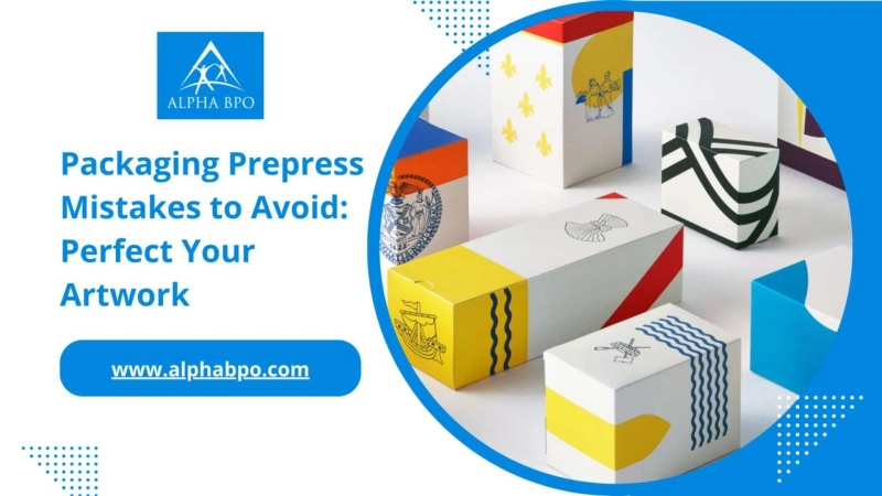
Keep scrolling to read a blog post on common packaging prepress mistakes to avoid from experts offering knowledge on font, image, color considerations, and more - your key to set the artwork right.
Knowing About Avoidable Packaging Prepress Mistakes
Even with a large in-house team of brand and prepress graphic design experts or top design agencies, packaging design mistakes can still slip through, especially on high-volume, consumer-facing packaging.
However, the potential for errors extends beyond consumer-facing packaging to transit packaging and businesses with limited resources or budgets for dedicated artworkers.
What does it cost you to make prepress mistakes on packaging?
Allowing common mistakes to avoid for prepress in packaging artwork can negatively impact your business, starting with cost implications.
Incorrect artwork can render the stock of boxes unusable, making your investment in printing plates worthless. Also, it can lead to delays in product shipment or launch, halt production lines, and disappoint stockists and customers, potentially harming repeat business.
Further, it can allow your competition to gain market share, spoil your brand's image, and make you look unprofessional and amateur, negatively impacting your brand perception.
So, let the experts shed light on the top 10 packaging prepress mistakes that can harm your business and provide solutions on how to avoid them.
1: Artwork Alignment Mistake
Avoiding Misaligned Graphics on Prepress Packaging
Using the cutter guide (also referred to as a die-line) provided by your packaging manufacturer is a logical step in creating artwork. However, overlooking the orientation of the cutter guide can lead to misaligned text and graphics on the printed packaging.
When laying artwork onto the inside view shown in structural drawings, the text and graphics may not appear correctly outside the box. To address this, a packaging prepress expert simply flips the cutter guide within the editing software to ensure proper alignment. Always consult your packaging supplier to ensure the correct orientation of the cutter guide for your artwork.
2: Wrong File Type Selection
Choose the Right Graphics Format
Understanding the difference between raster and vector files is crucial for effective packaging design. Raster files, composed of pixels, are suitable for full-color graphics and photographs, while vectors store shapes and colors as mathematical formulas.
An incorrect file type can result in fuzzy edges and a lack of definition, especially when scaling up raster images. Packaging prepress companies use vector files for icons, logos, and bold single-color graphics to maintain a professional appearance. It provides a clean, crisp finish regardless of the printing method used for your packaging.
3: Low Image Quality
High-Quality Image for Print
While vectors are ideal for most designs, raster images are necessary for detailed or photographic quality. However, using low-resolution images can lead to blurry and fuzzy prints.
Always work with the high resolution for high-quality reproduction when setting artwork for print. It requires collaboration and communication with the design and packaging supply process partner or a dedicated packaging prepress services provider to manage this effectively.
4: Incorrect Color Representation
Select the Correct Color Model for Printing
Choosing the right color model is essential for accurate color representation in printed packaging. Physical printing uses cyan, magenta, yellow, and black (CMYK) colors, while web images use red, green, and blue (RGB) colors.
Incorrectly using RGB images for print can result in washed-out colors and odd appearances. A prepress color management expert will always ensure that the color settings in your artwork file are correct and compatible with the printing process to achieve the desired colors on the final packaging.
5: Font Size Consideration
Avoid Ineligibility with Small Fonts
When printing onto typical corrugated material, using fonts that are too small can lead to illegibility due to ink bleeding outside the intended print area. It is advisable to not use text smaller than 10pt when printing onto such packaging materials to ensure readability and visual clarity.
6: Risky Font Outlines
No Font and Typeface Substitution Mishaps
Accidental font substitution before printing can significantly alter the appearance of your packaging. To avoid this, consider converting all of your text to outlines. It transforms the text into vector graphics, ensuring that the correct font is not required for the artwork to look correct.
However, it's essential to save a copy of your artwork with the text saved as text and a separate copy with the text outlined to supply to your packaging manufacturer or printer. This precaution by a prepress expert allows for future edits, such as correcting a typo, as outlined text cannot be edited.
7: Improper Bleeds
Ensuring Proper Color Alignment and Registration
Registration, the technology that aligns different colors to be printed in the correct part of your document or packaging, is crucial for accurate color representation.
Including basic prepress solutions like checking for proper bleeds that add extra space outside the intended print area is essential when using graphics or blocks of solid color that run over a cut line. It prevents unsightly, non-printed areas at the edges in case of any movement during the printing or cutting process.
8: Ignoring White Space
Use Safe Margins and White Space
Adhering to "safe areas" when creating artwork is crucial to prevent unintended design issues. Leaving 15 – 20mm of space around cut and crease lines on your cutter guide prevents graphics or logos from being cut off or stretching across different panels unintentionally.
Additionally, including white space in your design improves legibility as well as contributes to a more professional and visually appealing design.
9: Heavy of Weak Black Inks
Optimize Black Ink Usage for Quality Results
The setup and "black" print within your artwork can significantly affect the outcome, especially when printing onto kraft (brown) cardboard. Using the right combination of CMYK for black graphics and text can ensure a balanced and visually appealing appearance.
For successful color management results, a packaging prepress services provider will use C = 30, M = 30, Y = 30, K = 100 to achieve the desired outcome without compromising quality.
10: Not Proofing Artwork
Ensure Error-Free Artwork Before Printing
Proofreading your artwork before sending it for printing is required to avoid typos, spelling, and grammatical errors that can harm brand perception and ongoing sales.
It's important to have a digital prepress expert double check through and sign off on the copy to catch any errors that may have been overlooked. Avoidable packaging prepress mistakes in this area can lead to wasted packaging and the need to purchase new printing plates.
Outsourcing Prepress is a Smart Choice for The Best Packaging Artwork
It is always better to outsource prepress services to experts to avoid packaging prepress mistakes. Doing so eliminates packaging artwork worries about high costs from repurchasing printing plates, dealing with wasted, unusable boxes, and protecting your brand reputation.
When package prepress is done right with expert help, your artwork can benefit from improved business awareness, effectively communicate necessary information, and even contribute to sales growth.