

The moment someone picks up a coffee bag, the tasting begins long before the first sip. The paper texture, the typography, the amount of space, the tone of the copy, the colour palette, and the way origin is mentioned. Why? Because coffee packaging design got there first, the typography told you whether the coffee brand was modern or traditional, and the colours hinted at whether it was premium or playful. The packaging texture suggested craft, the photography created a lifestyle, and even the amount of whitespace quietly communicated price.
In other words, every coffee brand identity is a collection of intentional decisions, and the most successful coffee brands are rarely the ones with the loudest visuals but the ones where every decision aligns into one clear perception. That is what designers are really reading.
What does a coffee name communicate instantly?
Before the logo. Before the packaging. Before the café interiors or Instagram feed. A coffee brand introduces itself through its name first. And in branding, names are never neutral. A single name can immediately signal whether a coffee brand feels artisanal or commercial, local or global, nostalgic or contemporary. Long before customers understand the roast profile or sourcing philosophy, they begin forming assumptions based on language alone.
That’s the power of naming.
Short names. Soft phonetics. Minimal words. Slightly European rhythm. Quiet sophistication. Everyone wants to sound curated. But the danger is obvious when every coffee brand sounds premium, none of them becomes memorable. The best coffee names don’t just sound good. They create immediate perception.
In coffee branding, the name is often the first design decision, even before design begins.
The visual language of coffee brands
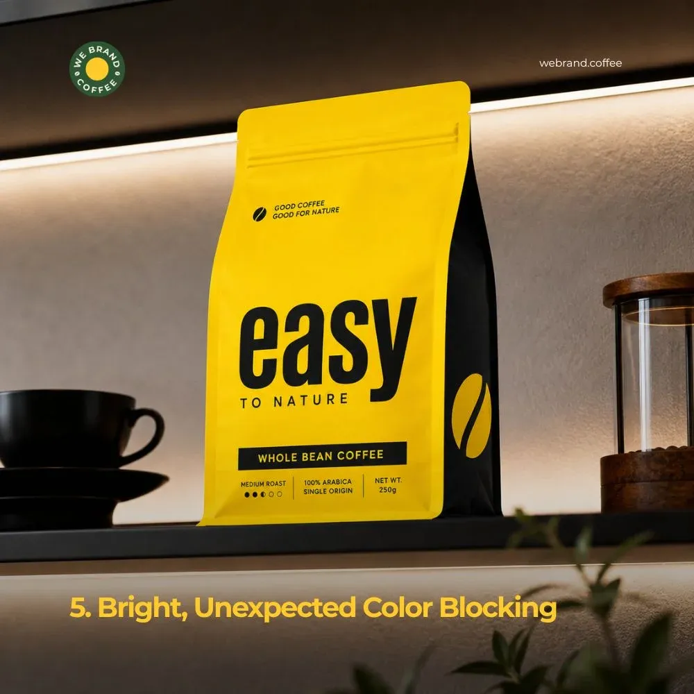
One of the most fascinating aspects of coffee branding is how much meaning is constructed before language is even processed. The customer does not first encounter flavour notes or sourcing philosophy. They first encounter typography, colour, and texture. A serif font can make coffee feel heritage-driven and refined. A clean sans serif instantly pushes the brand into modern speciality territory. Lowercase typography feels curated and contemporary. Uppercase often feels louder, stronger, more commercial. Even spacing becomes branding.
Luxury brands often use generous breathing room because space itself communicates confidence. Tight typography creates energy and density. Geometric fonts feel technical and modern. More human typography feels warm, approachable, and handcrafted.
Typography doesn’t just help customers read. Specialty coffee’s obsession with earthy neutrals emerged partly as a rejection of mass-market coffee aesthetics. Browns, creams, forest greens, and desaturated palettes helped position specialty coffee closer to craft culture, sustainability, and slow living. Over time, neutrality itself became aspirational. Muted palettes started functioning as social signals of taste and restraint. Minimal colour systems became associated with higher cultural value. But visual sameness inevitably creates resistance.
The narrative systems behind coffee branding
Modern coffee branding is fundamentally an exercise in narrative construction. Not simply through visuals but through geography, language, and informational structure. Origin, once treated merely as sourcing information, has evolved into one of the most powerful storytelling tools in speciality coffee culture. Yet brands deploy origin very differently depending on the identity they wish to construct.
One brand might cover the pack with details: estate name, altitude, processing method, harvest date, roast profile, cupping score. Another might simply say: “Single origin from Chikmagalur.” Minimal hierarchy feels calm and premium. Dense hierarchy feels expert and enthusiast-focused. Structured information systems improve shelf readability and digital browsing. Strong hierarchy also helps brands survive in fast-scrolling online environments where attention lasts seconds.
Hierarchy determines not only readability, but interpretation. It controls what customers notice first, what they remember, and ultimately what they associate with the brand. In speciality coffee, information architecture is never merely functional. It is an ideological design.
Conclusion
The most successful coffee brands are rarely the ones with the loudest packaging or the trendiest aesthetics. They are the ones where every decision feels intentional.
The name. The typography. The colors. The material. The photography. The language. The hierarchy. Everything customers feel about a coffee brand happens accidentally. That’s what makes speciality coffee branding so fascinating: every detail influences perception before taste even enters the experience. People don’t just buy coffee anymore. And once you learn to read coffee branding like a designer, every bag starts revealing the strategy behind it.
























Sign in to leave a comment.