
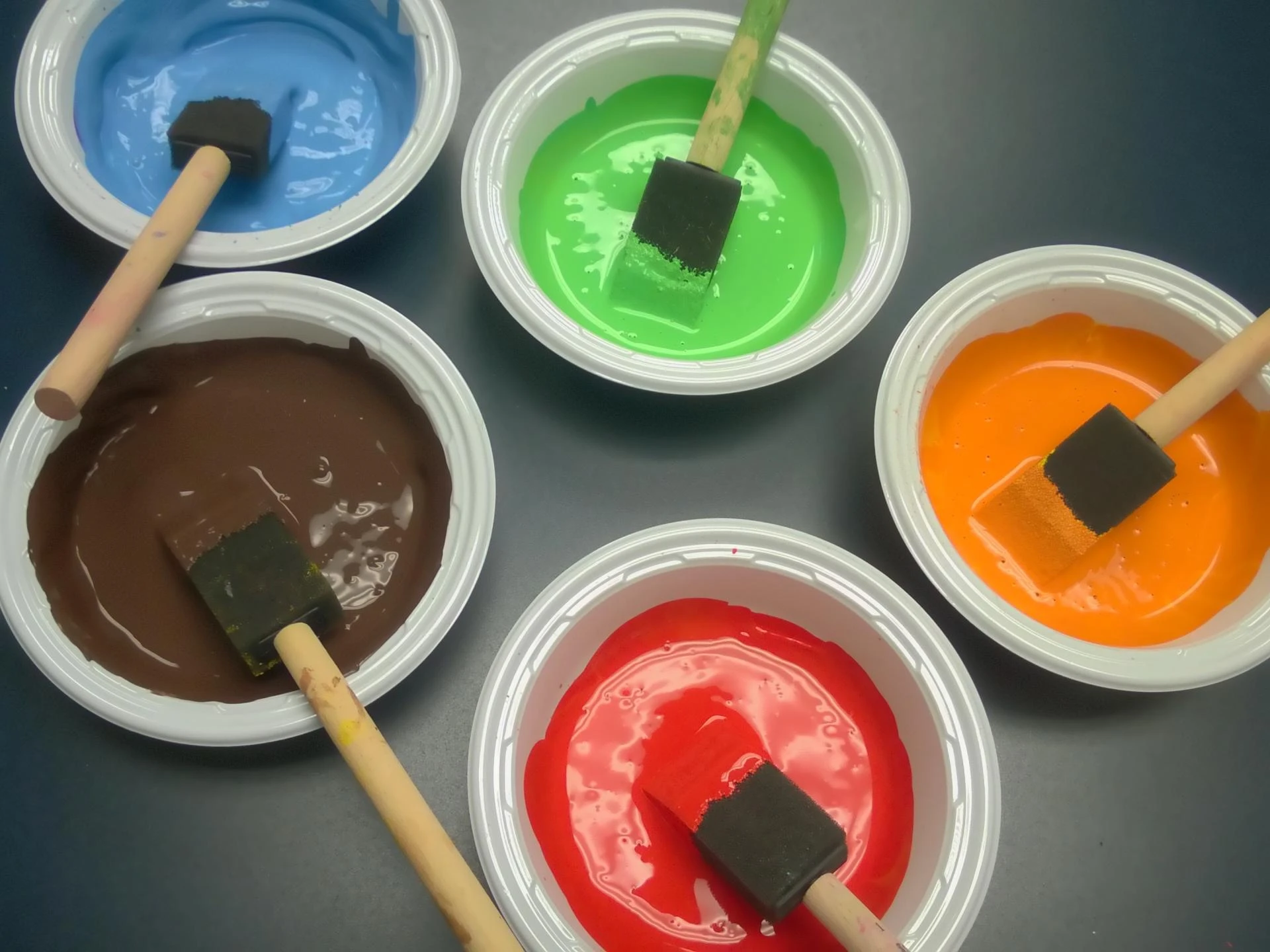
A red color palette can bring warmth, energy, confidence, and character to an interior. From deep wine tones to soft terracotta and bright crimson, red offers a wide range of shades that can completely change the mood of a room. While strong reds can create a dramatic focal point, softer variations can add warmth without making the space feel overwhelming.
Choosing the right red shade depends on the room, lighting, furniture, and colours you plan to combine with it. Whether you want a vibrant living room, a cosy bedroom, an elegant dining area, or an inviting entrance, the right combination can make red work beautifully in your home.

What Is a Red Color Palette?
A red color palette is a collection of red shades and complementary colours that work together to create a balanced visual appearance. Red can range from light and muted tones to rich and intense shades.
Some popular red shades include:
- Crimson red
- Cherry red
- Burgundy
- Wine red
- Maroon
- Terracotta
- Brick red
- Rust red
- Rose red
- Deep red
Each shade creates a different atmosphere. Bright reds can feel energetic and lively, while darker reds often create a sophisticated and luxurious appearance. Earthy reds such as terracotta and brick can provide a more natural and comfortable look.
Why Choose Red for Your Home Interiors?
Red is one of the most expressive colours in interior design. It naturally attracts attention and can become a strong feature in a room. However, it does not always need to cover an entire wall.
Using red strategically can help create visual interest while maintaining balance. A red accent wall, decorative section, furniture piece, artwork, or combination of red accessories can introduce colour without dominating the room.
Red can work particularly well in areas where you want warmth and energy. Living rooms, dining spaces, entertainment areas, and entrances can benefit from carefully selected red tones.
Best Red Color Combinations for Walls
The success of a red interior often depends on the colours used alongside it. Combining red with neutral or complementary shades can create a balanced appearance.
1. Red and White
Red and white create a clean and striking combination. White helps soften the intensity of red while making the space feel brighter. This combination works well for contemporary interiors and can be used in living rooms, bedrooms, and dining areas.
2. Red and Beige
For a warmer and more sophisticated appearance, pair red with beige. Beige provides a neutral background that allows red to become an accent without making the room feel too intense.
This combination can be particularly effective with earthy red shades such as brick, terracotta, or muted maroon.
3. Red and Grey
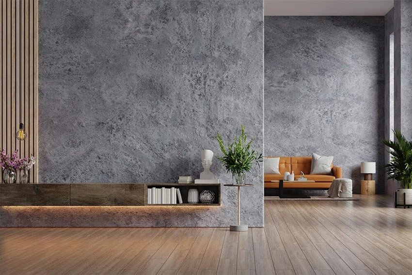
Grey and red offer a modern combination. Light grey can balance darker reds, while charcoal grey can create a dramatic appearance with brighter red accents.
For a contemporary room, consider using grey as the dominant colour and introducing red through an accent wall or selected decorative elements.
4. Red and Cream
Cream creates a softer alternative to bright white. Pairing cream with deep red can give an interior a warm and elegant appearance. This combination works especially well in traditional and transitional interiors.
5. Red and Brown
Red and brown create an earthy, warm combination. Shades such as terracotta, rust, and brick red can work naturally with wooden furniture and brown decorative elements.
This palette is suitable for spaces where you want a cosy and grounded atmosphere.
How to Use Red in Different Rooms
Red for the Living Room
The living room is one of the easiest places to experiment with red. Instead of painting every wall red, consider creating a feature wall behind the television, sofa, or main seating area.
Deep red, burgundy, or muted terracotta can add depth and warmth. Pair the colour with neutral furniture and lighter walls to maintain balance.
Red for the Bedroom
In bedrooms, softer and deeper red tones can create a warm atmosphere. Wine, burgundy, muted rose, and earthy red can work well as accent colours.
If you prefer a subtle look, use red on one wall and combine it with cream, beige, or soft neutral shades on the remaining walls.
Red for the Dining Room
Red can be an interesting choice for dining spaces because of its warm and energetic character. A deep red accent wall can create a defined dining zone and add visual depth.
Pairing red with wood finishes, warm lighting, or neutral furnishings can help create a welcoming environment.
Red for the Kitchen
For kitchens, red can be introduced through a feature wall, backsplash area, cabinets, or accessories. Bright red can create a contemporary appearance, while muted red or terracotta can provide a more understated look.
If your kitchen already has bold cabinets or patterned surfaces, use a softer red shade to avoid visual clutter.
Tips for Choosing the Right Red Shade
Before selecting a shade, consider the amount of natural light in the room. Bright rooms can generally accommodate deeper colours more comfortably, while rooms with limited natural light may benefit from softer or warmer red tones.
Also consider the size of the space. In smaller rooms, using a strong red across every wall can make the space feel visually heavier. An accent wall can provide the desired colour without overwhelming the room.
Your furniture and flooring should also influence the choice. Wooden furniture often works well with earthy reds, while modern grey or white furniture can complement stronger red shades.
When exploring wall colours, collections from established paint brands such as JK Maxx Paints can help you compare different shades and find an option suitable for your interior.
Red Color Palette Ideas for a Stylish Home
Here are a few combinations to consider:
Classic Palette:
Deep red + white + warm wood
Elegant Palette:
Burgundy + cream + gold accents
Modern Palette:
Crimson red + light grey + white
Earthy Palette:
Terracotta + beige + brown
Warm Palette:
Brick red + cream + wooden finishes
Contemporary Palette:
Wine red + charcoal grey + off-white
The best palette depends on the mood you want to create and the existing colours in your space.
Final Thoughts
A well-planned red color palette can transform an ordinary interior into a space with warmth, personality, and visual depth. From bold crimson and classic red to subtle terracotta and sophisticated burgundy, there are plenty of shades to explore.
The key is to use red thoughtfully. Consider the room size, natural lighting, furniture, flooring, and complementary colours before making your final selection. Whether you choose a dramatic accent wall or introduce red through smaller elements, the right combination can create a stylish and inviting home.






















Sign in to leave a comment.