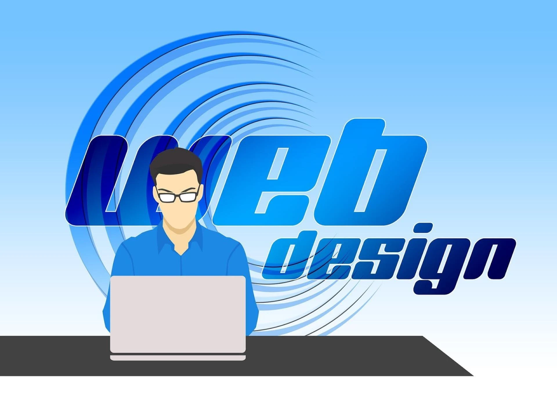
Introduction
There are only a few months left until the end of 2020, and we have witnessed plenty of new web design trends that emerged during the period. It’s a constant process—each year, some new trends emerge and old fade. The ever-growing technological development opens up new avenues for graphic designers every day. They reinvent erstwhile design and continuously experiment with the latest techniques. However, some popular styles never fade. Colorful flat illustrations and minimalism are some of those styles that we’ve been seeing around for years.
Last year, we experienced narrow yet powerful changes in the UX/UI designs for the website. Many other changes have been in the trend during the year, and to know them precisely, we discussed with the creative director and top designers at Designhill. Here’s the list of top 6 biggest web design trends of 2020 as per their experience.
1. Split-screen design
Split-screen web design has been around for a couple of years now but still hot in 2020 trends.
In fact, a split-screen design divides what you see into at least two parts. This design technique was widely used by a web designer to show a prominent contrast. For example, a beauty salon website could use the split-screen technique to display before and after looks with specific products.
Moreover, the split-screen technique works fine for showing clients what specific service or product can do. A split-screen site can also have multiple clickable areas so that you can use half the screen to show your customers who have used your products and the other half to provide details about what to buy and “Buy” buttons.
Although a split-screen design looks visually appealing, it involves a lot of technical intricacies.
2. Oversized type and elements
Today, web designers are using significant, prominent elements to communicate clearly and instantly. It applies to just about anything on the web page, from full-screen images to big, bold typography, videos, and website menu icons.
Large elements are not only eye-catching but also help visitors clearly understand what the website is about. Also, they look visually appealing on any screen size. To make most of this trend, you should reduce the number of design elements on all pages. Remember that too many great features all at once can be overwhelming and unfavorable.
As part of this web design trend, many web designers prefer a full-screen video or image on their first fold, along with large typography. This layout delivers a message more efficiently, ensuring that essential information comes across and is truly registered.
3. Adding depths and 3D effects to the web design
Flat designs are losing charm. They need extraordinary fonts and graphics to breathe life into them. The trend of adding depth with the use of drop shadows and a color variation add a 3-dimensional effect to the site. In fact, flat designs with 3D appearance look more visually appealing.
This web design technique can be used for design ideas and certain sections with inquiry forms or text on the website. For a 3-D effect, you can add a shadow on the action buttons on the site. You can, even for this minor change, modify your site\'s visual appearance without spending much money.
4. Solid color blocks
In the split-screen trend, many sites split their content into even more parts that result in different sizes of rectangles and squares separated by colors. In an orderly manner, this look can communicate various messages at once. With a few lines of text or images placed in each section of the screen, you can easily grab your visitors\' attention towards these small chunks of information and make them follow.
Make sure you color the squares in different shades from the color scheme to make the composition even more compelling. While this web design trend is all about showcasing a cluster of items in a visually pleasing website layout, you should keep the final result away from unsystematic collage work. Make sure the color blocks come together to create a harmonious composition, making the design more intuitive and understandable. The color blocks should also be neatly aligned with one another.
5. Plenty of whitespaces
Whitespace, also called negative space, is a term that refers to the blank space that comes between the design elements. It gives a web page or screens a spacious and well-balanced look. While most whitespace is white, you can also make it of any other background color. Whitespace includes the spacing between columns of text, lines, around visual elements, or the margin around the page.
While whitespace has been a popular web design trend in 2020, we can expect that it will become more prominent in days to come.
6. Clever use of gradients for a pleasing visual impact
Gradients are trendy in web design and layouts. While gradients, with a single color, add a significant visual effect to the design, too many colors might steal the highlight from the central element in focus. This design technique is simple yet powerful that can also be included while creating a logo or giving an existing logo a makeover.
For example, when implementing rebranding, Instagram added a gradient effect to its logo to give it a modern touch. So, if you\'re considering adding a new feature to your site without spending much, you should add a gradient to your web design, instead of going for a complete website overhaul.
Conclusion
You may not afford to revamp your entire site with the latest web design trends, but you can play smartly by just incorporating some of the design trends mentioned above. This way, you will keep your website stay updated. These 6 biggest web design trends are sure to add a refreshing look to your site.
Do you know any other web design trends for 2020? Let us know in the comments below.


Sign in to leave a comment.