A relatively simple element of interior design are lines. The interior design primarily uses curvilinear or rectilinear lines as well as line shapes that can be elegantly arranged in vertical, horizontal, or diagonal patterns. In interior design, line is frequently used to specify a space, evoke a feeling, or produce various patterns.
As an illustration, horizontal lines give the impression of stability. Let's say we have a room with wainscoting, chair rails, crown moulding, and tall baseboards. These horizontal lines give the entire area a pervasive sense of stability by conveying a sense of timelessness, stateliness, and occasionally even masculinity.
Interior Design Line Types
Line is an example of a less obvious element in interior design that, through its functionality, has the greatest influence on overall aesthetics. When made the centre of attention, these particulars can give a design a variety of looks. An area thus appears to be either longer, narrower, or larger. Lines can really grab attention when used thoughtfully, so they must be used with care.
Here are some examples of the different kinds of lines you can use in interior design to create the desired effect:
1. Straight Linear
Straight lines appear strong, stable, and well-organized. The straight-line layout makes it easier to focus attention on the areas that need to be highlighted. A straight line in interior design also gives the impression of space and promotes tranquilly. Because of this, it is wise to incorporate these lines into the layout of bathrooms and bedrooms. Stripes painted on the walls in these areas serve to reflect horizontal lines.
2.Horizontal Lines
Horizontal lines represent a strong, harmonious connection to our environment, which in turn results in a serene and calming home décor. Long horizontal lines have been shown to visually expand a space, giving the impression that a room is wider and longer and that the ceiling is lower.
It is therefore preferable that you use them in areas that you want to look wider or larger. In order to give the appearance of a larger space, beams are frequently installed horizontally close to the ceiling in narrow living rooms.
3.Vertical Lines
Vertical lines often cause the eye to move upward. They are typically related to power, equilibrium, stability, and elevation. According to experts, looking at vertical lines is much less natural than looking at horizontal ones.
A space appears higher because a line drawn vertically has a longer length because vertical lines move away from our visual plane. Use vertical lines more often if you are working with décor elements that are above the lines of sight, such as unique lighting fixtures or beautiful architectural domes.
Also Read: Rhythm in Interior Design and its types
4. Parallel Lines
Diagonal lines in interior design encourage a feeling of motion and energy. It's best to use these in rooms with high activity levels, like the living room, kitchen, or kids' playroom. You can reflect these in the furniture and fixtures in addition to painting them.
Straight lines are less visually appealing than designs that use diagonals. Balance things out as much as you can to avoid looking out of proportion if you use them excessively.
5. Diagonal Lines
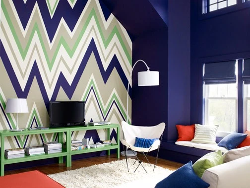
When zigzag lines appear repeatedly, they form what is commonly referred to as a chevron pattern in interior design. They stand for motion, activity, and energy. Your designs may feel more exciting due to their sharp edges.
Use zigzag lines, for instance, to give a dull corner in the house some personality. Alternately, use open shelves and storage areas with an angled shape. By doing this, you can improve the visual appeal of that area and make it seem less lifeless.
6. Circular Lines
In interior design, circular lines add harmony and softness to a straight or diagonal line. If your ceilings or walls already have horizontal beams or diagonal stripes, add contrast to your home's design by using round coffee tables, sofa sets, or chandeliers with circular rings. Because of their well-known softness, circular lines are known to evoke femininity. Choose the appropriate combination of circular lines to design gender-neutral spaces.
7. Curved Lines
Flowing lines that are slightly curved often trace a spiral. The stairs of houses frequently feature this pattern. You can use wallpaper patterns to introduce flowing lines if the steps are already fixed. These can also be used to add aesthetic appeal and draw attention to space in long, empty hallways, removing a sense of rigidity there.
What Effect Do Lines Have in Interior Design?
A line can be used alone or in combination with other graphic elements in interior design as a design element. Lines are incredibly adaptable and have a powerful ability to convey information and feelings. Lines, the fundamental component of design, can be long or short, straight or curved. Additionally, lines can be solid, thick, thin, or dashed, and their width can vary. A line's conclusion can be straight, curved, or blunt.
If you plan to decorate your space the best way, try the following interior design elements to add more worth to your space. What's better than levelling up your interior with a personal touch with DsignDpo.
Happy Reading!


Sign in to leave a comment.