Color is everywhere, and it plays a crucial role in our daily lives. From the clothes we wear to the food we eat, colors have an undeniable impact on how we perceive and interact with the world around us. This phenomenon becomes even more significant when it comes to packaging design. As consumers scan store shelves filled with products, their eyes are drawn not just by logos or labels but also by color.
Packaging designer wield this power of color psychology to evoke emotions, influence decisions, and ultimately drive sales. But what exactly is behind our reactions to different hues? Understanding these dynamics can be a game-changer for brands looking to stand out in competitive markets. Let’s dive into the fascinating realm of color psychology and explore its profound effects on packaging design!
The Science Behind Color Perception
Color perception is a fascinating interplay between light, the human eye, and our brain. When light hits an object, certain wavelengths are absorbed while others are reflected. The colors we see depend on what gets bounced back to us.
The cones in our eyes—there are three types—pick up different wavelengths of this reflected light. Each type corresponds to red, green, or blue hues. This combination allows us to perceive millions of colors.
Our brains then interpret these signals based on context and prior experiences. This is why two people might react differently to the same color depending on their personal associations or cultural background.
Moreover, color can evoke emotional responses almost instantly. A package designer must understand this science deeply; it’s not just about aesthetics but also how those colors will resonate with consumers at a subconscious level.
How Colors Influence Consumer Behavior
Colors evoke emotions and create perceptions, playing a crucial role in consumer behavior. For instance, red can signal urgency, often seen in clearance sales. This sense of immediacy drives quick purchasing decisions.
Blue tends to inspire trust and calmness. Brands like Facebook and PayPal utilize this shade to foster reliability among users. It’s no surprise that many financial institutions lean towards blue in their branding.
On the other hand, green is synonymous with nature and health. Products emphasizing organic or eco-friendly qualities frequently feature this color to attract environmentally conscious consumers.
Yellow grabs attention but should be used sparingly due to its overwhelming brightness. When balanced correctly, it can highlight key information or promotions effectively.
Understanding how colors resonate emotionally can empower brands to connect better with their target audience and improve overall engagement.
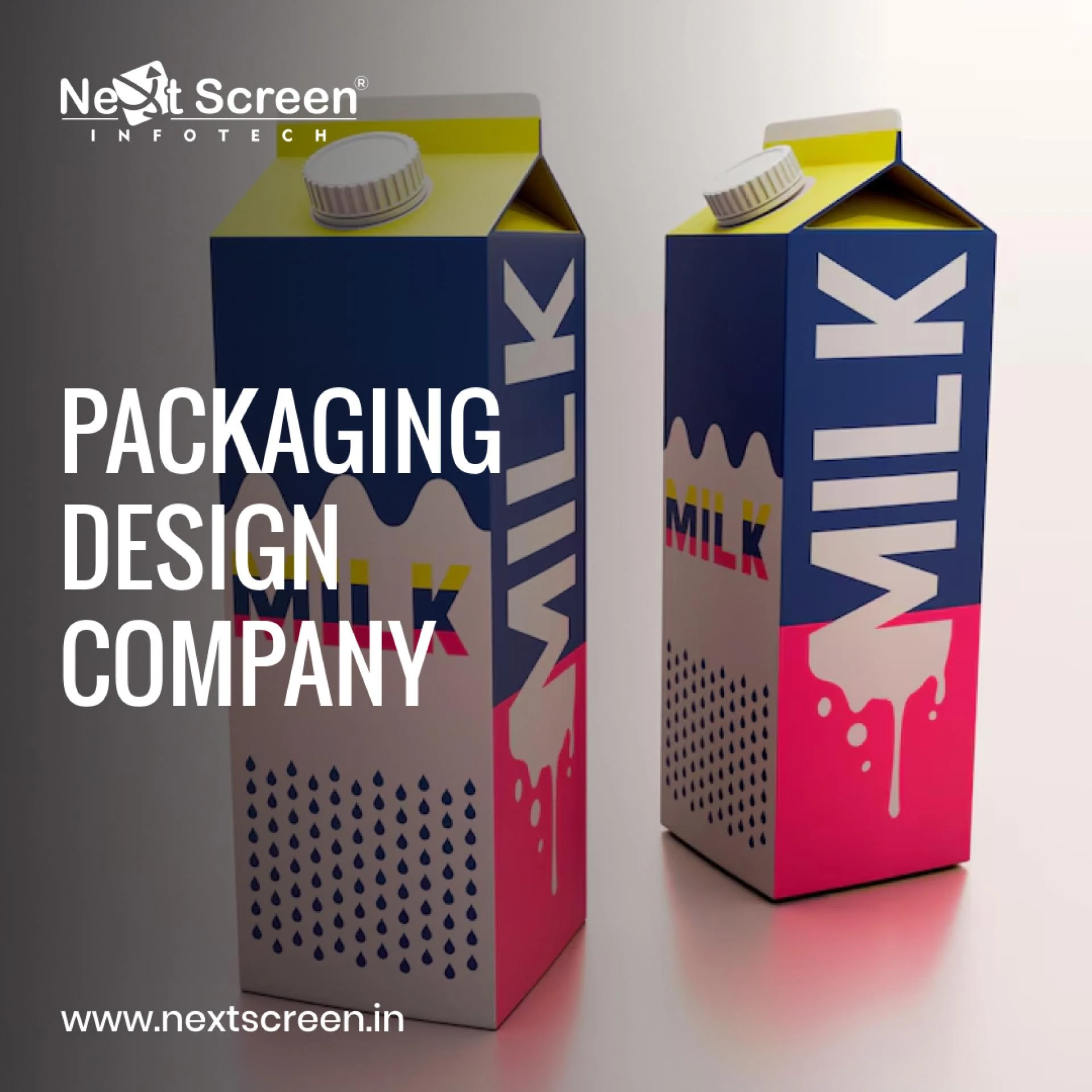
The Role of Color in Packaging Design
Color plays a pivotal role in packaging design, serving as the first visual connection between a product and potential customers. It can evoke emotions, set expectations, and even influence purchasing decisions.
The right color choice can create an instant association with brand identity. For instance, green often conveys freshness and sustainability, while vibrant colors like red can stimulate excitement or urgency.
Packaging designers harness these psychological triggers to align their products with consumer values. A well-chosen palette not only grabs attention on crowded shelves but also communicates essential information about the product\'s essence.
Moreover, consistency in color usage across various packaging helps reinforce brand recognition. Consumers tend to gravitate towards familiar hues that resonate with their previous experiences or aspirations related to a brand. Understanding this dynamic is crucial for any packaging designer seeking to make an impact in today’s competitive market.
Case Studies: Successful Examples of Color Psychology in Packaging
Coca-Cola is a classic example of color psychology at work. The brand\'s iconic red packaging evokes feelings of excitement and energy. It stands out on shelves, drawing consumers in with its vibrant hue. This clever use of color has helped Coca-Cola maintain its status as a global leader.
Another noteworthy case is Tiffany & Co., known for its trademarked robin\'s egg blue box. This serene color symbolizes luxury and elegance, instantly creating an emotional connection with customers. It elevates the unboxing experience, making even simple purchases feel special.
Consider also how KitKat uses bold colors for limited-edition flavors to create urgency and appeal to adventurous eaters. Bright wrappers grab attention while signaling fun and spontaneity, effectively boosting sales during promotional periods.
These examples show how skilled packaging designers leverage color psychology to enhance brand identity and influence purchasing decisions significantly.
Tips for Choosing the Right Colors for Your Product\'s Packaging
Choosing the right colors for your product\'s packaging can significantly impact consumer perception and sales. Start by understanding your target audience. Different demographics respond uniquely to color; know who you’re trying to reach.
Next, consider the emotions associated with various colors. For instance, blue often conveys trust, while red can evoke excitement. Align these feelings with your brand values.
Don’t forget about cultural implications of colors as well. What works in one region may not resonate in another.
Testing is crucial too. Utilize focus groups or A/B testing to determine which color palettes generate more interest and engagement from potential buyers.
Maintain consistency across all branding materials. Cohesive use of color will enhance brand recognition and create a strong identity over time.
Conclusion
Understanding the impact of color psychology in packaging design is essential for any packaging designer. Colors evoke emotions, influence perceptions, and can significantly sway consumer decisions. By tapping into the science behind color perception, Packaging designer can create packaging that resonates with target audiences.


Sign in to leave a comment.