INTRODUCTION
When it comes to selecting colors for your digital edition, it\'s crucial to think about what resonates with your audience.Some colors might attract them, while others might push them away. Picking the right colors for your digital stuff is super important. Some colors can make people feel certain ways. If you choose the wrong colors, it might make people not interested in what you made. So, it\'s crucial to choose colors that make people feel good and engaged. For example, if you pick colors that are boring or weird, it might make people not like your stuff as much. But if you pick colors that are cool and make people feel happy or excited, they\'ll probably like your stuff more. So, when you\'re making something digital like a website or an ad, think about the colors you use. Make sure they match the vibe you want to give off and the feelings you want to evoke in people. That way, they\'ll be more likely to stick around and check out what you made. In this blog, we will get to know more about The Psychology of Color in Multilingual Desktop Publishing.
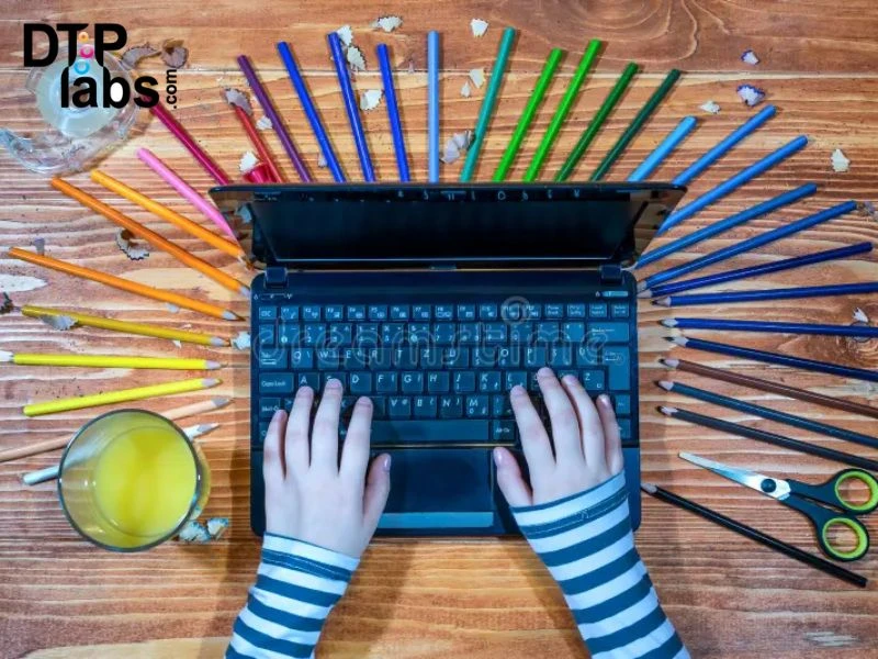
Understanding Color
Color theory is all about how colors work together and how they make people feel. It\'s like learning how to mix and match colors to create the right mood or vibe. Imagine a color wheel like a big circle that shows all the different colors and how they relate to each other. There are three main types of colors: primary (like red, blue, and yellow), secondary (like purple, green, and orange, made by mixing primary colors), and tertiary (made by mixing primary and secondary colors). Each color has its own name, like red or blue. Saturation is how intense a color looks, from really bright to kind of dull. Value is how light or dark a color is, from super bright white to pitch black. Temperature is whether a color feels warm (like yellow) or cool . Some colors really pop when you put them next to each other, like red and green. They\'re called complementary colors. Others, like yellow, orange, and red, are friends on the color wheel and look good together. These are called analogous colors. Then there are triadic colors, which are evenly spaced on the wheel, like purple, green, and orange. They make things look balanced and interesting when you use them together.
USES OF COLOR IN DESKTOP PUBLISHING
If your design incorporates bold, striking elements with solid blocks of color, employing spot color printing—such as the renowned Pantone system—can significantly enhance its visual impact. Spot colors entail printing a single color at a time, resulting in vivid, intense hues that captivate the viewer\'s attention. Moreover, spot color printing can be a cost-effective choice, particularly when your design predominantly features solid color areas. It\'s essential to note, however, that spot colors are not suitable for reproducing complex graphics or photographs in your printed materials, such as posters, business cards, or brochures. For such intricate imagery, the four-color process printing method is more appropriate. While it is feasible to incorporate both Pantone spot colors and CMYK colors within a single document, this hybrid approach requires careful coordination with your printer. Additionally, it\'s crucial to acknowledge that opting for this dual-color method is likely to incur higher costs compared to utilizing either Pantone or CMYK exclusively. By understanding the strengths and limitations of both spot color and CMYK printing methods, you can make informed decisions to achieve optimal results for your printed designs while managing costs effectively
Visual Adjustments for Different Languages
When you\'re translating content into different languages, it\'s important to tweak the layout and design to fit the new language\'s writing direction and character style. Multilingual Desktop Publishing (DTP) deals with issues like aligning text, breaking lines, and organizing paragraphs to make sure everything looks good and reads well in every language. This means making adjustments to text, pictures, and design elements to keep things consistent and make the material visually pleasing. It\'s all about maintaining readability and coherence across different languages while making everything look nice.
Tools and Techniques in Multilingual DTP
Multilingual desktop publishing involves using various software tools such as Adobe InDesign, Adobe FrameMaker, and QuarkExpress. These tools help manage the placement of text, font styles, colors, and overall document structure. They empower desktop publishing specialists to create visually appealing compositions that suit the unique needs of each language and culture. By utilizing these tools, professionals can ensure that translated materials are not only linguistically accurate but also visually engaging and culturally relevant. This means that the layout, design, and overall presentation of the content are adapted to resonate with the target audience. For instance, different languages may require adjustments in text placement to accommodate variations in sentence structure or character length. Moreover, font styles and colors might be chosen to align with cultural preferences and conventions.
Benefits of Multilingual DTP for Brands
Multilingual desktop publishing (DTP) is crucial for boosting brand recognition and expanding reach worldwide. Through investing in multilingual DTP, companies can tailor their marketing materials, ensure consistency in branding, and efficiently connect with global audiences. This approach allows brands to craft polished, culturally relevant content that resonates with various markets, building trust and credibility with customers and partners alike.
Multilingual Desktop Publishing (DTP) enhances brand recognition globally by tailoring marketing materials to diverse audiences. Understanding color psychology aids in evoking desired emotions, while tools like Adobe InDesign ensure linguistic accuracy and cultural relevance in layouts. By investing in DTP, brands maintain consistency, resonate with diverse markets, and foster trust with customers and partners.
Conclusion
Multilingual Desktop Publishing (DTP) enhances brand recognition globally by tailoring marketing materials to diverse audiences. Understanding color psychology aids in evoking desired emotions, while tools like Adobe InDesign ensure linguistic accuracy and cultural relevance in layouts. By investing in DTP, brands maintain consistency, resonate with diverse markets, and foster trust with customers and partners.
DTP Labs is a desktop publishing company based in New Delhi, India. We offer book publishing Services, PDF to Word conversions, post-translation DTP, and e-learning localization services to translation agencies worldwide. To avail of our services, check out our website www.dtplabs.com, or contact us at [email protected].


Sign in to leave a comment.