The website design is the mirror of your brand or company, giving information and brand awareness. When constructing a website or mobile application or maintaining content on a web page, the aspects of appearance and design hold significant importance in the process.
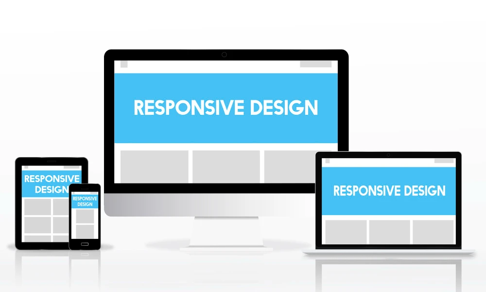
The term "responsive web design" refers to creating websites that can adjust to the dimensions of the visitors' screen. The idea is for a website to look different on different devices and screens so that people can enjoy it well no matter how they visit it.
What is a Mobile Friendly Website?
A website that is designed to be mobile-friendly is engineered to function uniformly across all devices. This means there are no computer or mobile device changes or issues. Navigation dropdowns are hard to use on mobile devices and are limited. Moreover, no Flash animation is used.
Reasons to Have a Responsive Web Design
The top 8 reasons your business should have a responsive website have been outlined. You can find more information about responsive web design and the eight (8) reasons we mentioned below.
Improves User Experience
The implementation of responsive design facilitates the accessibility of a website on any device, irrespective of its size or orientation. This means that the way people use the website is the same on all devices. This can make it easier to use and navigate.
In short, the user will be thankful for the responsive web design that reduces the bounce rate (1-page view) and increases the chance of a user returning to your site.
Easy to maintain It Infra
Responsive websites are more straightforward to maintain, reducing the time and effort needed to manage numerous versions of your website.
At the same rate as smartphones, it is imperative to update mobile templates. If you don't frequently update your organization's online presence, it could result in fewer transactions and a rise in the number of individuals leaving.
Safe Development Cost and Time
The implementation of responsive web design offers significant cost and time efficiency advantages. Instead of making different websites or apps for different devices, using a responsive approach lets you make one website or app for all of them. The streamlined development approach conserves time, energy, and resources, making it a tempting choice for both web designers and businesses.
Increases Conversion Rates
It is only half of the battle to reduce your bounce rate. Ensuring the user experience is the same on all devices is essential to get new customers. When people decide to use a service, they want to avoid visiting websites for their devices because it can take longer. Having a single secure website that looks professional on all platforms reduces users' chances of getting frustrated or turning to a competitor.
Boost in search engine rankings
Using responsive design for SEO is good because it lets a website work on multiple device types and browsers. Implementing this approach enhances the website's user experience and facilitates the creation of more seamless navigation. When a website exhibits greater ease of use and user-friendliness, search engine crawlers are more inclined to assign a higher ranking in organic search engine results.
A responsive design improves the loading speed of your website on all devices. When your website loads faster on all devices, it helps search engines rank it better. The search engine rewards webpages with a faster loading speed and ranks them higher in the search engine results.
Improved Search Ranking
Google recommends using responsive development for mobile web design. According to Google, responsive websites will act better in search rankings because they will deliver a better user experience than sites that are not mobile-friendly. Also, Google prefers responsive websites to have a single URL instead of using different URLs for separate mobile versions of websites.
More Engaged Audience
A mobile-friendly and optimized website delivers a superior user encounter. So, they're more likely to stay on your website longer and explore different parts of it.
The ability to adapt to different screen dimensions makes responsive websites a reliable and engaging platform, inspiring site visitors to dig deeper and spend more time on the site.
Makes Site Future-Friendly
Learning how to design websites that work well on mobile devices will become more complex as more devices emerge. We are still in the infancy of responsive web design, even though it is easy to assume that the benefits have been hammered out.
Future worries for developers will be how to save money on maintenance, keep search engines working better, and make more people buy something.
Conclusion
In today's mobile-driven society, responsive web design is not merely a fashion statement but a necessity. Creating websites that adapt seamlessly to different screen sizes and devices is a priority for businesses and web developers.
Mobile-friendly design enhances user encounters, boosts mobile usage, boosts search engine positions, and ultimately propels business accomplishment.
These are just a few reasons why responsive website development services can also help your search engine ranking – providing an enjoyable user experience is, after all, beneficial to search engines.


Sign in to leave a comment.