

How a Digital Corporate Invitation Creates a Premium Impression
An invitation usually arrives before anything else about an event does before the venue, before the agenda, before the first handshake. For a lot of recipients, it's the first real signal of how seriously to take what's being planned. A rushed, generic invite quietly tells people the event might be the same.
A well-made corporate invitation does the opposite. It doesn't need to shout luxury to feel premium. it just needs to feel deliberate, from the wording down to the format it arrives in.
Key Takeaways
- Premium rarely means expensive-looking it usually means clear, considered, and consistent.
- A digital corporate invitation can feel just as polished as print, often with better tracking of RSVPs.
- Tone in the wording matters as much as visual design for a business event invitation.
- A short corporate invitation video can communicate more credibility than a text-heavy card.
What a Corporate Event Invitation Actually Signals
A corporate event invitation does more than share logistics. It sets expectations how formal the event will be, how much effort went into planning it, and by extension, how much the organization values the people it's inviting. Recipients pick up on this quickly, often without consciously analyzing why.
This is why a generic template, even a nicely designed one, can undercut an otherwise well-planned event. If the invite feels like it could have been sent by any company for any event, it doesn't build much anticipation before the day itself.
Why a Digital Corporate Invitation Can Still Feel High-End
There's a lingering assumption that print automatically feels more premium than digital. In practice, a well-designed digital corporate invitation can feel just as considered sometimes more so, since it can include subtle animation, embedded RSVP tracking, and instant delivery across time zones without postage delays.
The format itself isn't what determines the impression. A cluttered printed card can feel cheaper than a clean, well-paced digital one, and the reverse is just as true.
- Consistent branding fonts, colours, logo placement matched to the company's actual identity.
- Clear, uncluttered layout that gets to the essential details quickly.
- A simple, working RSVP mechanism that doesn't require guests to hunt for it.
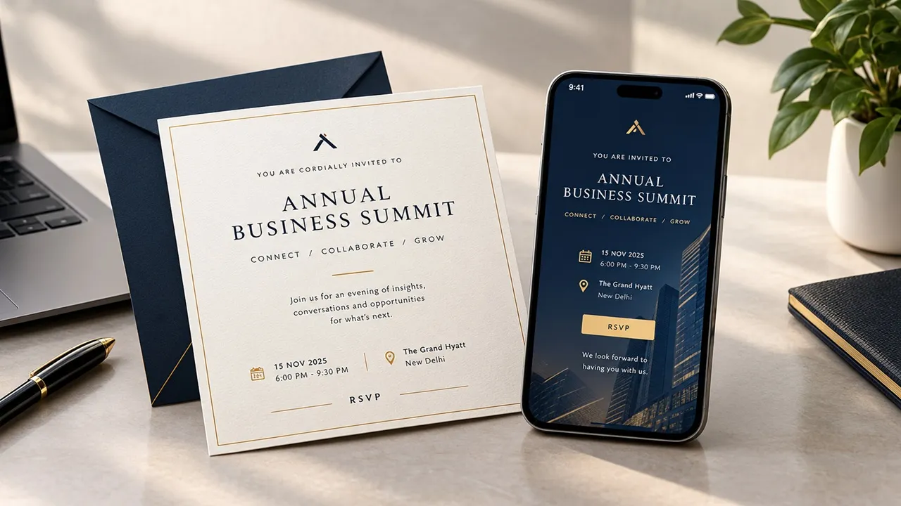
Tone Matters as Much as Design in a Business Event Invitation
It's easy to focus entirely on visuals and forget that the wording of a business event invitation carries just as much weight. Overly stiff, jargon-heavy phrasing can feel cold, while overly casual wording can undercut a genuinely important event. The tone needs to match the actual occasion.
A useful check: read the invite out loud. If it sounds like something an actual person would say to a respected guest, it's probably close. If it sounds like a legal disclaimer, it likely needs a rewrite.
When a Corporate Invitation Video Says More Than Text
For larger launches, conferences, or milestone events, a short corporate invitation video can carry more credibility than a static design a brief message from leadership, a quick look at what to expect, or simply strong visual branding in motion. It signals that the event was worth investing real effort into.
This doesn't need to be elaborate. Even a thirty-second video with clean branding and a clear message can outperform a text-heavy invite, particularly for events where excitement and anticipation matter as much as the logistics.
Small Details Behind a Premium Corporate Invitation
What ties a premium corporate invitation together is rarely one big design choice. It's the accumulation of small, consistent decisions correct guest names, accurate details, a working RSVP link, formatting that renders properly on mobile as well as desktop.
A guest who spots a broken link or a misspelled name forms an impression instantly, and it's hard to undo with a beautiful design alone. Attention to these small details is often what separates an invite that feels premium from one that just looks like it does at first glance.
Building a Corporate Invitation That Sets the Right Tone
Premium isn't really a design style it's a level of care that shows up in small, consistent details. A corporate invitation that gets the tone, format, and accuracy right will feel considered long before anyone reads the actual agenda.
Start with the basics done properly correct details, clear RSVP, consistent branding and let any extra polish, like video or animation, build on that foundation rather than replace it.
This piece is part of a series by Manav Invites on invitation formats built to match the seriousness of the event behind them.
Frequently Asked Questions
Is a digital corporate invitation appropriate for a formal business event?
Yes, when it's well-designed and consistent with the company's branding formality comes from execution, not the format itself.
How formal should the wording be for a corporate invitation?
It should match the event's actual tone a product launch can be warmer and more energetic, while a shareholder event usually calls for more measured, formal language.
Is a corporate invitation video worth the extra effort for smaller events?
It depends on the goal for smaller internal events a well-designed static invite is often enough, while larger or public-facing events tend to benefit more from video.
What's the most common mistake in corporate invitations?
Using a generic template without adjusting tone or details to the specific event, which can make even an important occasion feel routine.





















Sign in to leave a comment.