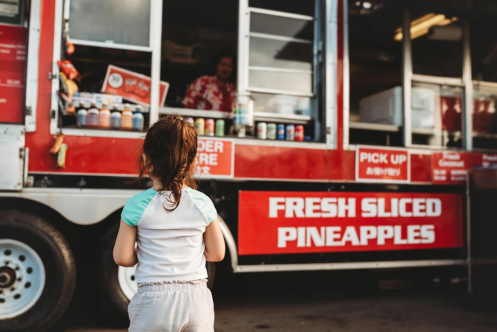
Your food truck isn't just a kitchen on wheels, it’s a moving billboard for your brand. In the frantic, fast-paced world of curb-side cuisine, you have mere seconds to grab a hungry customer's attention. Your signage is your most powerful salesperson, working 24/7 to stop people in their tracks and turn them into loyal fans.
But what happens when your billboard is failing you? A poorly designed sign can silently drain your profits, sending potential customers straight to your competitor down the street. At Car Signs Australia, we've seen it all. After years of providing top-tier vehicle wraps services to businesses across the country, we've identified the most common, and costly, pitfalls in food truck signage.
Avoid these five mistakes to ensure your truck is building your brand, not breaking it.
Mistake #1: The "Alphabet Soup" Layout
The Problem: You’re trying to say too much at once. When your menu, phone number, social media handles, logo, slogan, and a complex piece of artwork are all fighting for space, the result is visual chaos. A cluttered layout is overwhelming and, ironically, makes your key information unreadable from a distance.
How to Avoid It:
- Embrace Hierarchy: Decide on the single most important piece of information (e.g., your truck name or core offering like "ARTISAN WOOD-FIRED PIZZA") and make it the dominant visual element.
- Less is More: Trim your on-truck menu to your top 3-5 bestsellers. Use a smaller, secondary panel or a removable chalkboard/A-frame for daily specials.
- Use White Space: White space (or negative space) is not wasted space. It gives the viewer’s eye a place to rest and helps critical information stand out.
Pro Tip: The "5-Second Rule" applies. Can a person understand who you are and what you sell in five seconds from across a busy street? If not, simplify.
Mistake #2: Choosing Form Over Function (The Unreadable Font)
The Problem: That beautiful, swirling script font may look "gourmet" on your computer screen, but from 15 feet away, it’s an illegible squiggle. Fancy or overly complex fonts sacrifice readability for style, creating a barrier between you and your customer.
How to Avoid It:
- Prioritize Readability: Select clean, bold, sans-serif fonts for your primary text. They are proven to be more legible at a distance and from oblique angles.
- Use Stylistic Fonts Sparingly: A decorative font can be excellent for your logo or primary brand name, but use it only for that. Pair it with a simple, highly readable font for all other details like the menu and contact information.
- Test It Out: Print a sample of your sign design and tape it to a wall. Walk away from it. Can you still read it clearly?
Mistake #3: Fading into the Background (Poor Contrast & Colour)
The Problem: Your colour choices might look nice together, but do they create enough contrast to be seen in bright sunlight or at dusk? Low-contrast combinations like light grey on white or yellow on cream will render your sign invisible.
How to Avoid It:
- Leverage High-Contrast Pairings: Think dark on light or light on dark. Classic combinations like black on yellow, white on navy, or red on white are timeless for a reason, they work.
- Consider Colour Psychology: Colours evoke emotion. Red and yellow can stimulate appetite, green suggests freshness, and blue can convey trust. Choose a palette that aligns with your brand and cuisine.
- Account for Lighting: A great vehicle wrap services provider, like Car Signs Australia, will advise on colours and materials that maintain their vibrancy and legibility under various lighting conditions.
Mistake #4: The Mystery Meat Vibe (No Visual Cues)
The Problem: Your truck is called "The Rolling Gourmet" and your menu lists "Deconstructed Protein Bowl." Sounds fancy, but what does that mean? Without a visual cue, customers are left guessing, and in a fast decision-making environment, they’ll often move on to something more familiar.
How to Avoid It:
- Incorporate a "Hero Shot": A large, high-quality, mouth-watering photograph of your signature dish is one of the most effective tools you can use. It sells the experience and the outcome, not just the ingredients.
- Use Simple Icons: Are you vegan-friendly? Gluten-free? Accept QR codes? Use universally understood icons to communicate these features instantly.
- Clarify Your Cuisine: If your brand name is abstract, your imagery and tagline must do the heavy lifting. "The Rolling Gourmet: Craft Sandwiches & Salads" is infinitely clearer.
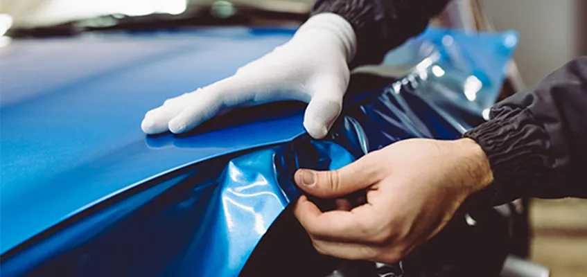
Mistake #5: Looking Cheap (Low-Quality Materials & Installation)
The Problem: You opted for a cheap, DIY print job on flimsy vinyl. After a few months in the sun and a few trips through the car wash, it’s faded, peeling, and covered in bubbles. This doesn’t say "budget-friendly"; it says "I don’t care about quality," and customers will assume the same about your food.
How to Avoid It:
- Invest in Professional-Grade Materials: High-quality, automotive-grade vinyl with UV lamination is designed to withstand the harsh Australian climate, resisting fading and scratches.
- Prioritise Professional Installation: A skilled installer ensures a bubble-free, seamless application that conforms perfectly to the curves and rivets of your vehicle. This is where the value of expert vehicle wraps services truly shines.
- View it as an Investment, Not a Cost: A premium wrap isn't an expense; it's a long-term marketing asset. A durable, professionally installed wrap can last for 5-7 years, continuously promoting your brand.
Drive Your Business Forward with Signage That Sells
Your food truck signage is the frontline of your marketing. It’s the first handshake, the first smile, and the first promise of a great meal. By avoiding these common mistakes, you transform your truck from a mere vehicle into an irresistible, profit-driving powerhouse.
Don't let a subpar sign park your potential. Car Signs Australia specialises in creating stunning, durable, and high-impact vehicle wraps services designed to make your food truck the star of the street.
Ready to serve up a brand experience that customers can’t ignore?


Sign in to leave a comment.