People today browse the internet from everywhere. They shop on their phones, read blogs on tablets, and research services on desktop screens. If a website does not adjust smoothly to these different devices, visitors often leave within seconds. A poor experience on even one screen can cost a business leads, sales, and trust.
This is where responsive web design becomes essential. It allows a website to automatically adapt its layout, content, and visuals based on screen size. The goal is simple. Make the website easy to use, easy to read, and visually clear for every visitor.
we will explore the key components of responsive web design that every website should follow. These elements help create a better user experience, improve performance across devices, and ensure a website stays relevant as technology continues to evolve.
What Is Responsive Web Design?
Responsive web design is a design approach that allows a website to adapt automatically to different screen sizes and devices. The layout, content, images, and navigation adjust based on how the user is viewing the site.
Instead of creating separate websites for desktop and mobile users, responsive design uses a single website that responds to all screen sizes. This makes the website easier to manage and more consistent for users.
Responsive web design focuses on flexibility. It ensures that content stays readable, images stay properly sized, and navigation remains easy to use, whether someone visits the site from a phone or a large screen.
Why Responsive Design Matters for User Experience
User experience plays a major role in how people interact with a website. When a site is easy to read and navigate on any device, users are more likely to stay longer and explore more pages. Responsive design removes the need for zooming, sideways scrolling, or struggling with small buttons.
A website that adapts well to different screens feels more reliable and professional. Visitors can find information quickly, complete forms easily, and move through the site without confusion. This leads to higher engagement and better overall satisfaction.
Responsive design is also important for SEO. Search engines prefer websites that provide a consistent experience across devices. A responsive website is easier for search engines to crawl and index, which helps improve visibility. Better performance, lower bounce rates, and improved usability all support stronger search rankings.
Components of Responsive Website Design
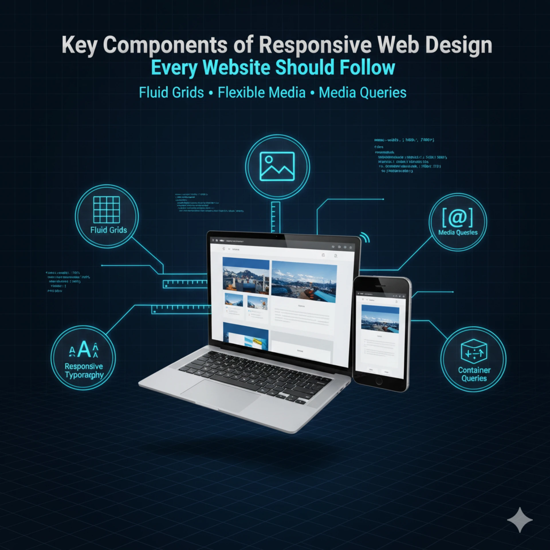
1. Flexible Grid Layouts
Flexible grid layouts form the backbone of responsive design. Instead of using fixed pixel widths, grids use relative units like percentages or em to allow columns and sections to scale according to screen size. This ensures that content adjusts naturally without breaking the design.
Flexible grids also allow for multi-column layouts on desktops to collapse into single-column layouts on mobile, creating a seamless reading experience. Combined with proper spacing and alignment, flexible grids prevent overcrowding and maintain visual hierarchy across devices.
2. Fluid Images and Media
Images, videos, and other media must adapt to the container they’re in. Fixed-size images can overflow, distort, or cut off parts of the content on smaller screens.
By using fluid images, designers ensure visuals resize dynamically while maintaining proportions. Techniques like CSS max-width: 100% and responsive srcset attributes help images load at the correct resolution for each device, balancing visual quality and performance.
3. Media Queries for Device Adaptation
Media queries are the engine behind device-specific adjustments. They allow developers to apply different CSS rules depending on screen width, resolution, or device orientation.
For example:
- A three-column layout on desktop can switch to two columns on tablets and a single column on mobile.
- Font sizes, padding, and navigation layouts can also change based on the device.
This ensures the website looks and works well regardless of whether someone uses a phone, tablet, or large monitor.
4. Scalable Typography and Readable Fonts
Text is a key part of user experience. Fixed font sizes often look fine on desktops but appear too small or too large on mobile. Responsive typography uses relative units like em or rem to scale text proportionally across devices.
Other considerations include:
- Maintaining line height for readability.
- Using web-safe fonts that render consistently on all devices.
- Ensuring headings, body text, and buttons remain legible without zooming.
5. Touch-Friendly Buttons and Navigation
Touchscreen users need elements that are easy to tap. Buttons, links, and menus must be large enough with enough spacing to avoid accidental clicks.
Responsive navigation often includes:
- Hamburger menus for mobile to save space.
- Sticky headers or floating buttons for easy access to important actions.
- Clear visual cues, like hover states or shadow effects, indicate interactivity.
6. Responsive Forms and Input Fields
Forms are essential for engagement—whether for contact, sign-ups, or checkout. Responsive forms adjust fields, buttons, and labels so users can complete them easily on any device.
Best practices include:
- Using stacked form fields instead of side-by-side layouts on mobile.
- Ensuring input fields are large enough for touch keyboards.
- Providing clear error messages and inline guidance that doesn’t break the layout.
7. Performance Optimization
A responsive website isn’t just about appearance—it’s also about speed. Slow-loading pages frustrate users and reduce conversions.
Key strategies include:
- Compressing images without losing quality.
- Minimizing CSS and JavaScript.
- Using lazy loading for off-screen images and media.
- Optimizing fonts for faster rendering across devices.
8. Adaptive Content Prioritization
Not all content is equally important on every device. Responsive websites often prioritize key information for smaller screens:
- Important text and call-to-actions are displayed first.
- Secondary content, such as sidebars or promotional banners, may move lower or hide on mobile.
This ensures users see the most relevant content immediately, improving engagement and usability.
9. Consistent Branding Across Devices
Maintaining brand consistency is crucial. Colors, typography, logos, and visual elements should remain recognizable across all devices while adapting to different screen layouts.
A consistent brand experience builds trust and ensures users instantly recognize your website, whether on mobile, tablet, or desktop.
10. Accessibility Considerations
Accessibility is a vital part of modern responsive design. Websites must be usable by all visitors, including those with disabilities.
Key practices include:
- Using sufficient color contrast for readability.
- Providing alternative text for images.
- Ensuring keyboard navigation works on all devices.
- Designing forms and interactions that screen readers can interpret.
Integrating accessibility ensures everyone can use your website effectively, which is increasingly important for both UX and SEO.
Best Practices for Implementing Responsive Design
1. Test Across Devices and Browsers
Check your website on multiple devices and browsers to ensure layouts, fonts, images, and navigation work consistently. Real-device testing is best.
2. Use Responsive Frameworks
Frameworks like Bootstrap or Tailwind provide pre-built grids and components, speeding up development while keeping your design consistent and mobile-friendly.
3. Avoid Common Mistakes
Keep layouts simple, text and buttons readable, media optimized, and content accessible. Avoid slow-loading pages and hidden elements.
4. Continuous Monitoring and Updates
Regularly audit your site, adjust media queries for new devices, and monitor analytics to maintain usability and performance over time.
Conclusion
Responsive web design is no longer optional it’s essential for delivering a seamless user experience, improving search engine rankings, and future-proofing your website. By focusing on flexible layouts, fluid media, scalable typography, touch-friendly navigation, and accessibility, your website can perform beautifully across all devices.
At WebyKing, we emphasize creating websites that are not just visually appealing but also fully responsive and user-focused. As a leading Responsive Website Design Company, we help businesses build websites that perform beautifully across all devices.


Sign in to leave a comment.