In the dynamic realm of UI/UX design, every element plays a pivotal role in shaping the user experience. One such element that holds significant influence is color. The psychology of colors in UI/UX design goes beyond mere aesthetics, delving into the intricate realm of human perception and emotion. Understanding how colors impact users can empower designers to create visually appealing and user-friendly interfaces that resonate with their target audience.
Colors Evoke Emotions
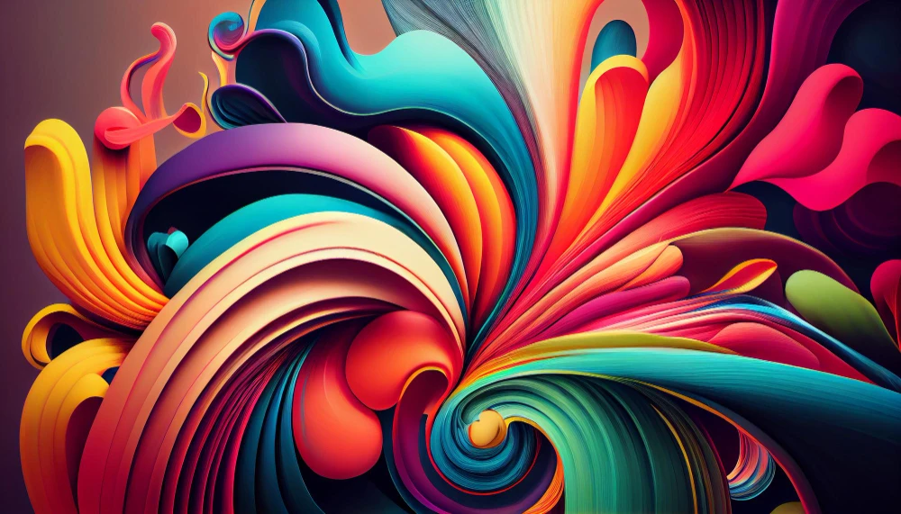
Colors possess the remarkable ability to evoke emotions and trigger specific responses. In the context of UI/UX design, selecting the right color palette is akin to choosing the emotional tone of the user’s journey. For instance, warm colors like red and orange tend to elicit feelings of excitement and passion, while cool colors like blue and green evoke a sense of calmness and tranquility. Designers can strategically leverage these emotional cues to guide users through a seamless and emotionally resonant experience.
Establishing Brand Identity
Beyond eliciting emotions, colors play a crucial role in establishing brand identity. Consistency in color usage across various touchpoints helps in creating a cohesive and memorable brand image. Think about the iconic blue of Facebook or the vibrant yellow associated with Snapchat; these color choices have become synonymous with their respective brands, contributing to instant recognition and brand recall. By understanding the psychological impact of colors, designers can craft a visual identity that aligns with the brand’s personality and values.
Navigating Cultural Significance
In a globalized world, UI/UX designers must be mindful of cultural nuances associated with colors. Different cultures attribute distinct meanings to colors, and understanding these variations is essential to avoid unintended miscommunications. For instance, while white symbolizes purity in Western cultures, it may signify mourning in some Eastern cultures. Navigating these cultural intricacies ensures that the chosen color scheme resonates positively with diverse user demographics.
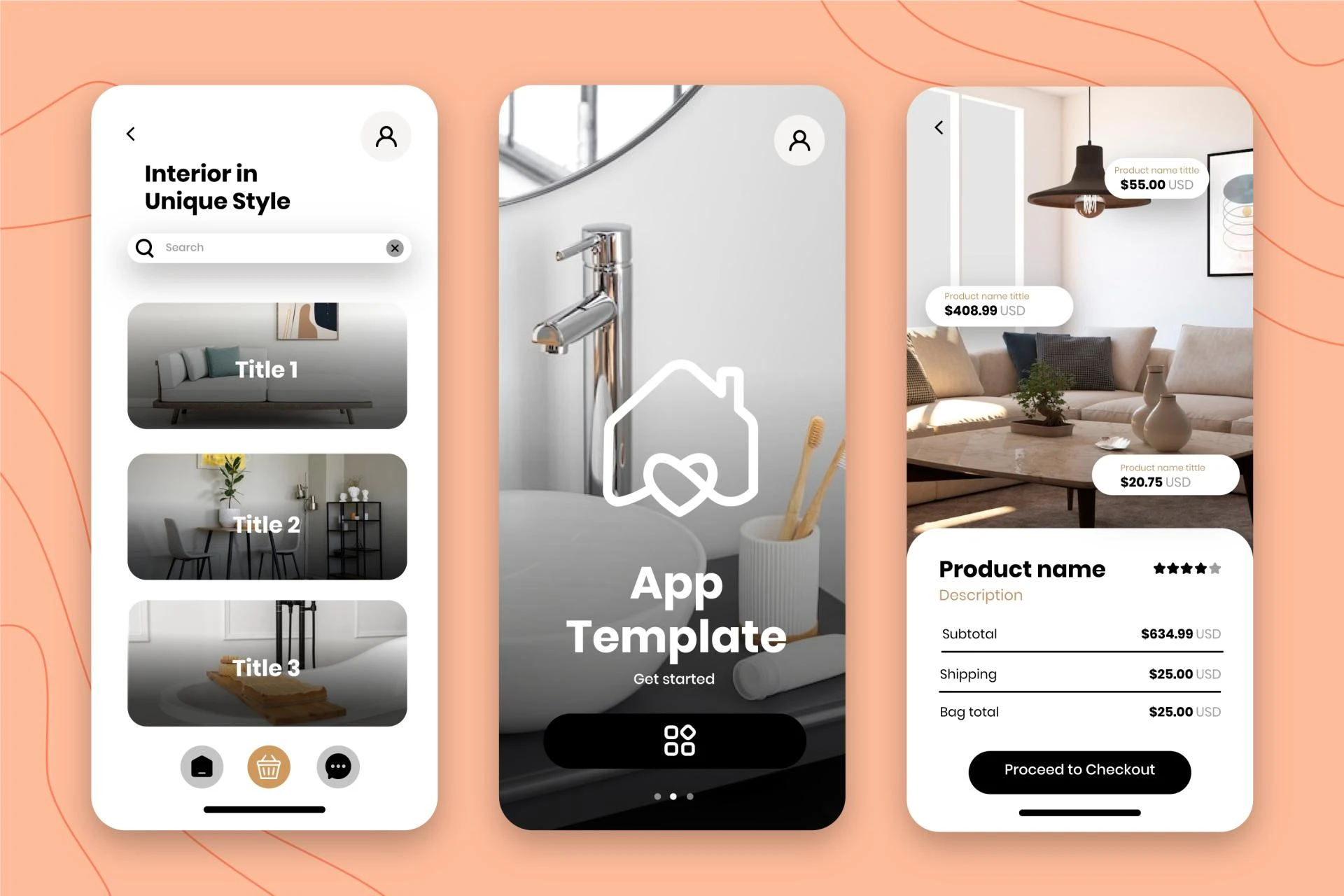
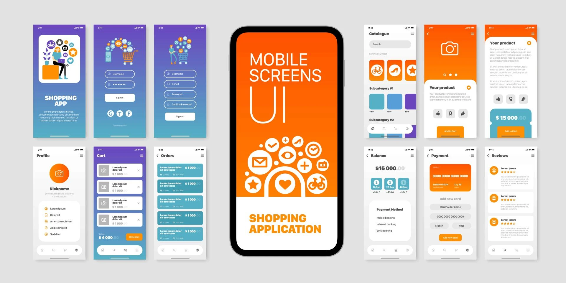
Improving User Navigation and Interaction
Colors also play a pivotal role in guiding users through the interface and facilitating seamless navigation. Well-chosen color contrasts can enhance readability and draw attention to essential elements, such as call-to-action buttons. Consistent color coding aids users in understanding the hierarchy of information and enhances the overall usability of the design. By strategically implementing color cues, designers empower users to interact intuitively with the interface.
The Power of Accessibility
Inclusive design is a cornerstone of effective UI/UX, and colors contribute significantly to accessibility. Consider users with visual impairments who rely on screen readers. Ensuring sufficient color contrast and providing alternative text for color-coded information ensures that the interface remains accessible to all users. Thoughtful color choices, accompanied by accessibility considerations, result in designs that cater to a diverse user base.
Conclusion
In conclusion, the psychology of colors in UI/UX design is a nuanced and powerful aspect that goes beyond the visual appeal. By understanding how colors evoke emotions, establish brand identity, navigate cultural nuances, improve navigation, and enhance accessibility, designers can wield the transformative power of colors to influence user perception positively. In a world where user experience is paramount, the strategic use of colors emerges as a key player in creating designs that resonate with users on a profound level.
Visit my Upwork profile for — UI/UX design, Mobile Design & Product Designer
Project Catalog for — Mobile App UI UX Design, iOS or Android Mobile APP UX/UI Design & Modern Crypto Design


Sign in to leave a comment.