In today's fast-paced business environment, the role of the Chief Financial Officer (CFO) has evolved far beyond traditional accounting and reporting. Modern CFOs are strategic partners to the CEO, responsible for navigating economic uncertainty and steering the company toward sustainable growth. To do this effectively, you need more than dense spreadsheets and static monthly reports. You need a dynamic, real-time command center: a finance dashboard.
A powerful finance dashboard cuts through the noise, transforming complex financial data into clear, actionable insights. It’s the single source of truth that helps you monitor the financial health of your organization, identify opportunities, and mitigate risks before they become critical. This guide will walk you through the essential metrics every CFO should have on their finance dashboard, breaking them down into four key pillars: Profitability, Liquidity, Efficiency, and Growth.
Why Finance Dashboards Matter More Than Ever
The need for real-time financial visibility has never been more urgent. Today's CFOs face unprecedented challenges that make traditional monthly reporting cycles obsolete:
- Market Volatility: Economic conditions can shift dramatically in days, not quarters. Interest rate changes, supply chain disruptions, and geopolitical events create ripple effects that impact your bottom line immediately. By the time your monthly report is compiled and reviewed, the damage may already be done. A real-time finance dashboard allows you to spot these impacts as they happen and adjust course quickly.
- Investor and Board Pressure: Stakeholders expect CFOs to have answers instantly. When the board asks about cash runway during a market downturn, or investors question your burn rate in light of new competition, "Let me get back to you after month-end close" is no longer an acceptable answer. Modern CFOs need fingertip access to current metrics to maintain credibility and trust .
- Speed of Decision-Making: In a world where competitors can pivot in weeks and new market entrants can disrupt entire industries overnight, waiting 30 days for financial insights is a competitive disadvantage. Real-time dashboards enable the agile decision-making that separates market leaders from those left behind. Whether it's identifying which product lines are suddenly underperforming or spotting early warning signs of customer churn, immediate visibility translates directly to faster, more effective responses.
- Complexity Beyond Spreadsheets: Today's financial data comes from multiple sources - your ERP, CRM, payment processors, and subscription management platforms. Manually consolidating this data into spreadsheets is not just time-consuming; it's error-prone and creates dangerous blind spots. A unified finance dashboard automatically integrates these data streams, ensuring nothing falls through the cracks.
This guide will walk you through the essential metrics every CFO should have on their finance dashboard, breaking them down into four key pillars: Profitability, Liquidity, Efficiency, and Growth.
What is a Finance Dashboard and Why Is It Essential?
A finance dashboard is a business intelligence (BI) tool that visually displays your most important financial key performance indicators (KPIs) in one place. Unlike a static report that shows a snapshot in time, a dashboard is interactive, providing a live look at the financial pulse of your company.
The core purpose of a finance dashboard is to move beyond simply reporting numbers to understanding the stories they tell. It allows you to see trends, compare performance against goals, and drill down into the specifics with just a few clicks. For a CFO, this means spending less time compiling data and more time on strategic analysis and decision-making. Research has consistently shown that firms that leverage data visualization and analytics in their decision-making processes exhibit superior financial performance. A well-crafted finance dashboard is the primary tool for enabling this data-driven culture at the highest level.
The Four Pillars of a Strategic CFO Dashboard
To build a truly comprehensive finance dashboard, you should organize your KPIs around the four fundamental pillars of financial health. This structure ensures you have a balanced view of both your current performance and your future potential.
The CFO Dashboard Framework
To build a truly comprehensive finance dashboard, you should organize your KPIs around the four fundamental pillars of financial health. This structure ensures you have a balanced view of both your current performance and your future potential.
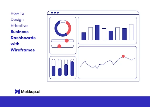
Designing a Finance Dashboard that Works
Knowing which metrics to track is only half the battle. The real challenge lies in creating a dashboard that CFOs and their teams will actually use. A CFO dashboard is a visual hub that turns financial information into actionable insights, but achieving this requires thoughtful design and the right approach to development.
Start with Design, Not Data
Traditional dashboard development often fails because it starts with the data and works backward. This leads to dashboards that are technically functional but practically useless. Instead, modern CFOs are taking a design-first approach that focuses on the user experience and strategic needs before connecting any data sources.
This is where specialized wireframing tools transform the dashboard creation process. Platforms like Mokkup.ai allow finance teams to visually design their ideal dashboard layout without writing a single line of code or connecting to any data sources. You can experiment with different visualizations, arrange KPIs in logical groupings, and create the perfect information hierarchy—all through an intuitive drag-and-drop interface or even by generating designs from text descriptions.
Collaborative Design Process
The most effective CFO dashboards are built through collaboration. Your dashboard needs to serve multiple stakeholders: the CFO, the finance team, department heads, and the board. Using Mokkup.ai's real-time collaboration features, all stakeholders can contribute to the design process simultaneously, providing feedback and ensuring the final dashboard meets everyone's needs. This collaborative approach dramatically reduces the back-and-forth typically associated with BI development and ensures buy-in from all parties before any technical resources are committed.
From Wireframe to Reality
Once your dashboard design is perfected in wireframe form, you have a clear blueprint that can be handed to developers or implemented in your chosen BI platform. This approach cuts development time by up to 70% because everyone knows exactly what they're building. There's no ambiguity, no endless revision cycles, and no expensive rework. For enterprises with strict security and compliance requirements, tools like Mokkup.ai can be procured through trusted platforms like AWS Marketplace, ensuring they meet the highest standards from day one.
Pillar 1: Profitability Metrics – The Bottom Line
Profitability is the ultimate measure of a company's success. These KPIs tell you not just if you're making money, but how effectively you're making it.
- Gross Profit Margin: This metric shows the percentage of revenue left after subtracting the cost of goods sold (COGS). It’s a fundamental indicator of your pricing strategy and production efficiency. A healthy margin means you have more money to cover operating expenses and invest back into the business.
- Net Profit Margin: This is the true bottom line. It calculates the percentage of revenue remaining after all expenses, including taxes and interest, have been deducted. A declining net profit margin on your finance dashboard is a clear warning sign that your operating costs are growing faster than your revenue.
- EBITDA (Earnings Before Interest, Taxes, Depreciation, and Amortization): EBITDA gives you a clean look at your company's core operational profitability without the distortions of accounting and financing decisions. It's a widely used metric for comparing the performance of different companies and is a cornerstone of any detailed financial analysis.
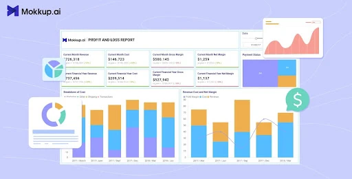
A dedicated Profit & Loss-Detailed Report dashboard is the perfect tool to visualize these metrics. Instead of digging through tables, you can see trends in your margins over time, instantly spotting where your profitability is strongest and where it's leaking.
Pillar 2: Liquidity Metrics – The Company’s Lifeblood
Profit on paper is meaningless if you don't have the cash to pay your bills. Liquidity metrics measure your company's ability to meet its short-term financial obligations. A cash flow problem is one of the fastest ways for even a profitable company to fail.
- Operating Cash Flow (OCF): This is arguably the most important health metric. OCF measures the cash generated from your regular business operations. A strong, positive OCF on your finance dashboard indicates that your core business can generate enough cash to sustain and grow itself without relying on external financing.
- Current Ratio (or Working Capital Ratio): Calculated by dividing your current assets by your current liabilities, this ratio assesses your ability to cover short-term debts. A ratio below 1 can be a red flag, while a very high ratio might suggest you aren't using your assets efficiently.
- Burn Rate & Cash Runway: Especially critical for startups and high-growth companies, burn rate is the pace at which you're spending cash. Your cash runway is how many months you can continue operating before running out of money. Visualizing this on your finance dashboard is essential for fundraising and strategic planning.
Pillar 3: Operational Efficiency Metrics – How Well You Run
These KPIs measure how effectively your company is using its assets and resources to generate revenue. Improving efficiency directly impacts your profitability and cash flow.
- Days Sales Outstanding (DSO): This metric tracks the average number of days it takes to collect payment after a sale. A high DSO means your cash is tied up in accounts receivable, negatively impacting your liquidity.
- Days Payables Outstanding (DPO): This shows the average number of days it takes for your company to pay its own bills. While extending DPO can improve short-term cash flow, an excessively high number can damage your relationships with suppliers.
- Working Capital: This is the difference between your current assets and current liabilities. Efficient working capital management is directly linked to higher profitability, as it ensures that resources are not tied up unnecessarily and are instead used to generate value. Tracking this on your finance dashboard helps you optimize your operational cycle.
Pillar 4: Growth & Valuation Metrics – The Future Outlook
While the previous pillars focus on current health, these metrics look to the future, measuring customer value and growth trajectory. They are particularly vital for SaaS and subscription-based businesses.
- Customer Acquisition Cost (CAC): The total cost of sales and marketing to acquire a new customer. A key goal is to keep CAC as low as possible.
- Customer Lifetime Value (LTV): The total revenue you can expect from a single customer account over the entire relationship.
- LTV:CAC Ratio: This powerful ratio compares the value of a customer to the cost of acquiring them. A healthy ratio (often cited as 3:1 or higher) indicates a sustainable and profitable business model.
- Monthly Recurring Revenue (MRR) / Annual Recurring Revenue (ARR): The lifeblood of any subscription business, this metric tracks your predictable revenue stream. Your finance dashboard should visualize MRR/ARR growth, churn, and expansion.
The Future of CFO Dashboards
The evolution of CFO dashboards is accelerating, driven by advances in artificial intelligence and machine learning. As the CFO cockpit dashboard equips leaders with real-time critical data , the next generation of dashboards will go beyond displaying data to actively providing insights and recommendations.
AI-Driven Analytics and Insights
Modern dashboards are beginning to incorporate AI capabilities that transform them from passive reporting tools to active financial advisors These advanced financial dashboards tap into analytics engines that can automatically identify patterns, anomalies, and opportunities that might be missed by human analysis. For example, AI can detect unusual spending patterns across cost centers, predict cash flow crunches weeks in advance, or identify which customers are likely to churn based on payment behavior.
Predictive Forecasting and Scenario Planning
The future CFO dashboard will not just tell you what happened or what's happening now—it will show you what's likely to happen next AI-powered forecasting models can analyze historical data alongside external factors like market conditions, seasonal trends, and economic indicators to provide highly accurate financial predictions. More importantly, these dashboards will enable real-time scenario planning, allowing CFOs to instantly see how different decisions would impact key metrics.
Natural Language Interactions
Tomorrow's CFO dashboards will be conversational. Instead of clicking through menus and filters, financial leaders will simply ask questions in plain English: "What's driving the increase in our burn rate?" or "Which regions are underperforming on collections?" The dashboard will understand the context, perform the analysis, and present the answer in the most appropriate visual format.
Automated Alerts and Recommendations
AI-driven dashboards will proactively monitor all financial metrics and alert CFOs to issues before they become critical . But beyond simple threshold alerts, these systems will provide contextual recommendations. If working capital is trending negatively, the dashboard might suggest specific actions like accelerating collections from top debtors or renegotiating payment terms with suppliers.
Integration with External Data
The CFO dashboard of the future will seamlessly blend internal financial data with external market intelligence. Real-time competitor pricing, industry benchmarks, economic indicators, and even social sentiment data will be automatically incorporated to provide a complete picture of your financial position relative to the market.
As we move toward this AI-enhanced future, the importance of having a well-designed dashboard foundation becomes even more critical. The dashboards you design today using modern wireframing tools will evolve to incorporate these AI capabilities, but the fundamental structure—the KPIs you track, the visual hierarchy, and the user experience—will remain the cornerstone of effective financial management.
From Metrics to Strategy: Building Your Finance Dashboard
Knowing which KPIs to track is the first step. The second, more crucial step is bringing them together in a way that is clear, intuitive, and actionable. This is where the design of your finance dashboard becomes paramount.
The goal is not to cram every possible number onto one screen. The goal is to tell a story. A well-designed finance dashboard should guide the user's eye from high-level summaries down to granular details.
This is where traditional BI development can become a bottleneck. The process of getting data, briefing developers, and waiting for a prototype can take weeks. But it doesn't have to. With modern wireframing tools, you can design your perfect finance dashboard without needing any data or design expertise . Platforms like Mokkup.ai allow you to transform your ideas into a fully-realized dashboard wireframe in minutes, using a simple drag-and-drop interface or even generating it from a text prompt .
This approach fundamentally changes the development process. Your finance team can collaborate on the design, ensuring it meets their exact needs, before any development resources are committed . This dramatically accelerates the time-to-value, cutting down on rework and ensuring the final product is exactly what the CFO needs. For enterprises with strict security requirements, these tools can be procured through platforms like AWS Marketplace, ensuring they meet the highest standards for security and compliance from day one .
Best Practices for a World-Class Finance Dashboard
- Establish a Single Source of Truth: Your dashboard is only as reliable as the data behind it. Ensure it integrates seamlessly with your accounting software, ERP, and CRM to provide a consistent and trustworthy view.
- Focus on Trends Over Time: A single number is a snapshot; a trend is a story. Your finance dashboard should emphasize line charts and comparison periods to show whether your performance is improving or declining.
- Use Visual Cues: Leverage color (red for negative, green for positive), gauges, and clear headings to make the dashboard scannable. A CFO should be able to glance at it and understand the overall financial health in seconds.
- Make it Interactive: The power of a finance dashboard lies in the ability to drill down. A user should be able to click on a high-level number (like total revenue) and see it broken down by product line, region, or sales team.
Frequently Asked Questions
1. How is a finance dashboard different from a standard accounting report? An accounting report is a static, historical document (like a P&L statement). A finance dashboard is a live, interactive, and visual tool that displays real-time KPIs and allows you to explore trends and drill down into data.
2. How often should a CFO review their finance dashboard? For high-level strategic oversight, a weekly review is common. However, key liquidity metrics like cash flow and burn rate might be monitored daily, especially in a fast-moving or cash-constrained environment.
3. Who else besides the CFO should have access to a finance dashboard? Different versions of a finance dashboard can be created for different stakeholders. The executive team, board members, and department heads can all benefit from a view tailored to their specific areas of responsibility.
4. What is the biggest mistake companies make with their finance dashboards? The most common mistake is information overload. They try to track too many metrics, creating a cluttered and confusing interface that nobody uses. The key is to focus on a handful of truly critical KPIs that drive strategic decisions.
5. Can I design a finance dashboard without having my data ready?
Yes. Tools like Mokkup.ai are data-independent, meaning you can sketch and refine your finance dashboard before connecting it to live systems. This helps CFOs validate KPIs, align stakeholders, and accelerate development by reducing costly rework later.”


Sign in to leave a comment.