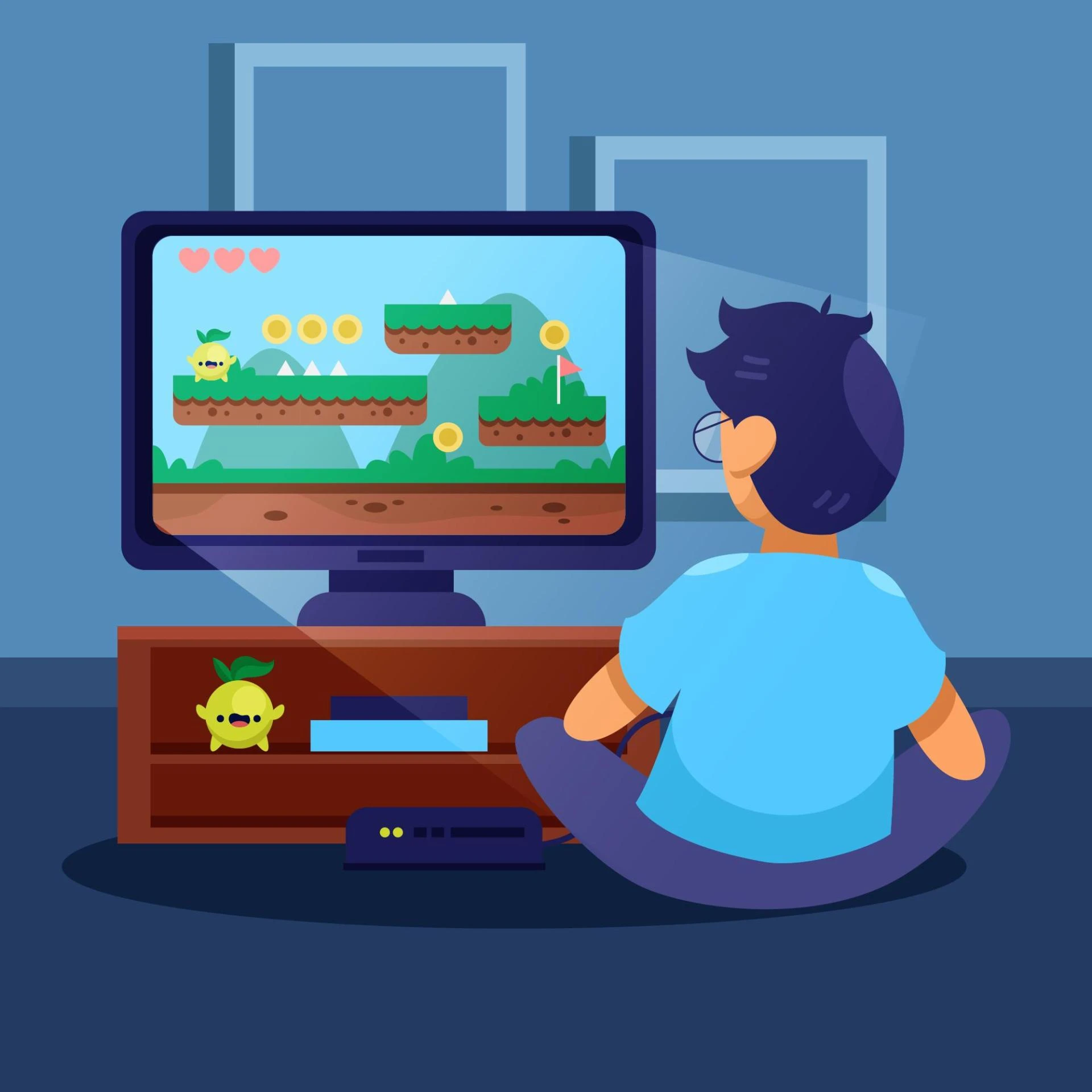
You made an epic clip — a perfectly timed snipe, a clutch Victory Royale — and you upload the video expecting views to pour in. Then…crickets. The problem isn’t the gameplay. It’s your thumbnail. In the fast-scroll world of YouTube and social feeds, Fortnite Thumbnail Design is the handshake that gets viewers to pause, click, and stay. Screw it up, and even the best content gets buried.
Here’s a reality check: thumbnails are tiny billboards competing with a billion other pixels. In that scramble, common mistakes in Fortnite Thumbnail Design are lethal. If you’re serious about growth and don’t want your videos to vanish into the algorithm’s void, working with a Pro Fortnite Thumbnail Designer can dramatically improve click-through rates by combining visual psychology, platform trends, and creator branding into a single, scroll-stopping image.
Why thumbnail design matters (short and blunt)
Thumbnails are the visual headline of your video. They convey emotion, promise value, and set expectations. On YouTube, a strong thumbnail can change your click-through rate (CTR) from meh to viral. For creators chasing growth, investing time in Fortnite Thumbnail Design is not optional — it’s essential.
Mistake #1 — Too much clutter: the “everything-and-the-kitchen-sink” look
You’ve seen it: ten characters, chunky fonts, HUD elements, and three surprise arrows all squeezed into a 1280×720 frame. That’s clutter. On mobile screens, clutter becomes noise.
How to fix it:
- Focus on one focal point (a face, weapon, or dramatic moment).
- Use negative space — spare design actually reads better.
- Limit text to 3–4 words max. Make every element earn its place.
Mistake #2 — Tiny text that disappears on mobile
If people can’t read your thumbnail’s text at thumb-size, they won’t click. Many creators forget that 70–80% of views are mobile.
How to fix it:
- Use bold, condensed fonts and keep text large.
- Test thumbnails at 30% scale before uploading.
- Prefer short punchlines over long sentences.
Mistake #3 — Using low-contrast colors and poor color hierarchy
A washed-out thumbnail blends into the background. Without contrast, your thumbnail becomes invisible among the bright reds and blues of competing videos.
How to fix it:
- Create contrast between foreground and background.
- Use color to direct attention (bright accent for the subject, muted background).
- Stick to 2–3 dominant colors for cohesion.
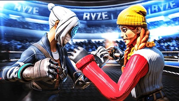
Mistake #4 — Generic gaming stock images (the “seen-it-before” problem)
If your thumbnail looks like everyone else’s — a canonized Fortnite hero pose and generic explosion — viewers skip it. Originality beats templates.
How to fix it:
- Use unique in-game moments or custom art.
- Add a recognizable personal touch (signature color, mascot, or prop).
- Consider face-cam reactions for personality.
Mistake #5 — Mismatch between thumbnail promise and content
Clickbait that disappoints kills your channel over time. If the thumbnail promises an insane trickshot but the video is a montage of noise, viewers will bounce and the algorithm notices.
How to fix it:
- Be honest in your imagery and text.
- Match thumbnail mood to content type (tutorial, highlight, review).
- Use timestamps or cards in the video to deliver promised value.
Mistake #6 — Over-editing faces and expressions
Cranking saturation, stretching eyes, or slapping on gaudy effects can make faces look fake and off-putting. Authentic reactions convert better.
How to fix it:
- Keep face edits natural; emphasize expression, not distortion.
- Use subtle sharpening and dodge/burn to add depth.
- When in doubt, tone it down.
Mistake #7 — Weak composition and ignored visual hierarchy
A thumbnail needs a clear path for the eye: subject → headline → logo/CTA. Poor composition leaves viewers unsure what to focus on.
How to fix it:
- Apply the rule of thirds or centered composition deliberately.
- Place the subject off-center and text opposite to balance.
- Use leading lines (aimed weapons, motion blur) to guide the eye.
For practical guidelines on thumbnails and platform rules, check YouTube’s official guidance on thumbnails and artwork.
(Use that as your quick reality-check before publishing.)
Mistake #8 — Ignoring brand consistency (no visual identity)
If your thumbnails look wildly different every week, your channel won’t develop a recognizable brand. Consistency builds trust — and returning viewers.
How to fix it:
- Develop a simple template: consistent logo placement, color accents, and font.
- Rotate small elements for freshness, but keep the core look stable.
- Treat thumbnails like a series of magazine covers.
Quick table — Bad vs Good Thumbnail Traits
| Problem Trait | Why it Fails | Fix |
|---|---|---|
| Cluttered layout | unreadable on mobile | One focal point, less text |
| Tiny text | unreadable | Large, bold fonts |
| Low contrast | blends in | Strong foreground/background contrast |
| Misleading promises | high bounce rate | Be honest and clear |
| No brand identity | poor recall | Simple templates and consistent accents |
Practical workflow — how I design a testable Fortnite thumbnail
- Capture a high-impact frame or screenshot from the replay.
- Isolate the subject and remove background clutter.
- Add mood (motion blur, vignette) and enhance expression.
- Type a short, readable headline (3 words).
- Color-correct for contrast and brand accent.
- Export two variants and A/B test the higher CTR one.
Use analytics: YouTube Studio shows impression CTR — measure and iterate. That small habit turns Fortnite Thumbnail Design from guesswork into repeatable wins.
Mistake #9 — Skipping thumbnail A/B testing
Design assumptions are cheap. Data is priceless. Not testing thumbnails leaves growth to chance.
How to fix it:
- Run simple A/B tests (TubeBuddy or VidIQ offer experiments).
- Change one variable at a time — headline, color, or face crop.
- Keep tests for at least 48 hours and measure impressions vs CTR.
Mistake #10 — Underestimating the CTA (call to action)
A subtle CTA in the thumbnail (like “How to” or “Win With This”) can prime viewers. No CTA often means passive browsing, not clicking.
How to fix it:
- Use action words aligned with the video intent ("Win", "Escape", "Clutch").
- Keep CTAs concise and supportive of the headline.
Design checklist you can use right now
- Is the subject clear at thumb size?
- Does the text read at 30% scale?
- Are colors high contrast?
- Does the thumbnail honestly reflect the video?
- Is your brand accent present?
- Have you exported two variants to test?
A short note on tools and templates
You don’t need expensive software to get professional results. Free tools like Canva or GIMP plus a disciplined template will outperform flashy chaos. The key is consistency and testing.
Conclusion
In the attention economy, Fortnite Thumbnail Design is the salesperson for your content. Fix the basics, clear focal points, readable text, honest promises, and visual consistency and your CTR will follow. Remember: the thumbnail’s job is simple: stop the scroll. Do that, and the rest of your quality content gets a fair shot at being seen.
Let’s stop killing views and start converting them.
Frequently Asked Questions (FAQs)
Q: How big should a Fortnite thumbnail be?
A: Use YouTube’s recommended size: 1280×720 pixels, at least 640 pixels wide, in a 16:9 aspect ratio. Keep file size under 2MB and use JPG, PNG, or GIF.
Q: Should I always include text on my thumbnails?
A: Not always. Use text when it adds clarity (tutorials, how-tos, or listicles). For emotional moments or cinematic clips, a striking image can work alone.
Q: How often should I change my thumbnail style?
A: Keep a consistent core for brand recognition, but refresh small elements every 4–6 weeks to avoid visual fatigue.
Q: Does face-cam help thumbnails for Fortnite content?
A: Yes — authentic reactions create an emotional bond. Use expressive, natural faces rather than over-edited ones.
Q: Can thumbnails really impact watch time?
A: Indirectly. Thumbnails influence CTR. If your thumbnail attracts the right viewers who enjoy your content, watch time and retention improve — and the algorithm rewards that.


Sign in to leave a comment.