
As frontend developers, we often focus on “hard skills” like frameworks, rendering performance, build systems, and component abstraction. But when I actually started building an online file conversion tool, I realized something important: interaction details are the most underestimated core of the experience.
This tool has only one job:
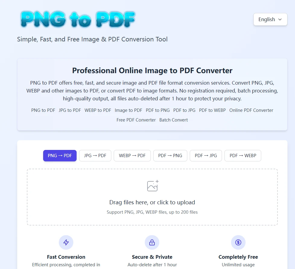
convert PNG / JPG / WebP to PDF in the browser — or convert PDFs back into images.
It sounds simple, but while refining the interactions, I distilled a few key principles:
1. Users hate uncertainty — always
Before uploading, users want to immediately know:
- What are the file limits?
- Which formats are supported?
- What will happen after upload?
So I kept only the essential information, placed in the most visible area of the page.
2. Drag-and-drop is the most natural upload behavior
Clicking an upload button is common, but what users really want is:
📌 “Just drop the file in.”
That’s why I designed a large drag-and-drop area — a clear signal that the system is ready to receive files.
3. Mode switching should be “zero cost”
When users switch from PNG → PDF to PDF → JPG:
- The interface doesn’t reload
- State isn’t lost
- Intermediate progress isn’t wiped
This makes the tool feel fast and fluid instead of fragile.
4. The conversion process should be as transparent as possible
What users dislike most:
- Conversions that feel stuck
- No feedback
- Unclear progress
So I added lightweight progress indicators to reassure users that the system is actively working.
5. Predictability matters more than features
Not everyone needs multi-page merging, sorting, rotation, or compression.
Most users just want:
✨ Fast, stable, and accessible file conversion.
The real value of small tools lies in these “invisible details.”
If you’d like to try it out, you can click the link below:


Sign in to leave a comment.