Some homes feel calm the moment you step inside. Others make you restless without you knowing why. The difference is often subtle. Colour plays a quiet but powerful role.
Colour affects the body before it reaches the mind. Your eyes notice it first. Then your breath changes. Your muscles respond. When colour feels gentle, the body softens. When it feels loud, the body stays alert.
This article looks at how to design a calming sanctuary at home using sensory friendly colours. There is no hype here. No promises of instant peace. Just thoughtful choices that make everyday life feel a little easier.
What Sensory Friendly Colours Really Mean
Sensory friendly colours are easy to live with. They do not compete for attention. They do not demand a reaction.
These colours tend to feel familiar. They often appear in nature. They sit comfortably in the background and let the space breathe.
Bright colours have their place. So do bold patterns. But in a home meant for rest, softer tones usually work better. They reduce visual effort. They help the nervous system settle.
Begin With a Calm Foundation
Every room needs a base colour. This is the colour you see the most. It sets the emotional tone of the space.
A calm foundation does not mean plain. It means balanced.
Gentle Blues
Soft blue shades often feel cool and steady. Many people associate them with sky or water. These tones can be especially helpful in rooms meant for sleep or quiet time.
Choose blues that feel muted. Avoid shades that are sharp or overly bright. A hint of grey or warmth makes a big difference.
Soft Greens
Green feels grounding to many people. It reflects trees, plants, and open landscapes.
Muted greens like sage or moss work well in shared spaces. They feel calm without feeling cold. They also pair easily with natural materials.
Warm Neutrals
Neutrals are often misunderstood. When chosen well, they feel comforting rather than dull.
Warm beige, cream, and soft taupe create a steady backdrop. These shades allow the room to evolve over time without causing visual stress.
Let Each Room Guide the Colour Choice
A sanctuary is not about making every room look the same. It is about making each room feel right for its purpose.
Bedrooms
Bedrooms should invite rest. Colour plays a key role in sending that signal.
Low contrast palettes work best here. Soft walls paired with gentle fabrics help the body unwind at the end of the day.
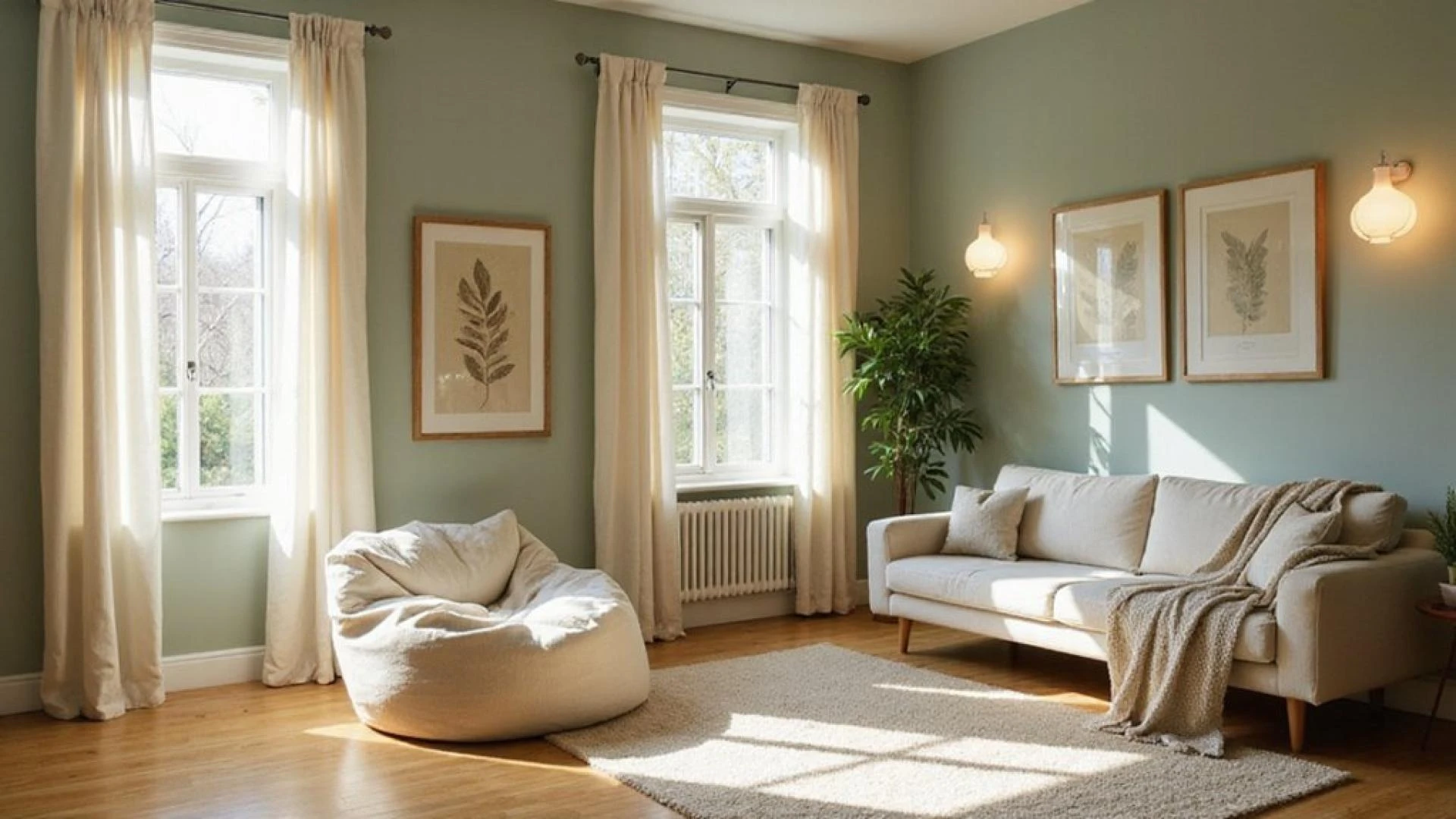
Living Areas
Living rooms hold many moments. Conversation. Rest. Movement.
Colours here should feel welcoming and stable. Mid tone neutrals or soft greens often strike the right balance. Texture can add depth without adding noise.
Quiet Corners
Small, quiet spaces can handle deeper tones. A darker sage or warm clay shade can create a sense of comfort.
Keep the palette tight. Too many colours break the calm.
Test Colours in Real Light
Paint changes with light. What looks calm in a store can feel very different at home.
Test colours on your walls. Look at them in the morning. Look again at night.
Notice how your body responds. Do your eyes relax. Does the space feel easier to sit in. These signals matter more than opinions.
Use Accent Colours Thoughtfully
Accent colours should support the space, not steal attention.
Choose shades that feel related to your base colour. Soft lavender. Muted terracotta. Dusty peach.
Use them sparingly. Pillows. Throws. Small decor pieces. Let the main colour do the heavy lifting.
Light Changes Everything
Colour does not exist on its own. Light shapes how it feels.
Natural light softens most colours. Sheer curtains help reduce glare while keeping rooms bright.
At night, warm lighting matters. Lamps and softer bulbs protect the calm you worked to create. Harsh light can undo it quickly.
Texture Makes Colour Feel Human
A calm home engages more than the eyes.
Soft textures make colours feel warmer. Linen. Wool. Natural wood. These materials support sensory comfort without visual clutter.
A neutral room feels more inviting when it has something soft to touch.
Small Changes Add Up
You do not need to redo your entire home.
Start with one change. Paint a wall. Swap a bright cushion for a softer one. Adjust your lighting.
Each small decision shapes how the space feels.
Living With Colour Over Time
Colour is not something you choose once and forget. You live with it every day. You wake up to it. You move past it when you are tired. Over time, your body forms a relationship with it.
That is why sensory friendly colours matter beyond first impressions. A shade that looks exciting on day one may feel exhausting after a few weeks. A softer colour often grows easier to live with. It asks less of you.
Many people notice this only after a change. They repaint a room and suddenly feel less rushed. Or they remove a strong colour and realise how tense it made them feel. These shifts are subtle, but they are real.
Designing with long term comfort in mind means choosing colours you can grow with. Colours that allow bad days to feel softer and good days to feel grounded.
Why Calm Colour Choices Matter
Homes influence how we move through our days. A space that feels calm makes daily stress easier to manage.
Sensory friendly colours support rest, focus, and emotional balance. They do this quietly. Over time.
This approach is not about trends. It is about care.
Closing Thoughts
A calming sanctuary is built through attention. Attention to colour. Attention to light. Attention to how a space feels, not just how it looks.
For those seeking guidance rooted in sensory aware design, Practical Sanctuary offers a thoughtful approach to creating homes that feel supportive, grounded, and genuinely livable.


Sign in to leave a comment.