First impressions count when someone walks into your office. Visitors notice everything from the reception desk to the artwork on the walls. But there's something they notice even more when it's missing: clear signage.
Good office signage helps people find meeting rooms without asking three different staff members. It shows your brand personality. It keeps everyone safe during emergencies. Most people think signage just means sticking up a few directional arrows.
That's not quite right. A proper signage system supports how visitors experience your space, helps employees move around efficiently, and reinforces what your brand stands for.
The Australian digital signage market reached USD 771.3 million in 2024 and will likely hit USD 1,273.3 million by 2030. Businesses now see signage as a real investment.
This guide covers design principles that work, strategic steps to build your system, and a practical checklist for getting it done.
Why a Signage System is More Than "Just Signs"
Think of signage as a system, not just random labels scattered around your office.
Wayfinding: Signs help people navigate your building. New employees need to find the kitchen. Clients need to locate the boardroom. Clear directional cues save time and cut down confusion.
Identity & branding: Every sign represents your company. The materials you pick, the colours you use, the fonts you choose all say something about your culture and professionalism. Consistent signage makes your brand feel more cohesive and polished.
Compliance & safety: Signs serve critical safety roles. Fire exits need marking. Emergency protocols need displaying. Accessibility requirements need meeting. In Australia, workplace signage often needs to follow specific building codes and standards.
Operational communication: Beyond directions and safety, signage handles everyday tasks like room identifiers, department labels, workspace names, and directories. These functional elements keep the office running smoothly.
Key Design Principles for an Effective Signage System
Creating signage that actually works means balancing how it looks with how it functions.
1. Clarity & legibility
Your signage must be readable right away. Use clean fonts that people can read easily. Make letters big enough to see from a distance. Create strong contrast between text and background. Dark text on light backgrounds works well, or swap it around.
Avoid putting too much stuff around signs. The message needs to stand out clearly. Door names and room identifiers should be readable without walking right up to them. If someone needs to squint, the sign isn't working.
2. Consistency & hierarchy
Visual consistency builds trust and makes navigation feel natural. Set up a unified system across all your signage:
- Pick a colour palette and stick to it
- Choose one or two fonts for everything
- Use the same icon style throughout
- Select materials that match across different sign types
Hierarchy matters quite a bit here. Major directional signs grab attention at key decision points. Secondary signs confirm people are heading the right way. Room-level identifiers provide final destination details. The visual language should feel unified whether someone stands in the lobby, walks down corridors, or enters meeting rooms.
3. Wayfinding logic
Effective wayfinding needs you to think like your visitors. Map out the typical journey: entrance to reception to corridors to specific rooms. Place signs where people make decisions, like intersections, junctions, or lift banks.
Wayfinding isn't about plastering signs everywhere. It's about putting signs in the right spots. Use secondary signs to confirm location so people know they're on track. Design for movement, not just static identification.
4. Accessibility & inclusivity
Great signage works for everyone who visits your office. Consider these elements:
- Add tactile features and Braille where needed
- Place signs at heights that work for standing and seated people
- Use universal symbols alongside text
- Think about wheelchair users and their viewing angles
Icons and pictograms help visitors who don't speak English as their first language. Visual symbols provide quick cues that everyone can understand. People approach signs from different angles and positions, so test your placement carefully.
5. Materiality, durability & aesthetics
Materials should match your environment and how much traffic each area gets. A busy lobby needs tougher materials than a back corridor. Quality materials cut down maintenance costs and keep your office looking professional longer.
Aesthetics should align with your workplace brand. But never sacrifice functionality for looks. A beautiful sign that nobody can read defeats its own purpose. Find the balance where design makes clarity better, not worse.
Strategic Steps to Build the System
Designing an effective signage system takes planning, testing, and regular upkeep.
Audit and map the space
Start by looking at what you already have. Walk through your office and note existing signage, entry points, room layouts, corridors, and how people naturally move around. Spot the gaps where people currently get confused or lost. This baseline tells you what needs fixing.
Define user personas & journeys
Who uses your space every day? Think about employees who know the layout well. Consider new hires still learning where everything is. Account for clients visiting for meetings. Don't forget delivery personnel and contractors working on projects.
Map typical journeys for each type of person. Where do they enter the building? What's their usual destination? What questions might pop up along the way? Understanding these paths helps place signs strategically, not randomly.
Set signage goals
Decide what you want to achieve with your signage system. Common goals include:
- Reducing visitor confusion
- Supporting efficient wayfinding
- Strengthening brand identity
- Meeting regulatory compliance
- Improving overall workplace experience
Clear objectives keep your project focused. They also give you ways to measure success later.
Develop signage inventory & hierarchy
List out all the types of signs you'll need. Start with entrance signs and reception directories. Include wayfinding signs for corridors and lifts. Don't forget regulatory signs for safety and compliance.
Create a hierarchy that shows which signs matter most. Primary signs guide major decisions. Secondary signs support navigation. Tertiary signs provide specific information like room names or department labels.
Design the visual system
Now comes the creative part. Choose your typographic scale carefully. Pick a colour scheme that matches your brand but stays readable. Select materials that suit each location and budget. Develop iconography that makes sense at a glance. Create layout templates that keep everything consistent.
Test your designs on paper first. Print samples at actual size. Check them in the lighting conditions where they'll live. Make adjustments before committing to production.
Pilot the design in one zone
Don't roll out everything at once. Implement your design in one key area first, like the main corridor and its connected rooms. Watch how people use the signs. Ask for feedback from employees and visitors.
Pay attention to what works and what doesn't. Are people still getting lost? Do they find the signs readable? Does anything feel confusing? Use this feedback to refine your design before wider installation.
Roll out full installation
Once your pilot works well, plan the full rollout. Create installation guidelines that cover placement standards, mounting heights, lighting requirements, and viewing angles. Work with professional installers who understand commercial signage.
Schedule installation during off-hours if possible. Nobody wants construction noise during important meetings. Double-check everything as it goes up. Small mistakes now create big headaches later.
Ongoing management
Signage needs regular care and attention. Set up a schedule to audit for consistency, damage, and outdated information. Review signs every quarter or whenever significant changes happen.
Keep your signage style guide handy. Future signs need to match the system you've built. Train someone on your team to handle updates and replacements. Budget for maintenance because signs will need refreshing over time.
Tips & Best Practices
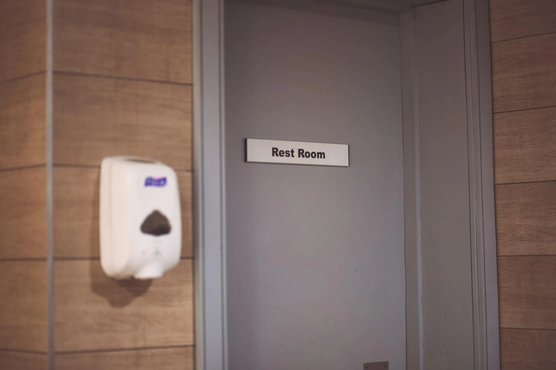
Make room identifiers crystal clear. "Meeting Room A" works better than vague names like "Quiet Zone" or "Creative Space". People need to know exactly where they're going.
Place signage at the right height and angle for your users. Test different viewing positions. What looks perfect at eye level for a tall person might be invisible to someone in a wheelchair.
Use lighting or backlighting in dim areas. Even the best-designed sign fails if nobody can see it properly. Consider where natural light falls during different times of day.
Maintain brand integrity but put clarity and function first. Your brand colours might look gorgeous, but not if they make text unreadable. Function always wins over style.
Design modular systems that make changes easier and cheaper. Rooms get reassigned. Departments move around. Your signage system should adapt without requiring a complete overhaul every time.
Keep a signage style guide somewhere accessible. Document font choices, colour codes, material specifications, and installation standards. In the future you will thank the present you for this effort.
Comply with local accessibility and building regulations. Check what applies in your area. Better to get it right the first time than redo everything later.
Consider durability and future updates from the start. Signage represents an investment in your workplace, not a luxury item. Choose materials and designs that last.
Common Pitfalls to Avoid
Over-designing creates problems instead of solving them. Too many colours, fonts, and confusing icons make reading harder. Simple almost always works better than complicated.
Neglecting maintenance damages your professional image. Signs that look damaged, faded, or outdated tell visitors you don't care about details. Regular upkeep matters quite a bit.
Ignoring room-level signage leaves people confused. Every room needs a clear identifier. Missing door signs force visitors to interrupt staff for directions constantly.
Installing signs without mapping user flow wastes money. Signs placed without thinking about how people actually move around don't help anyone. Always map first, install second.
Failing to test with real users causes preventable problems. Watch first-time visitors navigate your space. Ask new employees about their experience. Their feedback reveals what you've missed.
Measuring Success
Set up ways to track whether your signage system works. Useful metrics include fewer visitor enquiries at reception, reduced time to locate meeting rooms, and improved survey results about navigation ease.
Use regular audits to check signage consistency, physical condition, and information accuracy. Walk through your office with fresh eyes every few months.
Collect feedback from both staff and visitors. Ask specific questions about signage clarity and usefulness. Anonymous surveys often get more honest responses.
Track how often rooms change names or purposes. Monitor how easily your system adapts to updates. A good signage system should handle change without major drama.
Conclusion
Effective signage works as a strategic asset, not an afterthought tacked on at the end of a fit-out. Every piece of signage contributes something valuable to navigation, brand perception, safety protocols, and visitor experience.
Good signage makes people feel confident and welcome in your space. Poor signage makes them feel lost and frustrated. The difference comes down to thoughtful planning, solid design principles, and regular maintenance.
Start by understanding how people move through your office. Design with clarity and consistency at the forefront. Test your system before full rollout.
Then commit to keeping it fresh and accurate over time. Your employees will navigate more efficiently. Your visitors will feel more comfortable. Your brand will shine through every sign. Order custom office signs from Create Signs, from safety and directional to door signs. You can even personalise our pre-designed options to match your brand.


Sign in to leave a comment.