

Wood cabinets already bring color, grain, and visual movement into a kitchen, so the countertop has to work with those characteristics rather than compete with them. The most reliable approach is to coordinate undertones first, then consider pattern scale, contrast, flooring, backsplash, and lighting.
With the range of Formica laminate countertops available today, homeowners can choose from stone-inspired patterns, wood looks, and solid colors instead of treating laminate as a limited design option.
Express Kitchens carries laminate options in multiple colors and finishes, including custom-cut choices for non-standard kitchen layouts.

Start With the Wood, Not the Countertop
Cabinet wood should be the starting point because it usually occupies more vertical visual space than the countertop. Unlike a painted cabinet, natural or stained wood also contains several colors at once.
Oak may show gold, tan, amber, or slightly reddish notes. Cherry tends to have warmer red and brown tones. Walnut can range from medium brown to deep chocolate, while maple often appears lighter and more neutral.
Before selecting Formica with wood cabinets, look at three cabinet characteristics:
- The dominant color of the wood
- The warm, cool, or neutral undertone
- The amount and contrast of visible grain
The grain matters because a heavily figured cabinet already creates considerable movement. Adding an equally active countertop can make the kitchen feel visually crowded.
Understand Laminate Undertones Before Comparing Patterns
Two countertops can look nearly identical from a distance while behaving very differently beside wood cabinetry.
A cream laminate might contain yellow, beige, peach, or gray undertones. A white pattern might lean warm ivory or cool blue-gray. Even gray surfaces can have green, brown, violet, or blue influences.
These laminate undertones determine whether the countertop feels connected to the cabinetry.
For warm honey or golden wood cabinets, warm whites, creams, taupes, and brown-based stone patterns are usually easier to coordinate than icy whites. Reddish woods can work well with warm neutrals, but excessive red or orange in the countertop may amplify the cabinet color too much.
Dark walnut and espresso finishes give you more flexibility. Light neutral countertops can create strong contrast, while deeper countertops can produce a moodier, more continuous look.
Do not rely solely on color names. "White," "beige," and "gray" describe broad color families, not the undertones that actually determine whether materials work together.
Use Contrast Without Creating a Color Fight
Matching everything closely is not necessary. In fact, controlled contrast often makes a wood cabinet countertop pairing look more intentional.
Light countertops can keep medium and dark wood cabinetry from making a kitchen feel heavy. A soft white or light stone-inspired laminate can create separation while allowing the cabinet grain to remain the dominant visual feature.
Light wood cabinets can move in either direction. A pale countertop produces a bright, low-contrast room, while charcoal, dark stone, or deeper neutral laminate gives the cabinetry stronger definition.
The important distinction is between color contrast and undertone conflict.
A dark countertop and light cabinet may have considerable contrast while still coordinating beautifully because their underlying colors are compatible. Conversely, two medium-brown finishes can clash if one leans strongly orange and the other has a cool gray-brown cast.
Let One Surface Carry Most of the Pattern
A common design mistake is pairing busy wood grain with an equally busy countertop.
Imagine pronounced oak grain below a heavily veined stone-look laminate. Add patterned flooring and a mosaic backsplash, and suddenly four different surfaces are competing for attention.
A better approach is to establish a visual hierarchy.
If the cabinets have dramatic grain, consider quieter laminate kitchen countertops with subtle movement. Solid colors, lightly speckled designs, or restrained stone patterns allow the wood to stand out.
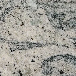
With smooth, understated wood cabinetry, you can usually introduce more movement on the countertop. A marble-inspired or granite-inspired laminate can become the primary pattern without overwhelming the room.
This principle becomes especially useful in large kitchens where long countertop runs make the pattern much more noticeable.
Be Careful With Wood-Look Laminate on Wood Cabinets
Wood-look laminate can be attractive, but placing it directly against real or wood-finished cabinetry requires restraint.
The problem is not that two wood looks can never work together. The problem occurs when they are similar enough to look like an attempted match but different enough for the mismatch to be obvious.
If you want both surfaces to resemble wood, create deliberate separation. For example, dark walnut-style counters over pale wood cabinets can read as purposeful contrast.
Trying to pair two slightly different oak tones is harder. Differences in grain direction, color temperature, pattern scale, and sheen can become noticeable where the countertop meets the cabinet.
In many kitchens, stone-look or solid-color laminate is simply easier to coordinate with natural wood.
Check Flooring and Backsplash Before Making the Final Choice
Cabinets and countertops are not viewed in isolation after installation.
Flooring is especially important. A kitchen with wood cabinets and wood-look flooring may already contain two substantial warm surfaces. Introducing another brown or wood-patterned countertop can make the room feel overly uniform.
Instead, a neutral countertop can create a visual break between the cabinet and floor.
The backsplash works differently because it sits directly between the upper and lower cabinets. It can help connect the countertop to the cabinetry, but it can also introduce another conflicting undertone.
If the cabinets and countertop already contain considerable variation, a restrained backsplash is often safer. Simple tile in a compatible neutral allows the major finishes to do the work.
For kitchens using custom laminate countertops, make these decisions before final dimensions and fabrication whenever possible. Changing the countertop after installation is much more disruptive than changing paint or smaller decorative elements.
Test Samples Under Real Kitchen Lighting
A countertop sample that looks perfect in a showroom can look surprisingly different at home.
Natural daylight changes throughout the day, while LED bulbs vary considerably in color temperature. Warm artificial lighting can emphasize yellow and red tones in wood. Cooler lighting may make gray or white countertops appear bluer.
Place the laminate sample horizontally on or immediately beside the cabinets rather than holding it vertically. Countertops receive light differently from cabinet doors, so orientation matters.
Check the combination in morning daylight, afternoon light, and after dark with the kitchen fixtures switched on.
Also place the flooring and backsplash samples nearby. A four-material sample board reveals conflicts that are easy to miss when each finish is selected separately.
Avoid Trying to Match the Cabinet Exactly
An exact color match sounds safe, but it can produce a flat kitchen.
Wood contains natural variation, while laminate is a manufactured decorative surface. Attempting to reproduce the cabinet's exact brown, beige, or wood appearance may emphasize the differences rather than disguise them.
Coordinating is usually more successful than matching.
For example, medium warm wood cabinetry might pair with cream, soft taupe, warm gray, or understated stone patterns. None needs to duplicate the cabinet color. They simply need enough shared warmth or neutrality to feel related.
Express Kitchens offers laminate in wood-look, stone-look, and solid-color options, which provides several ways to create either contrast or visual continuity depending on the cabinetry.
Common Pairing Mistakes Worth Avoiding
Many unsuccessful combinations come from choosing each material independently. A cabinet may look attractive on one sample board and a countertop may look attractive on another, yet the two may not create a coherent kitchen.
Watch particularly for undertones that become stronger when placed together. Yellow oak can make a cool gray appear even cooler, while an orange-brown counter may exaggerate warmth in cherry cabinetry.
Pattern scale deserves similar attention. A tiny countertop sample may make bold veining appear subtle. Across an eight-foot counter run, the same pattern can become a major feature.
Finally, avoid selecting solely from a computer or phone screen. Screens are useful for narrowing choices, but they cannot reliably reproduce finish, undertone, sheen, or the way a surface responds to your kitchen lighting.
Build the Palette Around a Clear Visual Priority
The easiest way to pair Formica laminate countertops with wood cabinets is to decide which material should receive more attention. If the cabinetry has beautiful grain and strong color variation, choose a quieter countertop that supports it. If the cabinetry is simple and restrained, the laminate can carry more contrast or pattern.
Start with cabinet undertones, establish intentional contrast, control the number of competing patterns, and test actual samples alongside the flooring and backsplash. That process is more dependable than trying to match colors by name. A successful kitchen does not require every finish to look alike. It requires the materials to feel deliberately connected.

















Sign in to leave a comment.