Introduction
Welcome to the world of data science! As you embark on your journey into this exciting field, one thing you cannot overlook is the importance of data visualization. In the era of big data and advanced technologies like machine learning and AI, it has become crucial for any data scientist to be able to effectively visualize their findings.
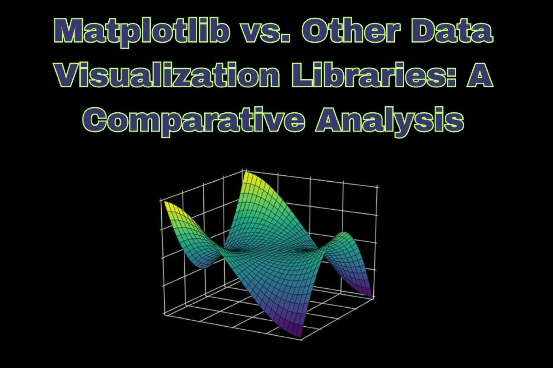
One popular library used for creating visualizations in Python is Matplotlib. It is a powerful tool for generating high quality static plots, charts, and graphs
Data visualization refers to the use of visual elements such as charts, graphs, and maps to represent data and information in a meaningful way. It helps to communicate complex ideas and patterns in a simple and visually appealing manner. In fact, it has been proven that humans process visual information much faster than text or numbers. This makes data visualization an essential tool for understanding large datasets.
In the field of data science, where massive amounts of information are being analyzed and processed, data visualization plays a significant role in helping us make sense of all that data. It allows us to spot trends, patterns, and outliers that may not be apparent when looking at numbers alone. By using different types of visualizations, we can gain a deeper understanding of the relationships between variables in our dataset.
Matplotlib offers numerous customization options to create visually appealing outputs that convey the desired message effectively. With its extensive documentation and large user community, it is no wonder that Matplotlib is a goto choice for many data scientists.
Overview of Data Visualization Libraries
Data visualization is a crucial aspect of data science, machine learning, and AI. It allows us to present complex data in a visually appealing and easy to understand format. A well designed visualization can help us identify patterns, trends, and insights that may not be apparent from raw data.
With the increasing demand for data driven decision making, the popularity of data visualization libraries has also risen. These libraries provide tools and functionalities for creating visualizations in various formats such as charts, graphs, heatmaps, and maps. In this blog section, we will discuss some of the most popular data visualization libraries that are commonly used in the field of data science.
One of the oldest and most widely used libraries is Matplotlib. It was originally designed to replicate MATLAB's plotting capabilities in Python but has evolved into a powerful library capable of creating high quality visualizations. Matplotlib provides a wide range of customization options for labels, colors, legends, and styles. It also integrates well with other Python libraries such as NumPy and Pandas.
Another popular library is Seaborn which is based on Matplotlib but offers more advanced statistical visualizations. It has an intuitive API for creating attractive statistical plots such as heatmaps, regression plots, and categorical plots. Seaborn also supports different color palettes to enhance the aesthetics of your visualizations.
Plotly is another library that stands out due to its interactive nature. Unlike other libraries that create static images or charts, Plotly produces web based interactive visualizations that allow users to zoom in/out, hover over points for more information, and interact with the plot elements. This makes it an excellent choice for exploratory analysis or dashboards.
Importance of Data Visualization in Data Science, Machine Learning, and AI
Data visualization is especially crucial in fields like data science, machine learning, and AI, where the analysis of large datasets is a fundamental aspect of the job. As the saying goes, "a picture is worth a thousand words" – this holds true in the world of data as well. Visualizing data not only makes it easier for analysts to understand complex information but also enables them to effectively communicate their findings to others.
One of the most widely used libraries for data visualization in Python is Matplotlib. It provides an extensive range of tools for creating charts, graphs, and other visualizations that are customizable and publication quality. But what sets it apart from other libraries? Let's take a closer look at why Matplotlib stands out in comparison.
Firstly, Matplotlib has been around since 2003, making it one of the oldest libraries for plotting in Python. Its longevity has allowed it to become a staple tool in data visualization for many years, with constant updates and improvements being made over time.
Secondly, Matplotlib offers an extensive range of customization options compared to other libraries such as Seaborn or Plotly. From changing colors, fonts, and sizes to adding annotations or legends – you have full control over every aspect of your visualizations. This level of flexibility allows you to create unique and informative plots tailored specifically to your needs.
Understanding Matplotlib as a Popular Tool for Data Visualization
One of the reasons for Matplotlib's popularity is its versatility. Unlike other data visualization libraries that specialize in certain types of plots, Matplotlib offers a wide range of visualizations such as line charts, bar charts, histograms, scatter plots, heatmaps, and many more. This makes it suitable for various analysis purposes across different industries.
Moreover, Matplotlib is compatible with other popular libraries like NumPy and Pandas. This integration allows users to seamlessly analyze and plot their data without any extra effort or code. This feature makes it convenient for users who are already familiar with these libraries and want to visualize their data quickly.
Another significant advantage of using Matplotlib is its customization options. You can easily change the color schemes, add labels and titles, adjust font sizes, and customize almost every aspect of your plot according to your preferences. This means that you can create unique and personalized visualizations that suit your requirements.
Comparison between Matplotlib and Other Data Visualization Libraries (ggplot, seaborn, plotly)
Data visualization is an essential aspect of data science, machine learning, and AI. It is the process of representing data in a visual form to better understand patterns, relationships, and trends. The use of graphs, charts, maps, and other visual elements helps us to communicate complex information in a concise and easy to understand manner.
There are various data visualization libraries available to assist data scientists in creating compelling visualizations. These libraries offer different features and functionalities that cater to specific needs. In this blog section, we will focus on comparing one of the most popular libraries – Matplotlib – with three other well known data visualization libraries: ggplot, seaborn, and plotly.
Matplotlib is a powerful library for creating static visualizations in Python programming language. It offers a wide range of customization options for graphs and charts, making it suitable for both beginners and advanced users. On the other hand, ggplot is based on the Grammar of Graphics concept and uses R as its primary programming language. Seaborn is built on top of Matplotlib and provides higher level functions for creating more sophisticated plots. Plotly is a web based library that allows for interactive visualizations and can be integrated with various programming languages like Python, R, JavaScript, etc.
When it comes to functionality and versatility, Matplotlib takes the lead among these four libraries. It provides complete control over every aspect of your plot – from customizing axes to adding annotations or legends. However, its syntax can be quite complex for beginners compared to ggplot or seaborn.
Features and Functionality Comparison among Different Libraries
Data visualization is a crucial aspect of data science, machine learning, and AI. It allows us to convert complex data into visual representations that are easily understandable and interpretable. The use of effective data visualization techniques has become increasingly important in today's world, where the volume and complexity of data are growing at an exponential rate.
When it comes to data visualization libraries, Matplotlib is often the goto choice for many data scientists and researchers. However, with the rising demand for more advanced and specialized visualizations, numerous other libraries have emerged, claiming to offer better features and functionality than Matplotlib. So let's take a closer look at how Matplotlib stacks up against some of these competing libraries in terms of features and functionality.
Firstly, let's understand why Matplotlib has been the preferred choice for many in the field of data science. One major reason is its versatility: it offers a wide range of plot types, customization options, and support for different file formats. Additionally, its integration with popular programming languages like Python makes it an ideal option for users with diverse coding backgrounds.
Now let's delve into some specific features that set Matplotlib apart from its competitors. One noteworthy aspect is its object oriented approach to creating plots. This means each element on the plot axes, lines, markers is treated as an object that can be individually manipulated and customized.
On the other hand, libraries like Plotly offer interactive plots that allow users to hover over elements for more information and zoom in/out to view specific data points. This can be particularly useful when analyzing large datasets with multiple variables.
Pros and Cons of Using Matplotlib vs Other Tools for Data Visualization
One of the most widely used tools of data visualization is Matplotlib. However, there are several other tools available in the market that offer similar functionalities. In this blog section, we will discuss the pros and cons of using Matplotlib compared to other data visualization libraries.
Firstly, let's understand what Matplotlib is all about. It is an open source library for creating interactive and high quality visualizations in Python. It provides a wide range of customizable plots, charts, and graphs to represent data effectively. With its extensive range of features and functionalities, Matplotlib has become a goto tool for many data scientists.
One of the biggest pros of using Matplotlib is its popularity and widespread usage. It has been around since 2003 and has gained a massive community following over the years. This means that there are plenty of online resources available for learning Matplotlib, troubleshooting issues, and getting help from fellow users.
Moreover, Matplotlib offers a wide range of customization options to create unique visualizations according to specific requirements. From controlling axis labels to changing color schemes and fonts, this library provides complete control over every aspect of the visualization. This makes it an ideal choice for creating professional looking graphs and charts.
On the flip side, one major drawback of Matplotlib is its steep learning curve. As it offers a vast array of features and customization options, it can be overwhelming for beginners to get started with it. The documentation also has room for improvement as some concepts may not be explained clearly.
You can also read:
star agile data science reviews


Sign in to leave a comment.