Print media as a marketing tool is quickly gaining popularity again. While digital marketing has been popular for some time now, more and more people are starting to scroll through the influx of ads they see on their devices every day. This often means that your ad or marketing campaign may be ignored completely!
Offline marketing, however, catches attention, and is often a physical material that people can hold on to. This makes people recall your business every time they hold the promotional product, such as a pen, notepad, badge or a box with your label on it.
But when there are so many offline marketing options, and so many different kinds of printing, such as screen printing, lithographic printing, flexography, digital printing and more, it can be very easy to make simple mistakes that can end up costing your business thousands of dollars. Here are a few common printing mistakes made that you should avoid at all costs:
Not proofreading:
Perhaps the most cardinal mistake of all: Letting a simple grammar, punctuation or spelling mistake sneak into your ad campaign. Not only does it hurt the credibility of your brand, it is money down the drain when you—or worse, the audience—detect the error after the promotional material has already been printed. After all, who’d want to do business with a brand that couldn’t even be bothered to run a spell check on their ad?
Leaving out important details:
When you’re focusing so much on what your branding material should say to convince the buyer to do business with you, you may forget to include some very important details to add in the material; your contact details, or even your business name, for example. You’d be surprised to know how often it happens! A potential customer can’t do business with you if they don’t know how to reach you!
Unattractive designs:
While it may seem tempting to add tons of colours to your branding material to attract attention, it can very often backfire and attract the wrong kind of attention. Loud, bold colours and branding materials with too much going on can be confusing, jarring to the eyes and might even force your customers to look away.
Similarly, the right formatting is necessary. Colours, images and fonts do not always look the same when transferred from computers to print. Some image formats (.jpg and .png) may look high-quality and sharp on a screen but could end up pixelated when printed. RGB colours are not the same as CMYK colours, and may make your design look different when translated on paper.
Consult a qualified printing expert before sending the content for printing. Not only will they immediately be able to tell you if your formatting will translate well on paper, but may also advise you of the best colours to use and may assist in artwork design.
Not using the right printing methods:
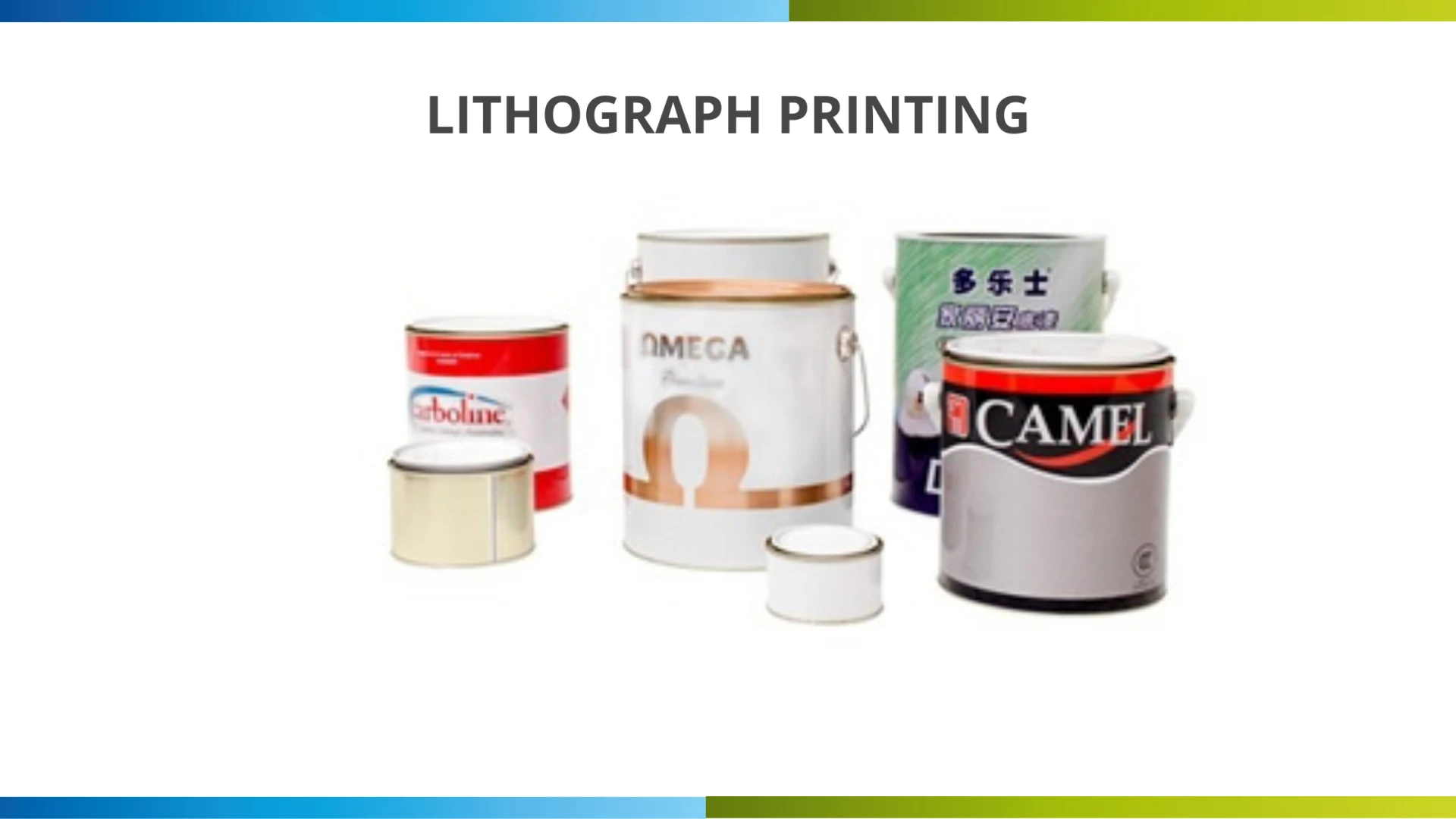
No two printing methods are the same. The printing method you use for wood will not be the one you use to print on posters and newsletters. Similarly, LED UV is not the same as lithographic printing, which is usually used for printing on cans, pails, drums and other metal objects. Consider the material you will be using for your promotional material and consult an expert printer before starting your graphic design to save both money and time.
Knowing the right method of printing, the correct formatting to use, and making sure no mistakes creep in can make the difference between a successful campaign that can bring more customers in or a lot of money down the drain.


Sign in to leave a comment.