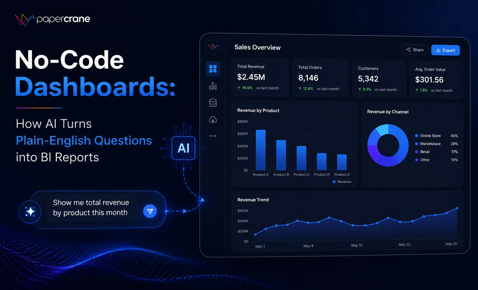

A growth manager types one sentence into a chat box: "show me signup conversion by channel for the last 60 days." Thirty seconds later a chart appears, correct, shareable, and built without a single line of SQL. That's the entire premise of no code dashboards, and it's a much bigger shift than it sounds at first glance.
For years, getting a new report meant filing a request, waiting for someone with the right technical background to interpret it, and hoping the final chart matched what was actually meant. No code dashboards remove that middle step entirely. The question and the answer are now the same interaction, with nothing standing between them.
Is No Code the Same as No Logic?
Not at all. The logic hasn't disappeared, it's just moved somewhere else. Instead of a person writing a query by hand, an AI agent reads the plain English question, figures out which tables and fields are relevant, writes the query itself, and renders the result as a chart. The user never opens a query editor, never configures a report template, and never has to know what a join even is.
The thinking still happens. It just happens inside the model instead of inside a person's head at 4pm on a Friday, squeezed between three other requests. That distinction matters because it explains why this shift feels less like a new tool and more like a change in who gets to participate in analysis at all. Support leads, marketing managers, and operations staff who never learned SQL can now ask the same kinds of questions an analyst would have asked on their behalf.
What Actually Happens Between the Question and the Chart?
There's a short sequence behind every request, even though it feels instant to the person asking:
- The question gets parsed and matched against the schema of a connected data source, including table names, column meanings, and any relationships between them.
- The agent writes and runs a query, choosing joins and filters based on what the question implies, and checking that the output shape makes sense before moving on.
- It selects a chart type suited to the data, whether that's a trend line for something changing over time, a funnel for a multi step process, or a simple table when precision matters more than visual storytelling.
- A live dashboard with a shareable link is produced, ready to send to a teammate, drop into a Slack channel, or embed directly inside a product.
An AI powered dashboard builder builds this whole sequence around a single connection step. Once a database or spreadsheet is linked, every future question reuses that same context instead of asking the user to explain the data all over again. The system remembers what "active customer" means once someone has clarified it, and doesn't need that definition repeated for the next ten questions.
Why Do Plain English Requests Beat Fixed Report Templates?
Fixed dashboards are built around questions someone anticipated in advance. A team sits down, imagines the reports people will need, and builds a library of saved views meant to cover most future requests. The problem is that real questions rarely land exactly on the template that was built for them.
A support lead doesn't want "tickets by category." They want "tickets by category for accounts that upgraded in the last month," and that specific filter usually doesn't exist yet in any prebuilt report. Someone then has to file a request to get that exact slice, which puts the question right back into the same queue that no code tools are meant to avoid.
An AI agent skips the anticipation problem entirely. It builds the exact view the question calls for, at the moment it's asked, rather than forcing the question to bend toward whatever report happens to already exist. This on demand model fits the pace at which real business questions actually change, which in most growing companies is far faster than any fixed dashboard library can keep up with.
Does This Remove the Need for Clean Data?
No, and this is worth being direct about. If the underlying tables are messy, undocumented, or full of duplicate records, the AI will still generate a technically correct query against that confusing data, and the resulting chart will be confusing too. A natural language dashboard tool is not a substitute for basic data hygiene, it's a layer built on top of it.
The value of a no code dashboard depends heavily on how well the connected source is organized in the first place. Teams that invest in clear naming conventions, documented fields, and consistent definitions across systems tend to get noticeably better results than teams that connect a messy warehouse and expect the AI to sort it out on its own. Good data practices matter just as much as they did before, they just show up differently now, as an input to the agent rather than a prerequisite for a human analyst to start work.
What Should a Team Check Before Trusting the Output?
Spot check the first few results against a number you already know to be correct. This takes only a few minutes and tends to catch most misunderstandings early, especially around date ranges, deduplication logic, and how a metric like "active user" is actually defined inside your specific business. A generic definition of churn might not match the one your finance team already uses in board reporting, and it's worth confirming that alignment before a dashboard goes out widely.
Once that trust is established for a given source, follow up questions tend to move much faster, since the agent already understands the schema and doesn't need the same explanation repeated. Teams often find that the first week of using a tool like this involves more verification, and every week after that involves less, as confidence builds around a specific connected source.
Getting Started Without Disrupting an Existing Workflow
Teams that want to try this without touching their existing BI setup usually start with a single connected source, ask a handful of real questions they'd normally file as tickets, and compare the results against what an analyst would have produced for the same request. This staged approach avoids the common mistake of trying to replace an entire reporting stack overnight, which tends to create more resistance internally than it needs to.
A reasonable first test looks something like this: connect one warehouse or spreadsheet, recreate one existing dashboard using a plain English request, and see how closely it matches the version that already exists. If the match is close and the turnaround is faster, expanding to a second source and a wider group of stakeholders becomes a much easier internal conversation. You can try a free no code dashboard tool to run that exact comparison against your own data before deciding whether to expand further.


























Sign in to leave a comment.