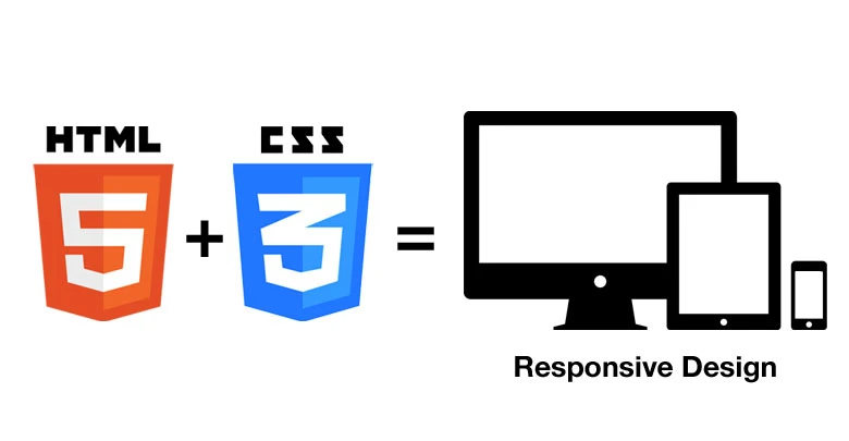
In today's digital era, having a fully responsive website is no longer an option but a necessity. With users accessing websites from various devices such as smartphones, tablets, and desktops, ensuring a seamless experience across all screen sizes is crucial. HTML5 and CSS3 offer powerful tools to create responsive, visually appealing, and user-friendly websites. Here are some essential techniques to achieve a fully responsive design.
1. Use Semantic HTML5 Elements
Semantic HTML5 elements help structure web pages effectively while enhancing accessibility and SEO. Elements like <header>, <section>, <article>, <nav>, and <footer> provide meaning to the content, making it easier for browsers and search engines to interpret.
Example:
<header>
<h1>Welcome to My Website</h1>
</header>
<section>
<article>
<h2>About Us</h2>
<p>We create stunning and responsive websites.</p>
</article>
</section>
<footer>
<p>© 2024 All Rights Reserved</p>
</footer>
2. Implement a Fluid Grid Layout
A fluid grid layout ensures that your website adapts to different screen sizes proportionally. Using CSS Grid and Flexbox makes designing flexible layouts easier.
Example Using CSS Grid:
.container {
    display: grid;
    grid-template-columns: repeat(auto-fit, minmax(250px, 1fr));
    gap: 20px;
}
3. Utilize Media Queries for Responsive Design
Media queries allow you to apply different styles based on the device's screen size. This ensures an optimized user experience on all devices.
Example:
@media (max-width: 768px) {
    body {
        font-size: 14px;
    }
}

@media (min-width: 1024px) {
    body {
        font-size: 18px;
    }
}
4. Use Flexible Images and Videos
Images and videos should be adaptable to different screen sizes. The max-width: 100% property ensures that media files scale appropriately without exceeding their container’s width.
Example:
img, video {
    max-width: 100%;
    height: auto;
}
5. Implement Responsive Navigation
A responsive navigation menu improves usability across devices. Using CSS and JavaScript, you can create a collapsible menu for mobile screens.
Example:
.nav {
    display: flex;
    flex-wrap: wrap;
}
@media (max-width: 768px) {
    .nav {
        display: none;
    }
    .menu-button {
        display: block;
    }
}
6. Optimize Typography for Readability
Typography should be legible on all devices. Using rem or em units ensures text scales dynamically based on the user's settings.
Example:
body {
    font-size: 1rem;
    line-height: 1.6;
}
7. Enhance Performance with CSS Transitions and Animations
CSS animations and transitions can add visual appeal while keeping the website lightweight.
Example:
button {
    transition: background-color 0.3s ease-in-out;
}
button:hover {
    background-color: #007bff;
}
Conclusion
Build responsive website with html5 and css3 requires a combination of semantic structure, flexible layouts, media queries, and optimized assets. By implementing these essential techniques, you can create an engaging and seamless user experience across all devices. Embrace these best practices, and your website will stand out in today's dynamic digital landscape.


Sign in to leave a comment.