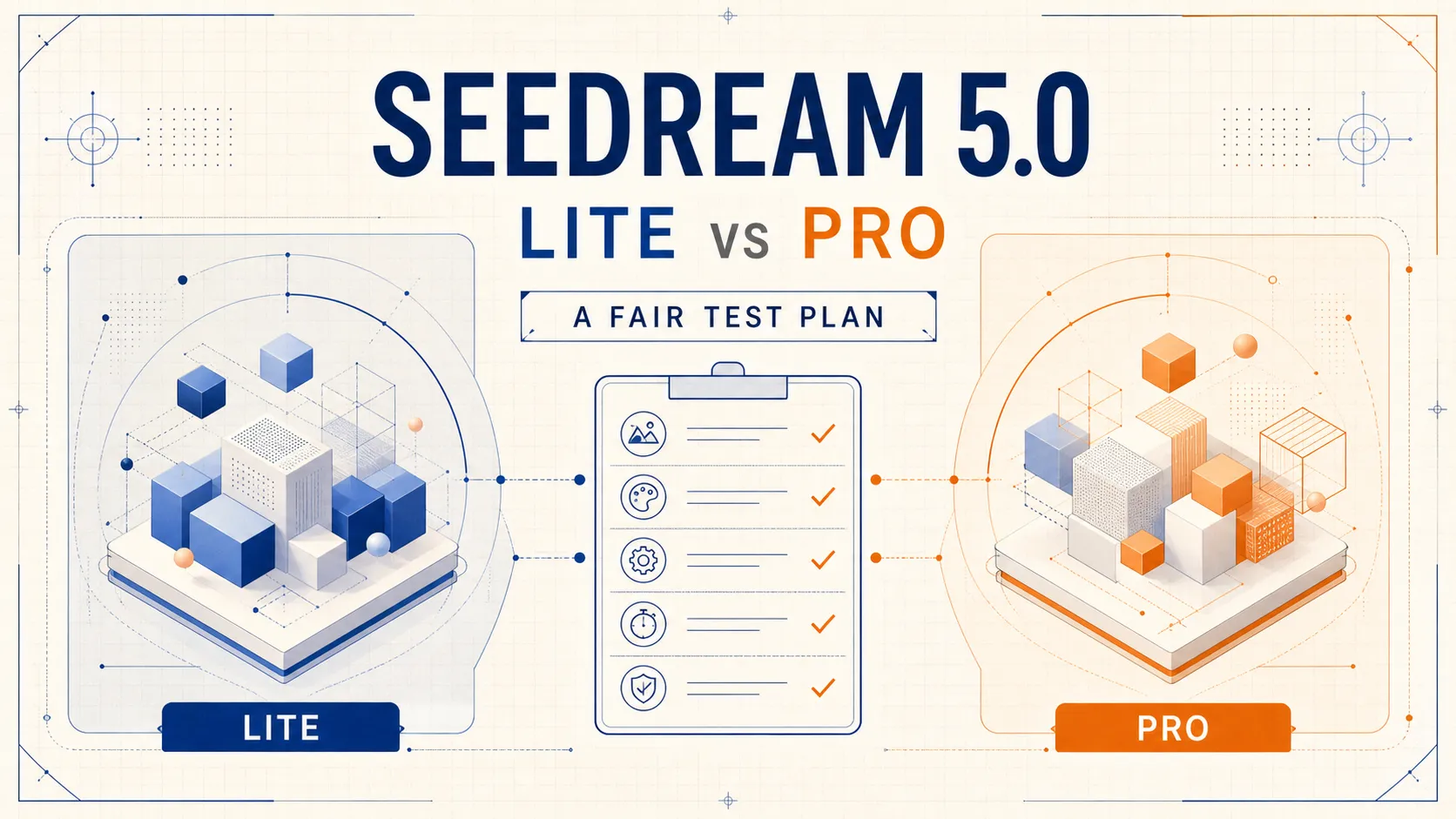

Seedream 5.0 Lite and Seedream 5.0 Pro now sit under the same model family, but a shared name does not make them interchangeable. The useful question is not simply which model is “better.” It is which one is more reliable for the kind of image work you actually do.
That distinction matters because AI image comparisons are easy to manipulate. A reviewer can change the prompt, aspect ratio, reference image, or number of attempts and produce almost any conclusion. A fair comparison needs fixed inputs, visible failure criteria, and paired outputs. Until those outputs exist, the honest answer is a test plan—not a winner.
What the official positioning tells us
ByteDance presents Seedream 5.0 Lite as a model focused on stronger understanding and visual reasoning. Its official introduction emphasizes world knowledge, information visualization, style transfer, editing, multi-subject scenes, and search-enhanced generation. The same article also describes Lite as a relatively small model and acknowledges room for improvement in areas such as realism, aesthetics, and structural stability.
The official Seedream 5.0 Pro page puts more weight on professional production. It highlights dense infographics, spatially guided editing, photographic lighting and textures, and multilingual image generation. Those claims suggest a different priority: not merely understanding an idea, but turning it into a controlled, production-ready visual.
These are vendor descriptions, not independent benchmark results. They are useful for forming hypotheses, but they do not prove that Pro wins every prompt or that Lite is always the faster or more economical choice on every platform.
Why most Pro-versus-Lite comparisons are weak
A side-by-side image only means something when the test conditions are the same. Several common shortcuts make comparisons unreliable:
- Using a more detailed prompt for one model than the other.
- Changing the aspect ratio or reference image between runs.
- Publishing the best result from one model and the first result from the other.
- Judging visual polish while ignoring misspelled text or lost product details.
- Mixing image quality, latency, availability, and price into a single vague score.
A better test keeps the prompt and settings fixed, records every output, and scores each capability separately. Speed and cost should be reported alongside quality rather than quietly deciding the quality verdict.
A four-part paired test
We are preparing a paired evaluation built around four tasks. Each task exposes a different failure mode, so a model cannot win merely by producing one attractive image.
1. High-density infographic
The first prompt asks for a vertical coffee infographic with an exact title, four numbered sections, a short footer, a defined color palette, and no extra words. This test checks whether the model can manage hierarchy, typography, spacing, counting, and instruction fidelity at the same time. A beautiful poster with a missing section or invented text is still a failure.
2. Photographic materials
The second task requests an original perfume bottle made from faceted clear glass, with amber liquid, a brushed-metal cap, travertine, late-afternoon side light, refraction, caustics, contact shadow, and subtle surface imperfections. The point is not whether the image looks expensive at first glance. The point is whether the materials behave plausibly and remain coherent around edges, reflections, shadows, and the label.
3. Native multilingual typography
The third task places five specified lines—English, Chinese, Spanish, Japanese, and Arabic—on one editorial poster. Every line must appear exactly once and remain legible. This is a harder standard than “supports multilingual text.” It tests character accuracy, script direction, layout balance, and whether the model invents additional copy.
4. Reference-preserving edit
The fourth task begins with a source image. The model must preserve the product’s silhouette, proportions, label placement, primary color, camera angle, and position while changing only the background and lighting. This separates controlled editing from broad regeneration. A visually pleasing result is not successful if it quietly redesigns the product.
How the outputs should be scored
Instead of assigning one subjective star rating, each pair should be examined across six dimensions:
- Instruction fidelity: Did the model follow every explicit constraint?
- Text accuracy: Are words, numbers, and characters complete and correct?
- Subject preservation: In an edit, did unchanged elements actually remain unchanged?
- Physical plausibility: Do lighting, materials, anatomy, and perspective hold together?
- Aesthetic finish: Is the composition usable without extensive cleanup?
- Workflow efficiency: How many attempts, how much time, and what cost were required?
The last category should not erase the others. A lower-cost result may be ideal for ideation even when it needs cleanup; a higher-cost result may be justified when accurate copy or product preservation prevents hours of manual repair.
Who should start with Lite, and who should start with Pro?
Based on the official positioning—not on an unfinished benchmark—Lite is the more natural starting point for exploratory concepts, reasoning-heavy visual briefs, everyday image creation, and workflows where iteration volume matters. Its smaller-model positioning may also make it attractive where a platform offers meaningful speed or cost advantages, though those details should be checked in the tool you actually use.
Pro is the more natural starting point for dense information design, multilingual campaigns, tightly controlled reference edits, and photographic work where material realism or lighting consistency is commercially important. It is also the safer hypothesis when the cost of a small error is high: a misspelled headline, a changed product label, or an inconsistent branded object can make an otherwise attractive image unusable.
These are starting hypotheses, not universal rules. Model behavior can vary by provider implementation, generation settings, reference-image handling, and product updates.
Why we are withholding a winner
The paired images for this evaluation are still being produced. Publishing a confident verdict before the evidence is ready would turn a comparison into marketing copy. The public Dreammmer Seedream 5.0 Pro vs Lite comparison protocol therefore keeps the prompts and scoring criteria visible while withholding the final recommendation until the complete Lite and Pro output set can be reviewed.
Once the evidence is available, the useful result may not be one overall champion. Lite could be the sensible default for some tasks while Pro earns its place for text-heavy, multilingual, or precision-editing work. That task-level answer is more valuable than a headline designed to declare a winner.
Bottom line
Choose Seedream 5.0 Lite or Pro according to your weakest critical requirement. If you are exploring ideas, optimize for iteration. If a project depends on exact text, stable identity, precise edits, or convincing physical detail, test those constraints first. Above all, compare paired outputs under the same conditions. Until then, any absolute verdict is premature.

























Sign in to leave a comment.