The Australian Sunday market scene is vibrant, bustling, and incredibly competitive. Whether you're at Bondi, Queen Victoria Market, or a local regional fair, you are competing for attention against hundreds of other vendors, sensory overload, and the distraction of coffee carts.
In this environment, blending in is the fastest way to miss out on sales. Your stall needs to act as a beacon.
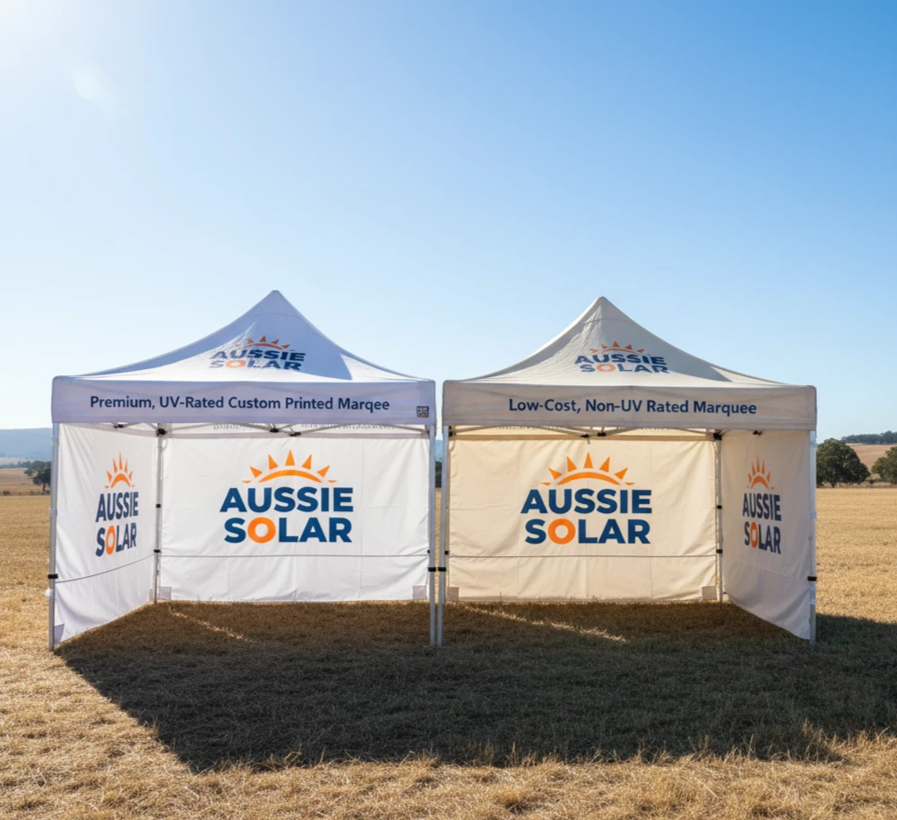
While a plain white marquee provides shade, a custom Gazebo Tent Print provides customers. It's your 24/7 salesperson, shouting about your brand before you even say hello. But simply slapping a logo on a roof isn't enough. To truly maximize your return on investment, your design needs strategy.
Here are 5 design tips to ensure your Gazebo Tent Print stops traffic and draws customers into your stall.
1. The 3-Second Rule: Define Your Offering Instantly
Market-goers are usually scanning, walking, and dodging prams simultaneously. You have roughly three seconds to tell them what you sell before they walk past.
Your Gazebo Tent Print must answer the question "What is this?" immediately. Don't rely on people walking right up to your table to figure it out.
- The Mistake: Printing only an abstract logo or a business name like "J.B. Enterprises," which gives no clue as to what is being sold.
- The Solution: Be literal. If you sell handmade ceramics, your valance or peak should prominently feature words like "HANDMADE CERAMICS" or "LOCAL POTTERY." Use your name/logo alongside the descriptor, but ensure the product category is obvious from 20 metres away.
2. Master Your Real Estate: Peak vs. Valance
A gazebo has distinct printing zones, and each serves a different purpose based on the customer's line of sight.
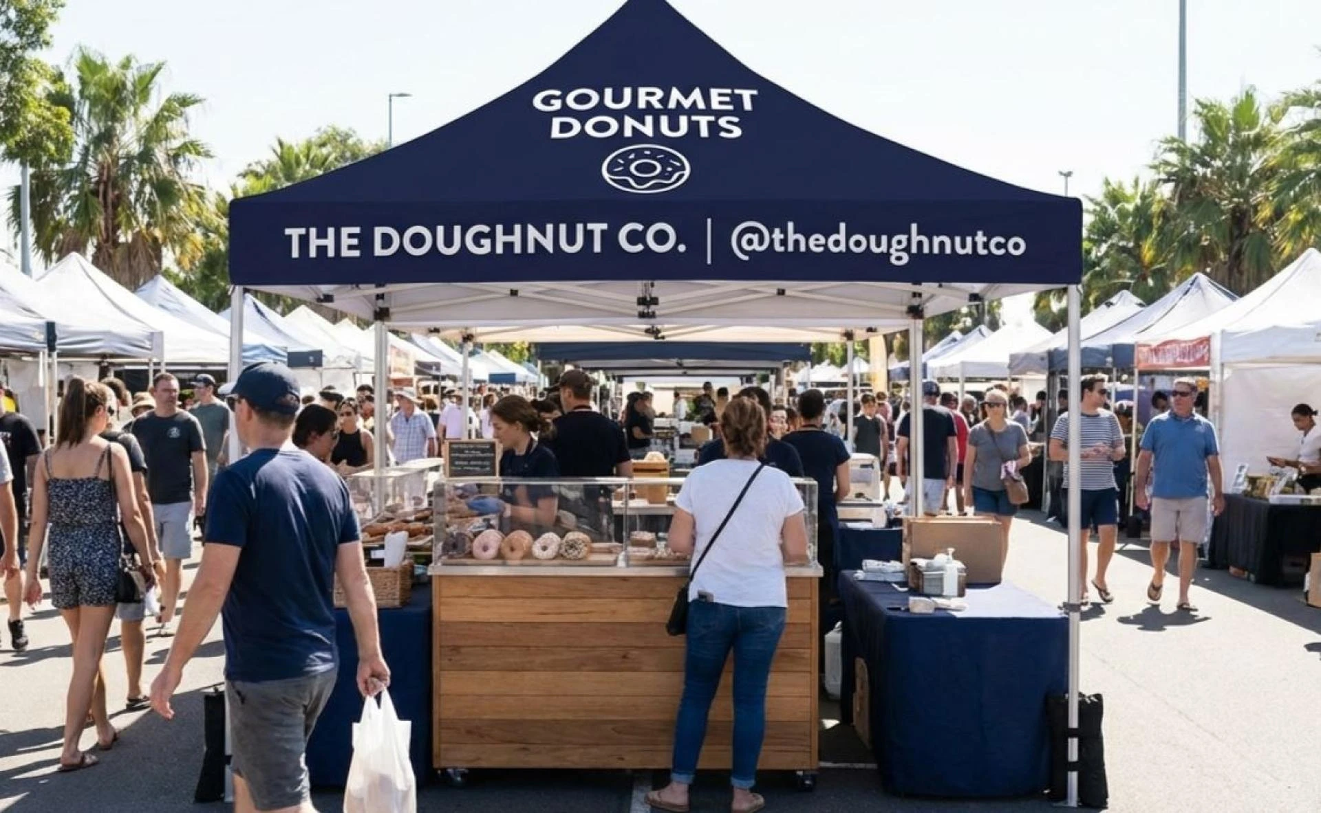
- The Peak (The Roof): Your Distant Billboard. This is the highest point and visible from across the market square or oval. Use this space for bold, high-impact branding—either a massive, recognisable logo or a very short, punchy description of your core offering (e.g., "GOURMET DONUTS").
The Valance (The Overhang edge): Your Shop Sign. This is eye-level for people walking past your stall (the "kerb appeal"). This is the critical zone for essential information: your business name, your website, or your social media handle. It frames your products and invites people in.
3. Contrast is King Under the Aussie Sun
Subtlety rarely works at a busy outdoor market. The harsh Australian sun can wash out pastel colours, and complex patterns get lost in visual clutter. To stand out, you need high contrast.
Think like a road sign. Dark text on a light background (or vice-versa) is the easiest to read. If your brand colours are soft blues and greens, consider using a crisp white background for the canopy and using those brand colours for massive, bold text. If your brand is dark and moody, ensure your logo pops in white or bright yellow.
4. Typography for Traffic: Keep it Bold and Simple
A market stall is not the place for elegant, swirling script fonts that look beautiful on a wedding invitation but are indecipherable from five metres away.
If people can't read it instantly, they won't try.
Choose bold, clean, sans-serif fonts for your main messages. Ensure the letter height is significant, particularly on the roof peak. Remember, your Gazebo Tent Print needs to be readable by someone squinting in the sun while holding a hot coffee.
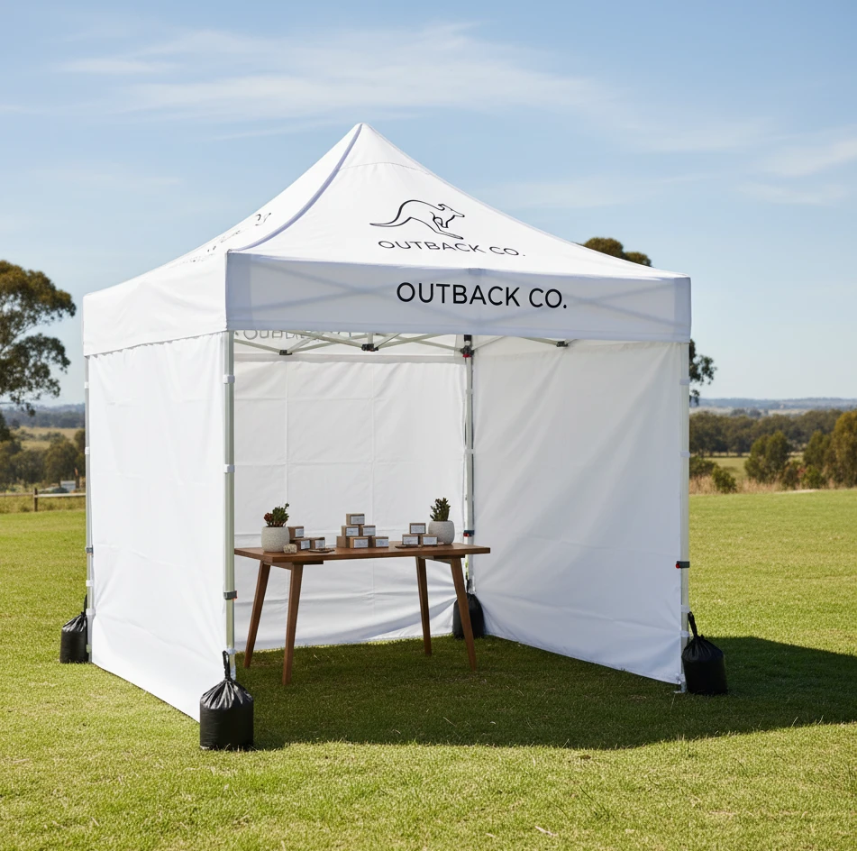
5. Less Clutter, More Impact (Embrace White Space)
The biggest temptation when designing a Gazebo Tent Print is to try and say everything. It's tempting to list every product, add five photos, your phone number, email, and three social media icons.
Resist this urge. A cluttered canopy looks chaotic and unprofessional.
Your gazebo is the "hook," not the brochure. Its job is to get them to step under the shade. Once they are there, you can tell them the details. Keep the design clean. Use "white space" (empty space around logos and text) to let your core message breathe. A clean, confident design always looks more premium than a crowded one.
The Verdict
A high-impact Gazebo Tent Print transforms your market presence from a temporary table into a professional pop-up shop. By focusing on clarity, bold contrast, and strategic placement, you stop being background noise and start becoming a destination.


Sign in to leave a comment.