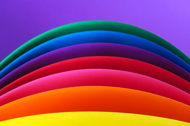
COLOR IN GRAPHIC DESIGN
Color is a universal language and a powerful way of communication. Of all the elements that make up visual design, color is perhaps the most important and influential. Studies by psychologists and marketers have shown how color can affect our emotions and perception. Color schemes are often used to emphasize certain aspects of a design or to evoke a desired mood or emotion in the viewer. Designers use color selectively to create harmony, balance and coherence.
Color is clearly an important aspect when designing marketing assets or building a brand. This article talks about color psychology and how the insights from color psychology can help you determine the most effective color combinations for designing your marketing and branding materials. Graphic designers and marketers should always be aware of the subtle but significant impact of color schemes on how viewers perceive and experience a marketing message or brand. Which colors should you choose for your projects? How can color affect moods and perceptions? How can you use this knowledge to build more effective and engaging designs that speak to your target audience?
COLOR, PSYCHOLOGY AND EMOTIONS
Color psychology is the study of how colors affect behavior and perception. Remember that color associations are often influenced by personal experiences and cultural factors, and it is too easy to assume that color associations are universal. However, studies have shown consistent associations. "Warm colors" like red, orange, and yellow are energizing, while "cool colors" like blue and green are relaxing and calming. A survey of color and word associations found that 43% of people associate blue with reliability and 76% red with speed. Another study found that color can have a major impact on consumer behavior. Red signs on shop windows have attracted more impulse purchases. Colors can be used to increase or decrease appetite, increase or decrease heart rate, improve mood, or calm down. When it comes to designing marketing assets, a carefully chosen color palette can evoke viewers' emotions and subconsciously influence how they feel about your brand and message. As a guide, the color directs the eye and helps to emphasize the essentials. Designers and marketers are increasingly recognizing the importance of the influence of color in shaping consumer perception.
COLORS IN MARKETING AND BRANDING
There are many studies and scientific research that support the idea that people strongly associate color with emotions. Let's look at some common colors used in marketing and summarize some of the key findings.
RED
Red is one of the most visible colors in the spectrum. It is a warm color strongly associated with excitement, action, danger and passion. Red increases heart rate and blood pressure, creating a sense of urgency. It is commonly used on warning signs and stop signs as it quickly draws attention and inspires action. In marketing, brands like Red Bull and Ferrari also use red to draw attention and convey a sense of energy and excitement.
YELLOW
Yellow is also a warm color associated with optimism and youth. Fun, Smileys and Sunshine. Yellow is often used on children’s toys and to advertise children’s products. Its brightness sparks enthusiasm and is widely used in promoting special offers to catch customers eyes. It is also associated with mental clarity and logical thinking. Bright, energetic, and eye-catching, yellow is more effective when used sparingly, or with a darker tone for balance.
BLUE
Blue is a cool color and has a more calming and relaxing effect compared to warmer colors like red and yellow. It is strongly associated with maturity, honesty, and credibility. It's no coincidence that so many large organizations choose blue in their branding. IBM, Facebook, Twitter, Samsung, Intel, Ford, RBS. Blue soothes and reassuring. This creates security and shows honesty, professionalism and reliability.
ORANGE
Orange is a warm, confident and cheerful color. It lies between red and yellow on the color spectrum, combining the excitement of red with the brightness and joy of yellow. Fun, friendly and inspiring, orange is a popular color in sports and is often used by brands that appeal to young people. Fanta Soda, Nickelodeon Television and Mozilla use oranges in their branding to share their enthusiasm and energy with their target market.
GREEN
Green is a cold color and, like blue, has a calming effect. Green is the dominant color in nature and is closely related to the environment, growth, freshness and health. Green is often used to highlight environmental issues and to promote health and fitness products. Oil and gas company BP uses the color green in its branding to show that it takes its environmental responsibilities very seriously. Starbucks, Subways, and other food companies use green vegetables to showcase the fresh ingredients they use to make their products.
BLACK
Black is neither hot nor cold. Technically, it's not a color at all. Black is neutral and stable and is often used in marketing for its transparency and ability to create a high contrast effect when paired with lighter colors that would otherwise be overwhelming. Black is often used as a background to improve readability. In branding, black is associated with quality, sophistication and elegance. Think of related events. Luxury brands like Chanel, Prada and Louis Vuitton use black in their branding to reflect these characteristics.
The list of colors above provides a brief overview of some of the types of emotional associations and responses colors can evoke in customers. When used carefully, designers can use their understanding of these emotional associations to create more effective designs.
COLORS AND THE CUSTOMER
Whether you're building a brand from scratch or designing marketing materials for an existing brand, it's hard to overstate the importance of color. 80% of consumers believe color increases brand awareness and 84.7% cite color as the top reason for purchasing a particular product. Carefully selected brand colors ensure the right impression and set the brand apart from the competition.
You should know that color combinations are not universal. Color associations can be culturally specific. For example, in the UK, Europe and North America, the color orange is generally associated with excitement and fun. However, in China, orange symbolizes love, health and humility. Gender also plays a role in color associations. In a color preference survey, 57% of men said blue was their favorite color, but only 35% of women shared this preference. The study also showed a much stronger preference for purple in women than in men. Men generally prefer cool colors while women prefer warm colors.
ARE YOUR COLORS APPROPRIATE FOR YOUR BRAND?
Colors do not affect isolated customers. Context is important. Key questions to ask when brainstorming color schemes: Do these colors align with your brand or message? Will these colors evoke the right moods and emotions I want my customers to associate with my brand? Your brand colors should feel appropriate to the message you are conveying. Colors reinforce the marketing message. To get the most out of color psychology in marketing, it helps to have a clear understanding of your brand values and personality. Is your brand young or mature? Challenging? Energetic? Who is your typical customer and which audience segment are you targeting? Understanding these things will give you valuable insights that will help you craft marketing messages and collateral that resonate with your audience.
As you can see, color is a key element of successful design and can have a major impact on how people perceive and process information. Color can be used to connect a brand or message to mood and emotion, attract attention, act quickly, and increase desired response. Color affects the viewer's perception in subtle ways. If you know your audience and the type of emotional response you want to evoke, knowing color psychology can be a very effective marketing tool. For best results, your color palette should be visually appealing, complementing and reinforcing the message you are trying to convey.


Sign in to leave a comment.