In today's data-driven world, the ability to extract meaningful insights from vast amounts of information is crucial for businesses and decision-makers. Raw data alone is often overwhelming and difficult to comprehend. This is where data visualization comes into play, offering a powerful tool to transform complex data into visually appealing and easily understandable representations.
In this article, we will explore the importance of data visualization, discuss the benefits of creating dynamic dashboards, and provide insights into how they can revolutionize data analysis.
Live data visualization
Embrace Real-Time Information for Immediate Impact
Get ready to supercharge your decision-making with real-time data updates and eye-catching visuals!
In today's fast-paced world, data is the name of the game. But how do you turn all that information into actionable insights? The secret lies in harnessing the power of live data updates and creating visual displays that make sense to you. Live data updates mean getting information in real-time, straight from the source. No more relying on old snapshots of data that might be outdated. With live updates, you can see what's happening right now and make decisions based on the latest information. Whether it's tracking website traffic, monitoring sales, or analyzing customer behavior, real-time data gives you an edge.
Unlock the Potential of Visualization for Enhanced Understanding
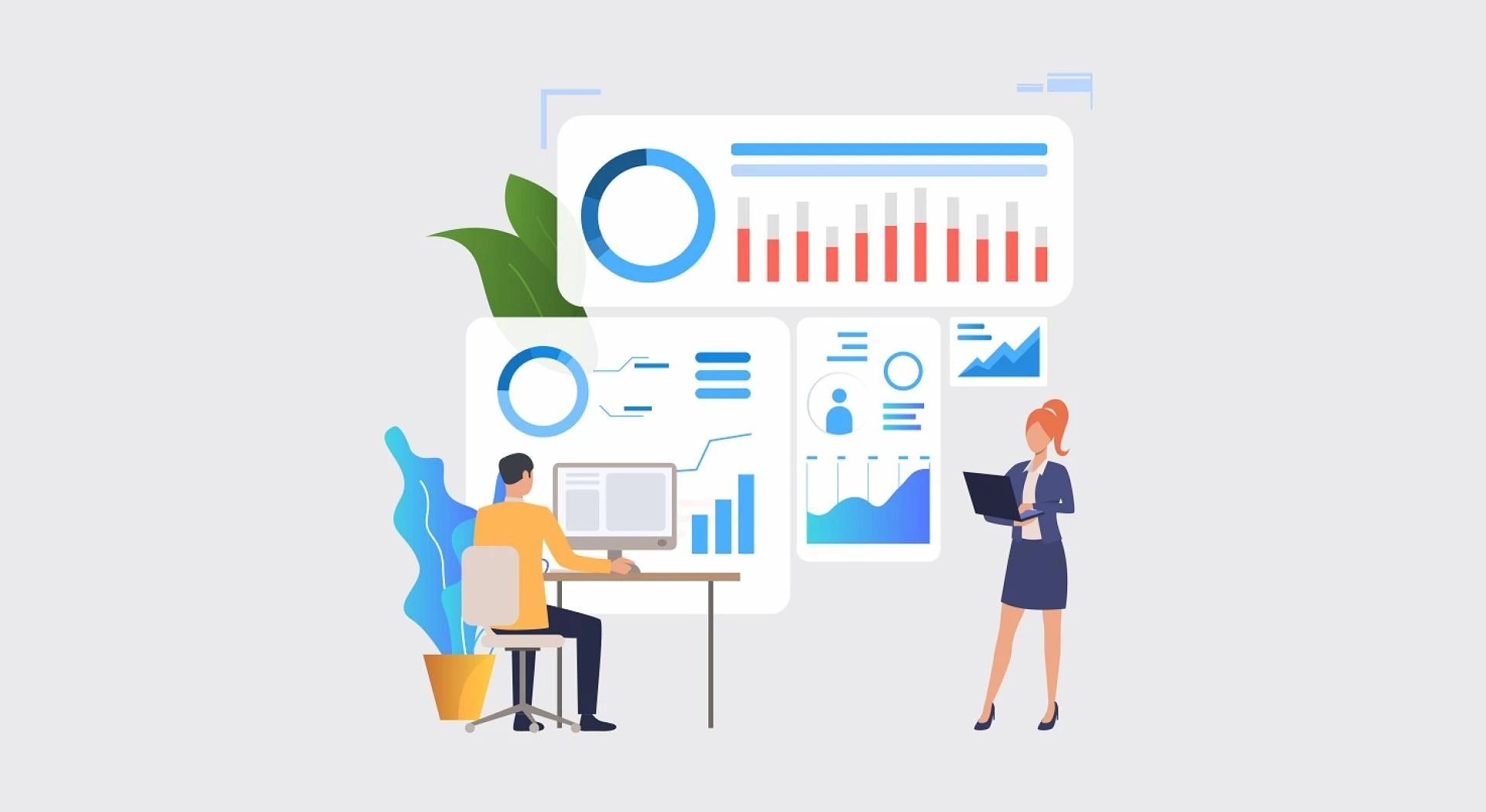
But numbers and raw data can be overwhelming. That's where visualization comes in. Instead of staring at spreadsheets and trying to make sense of it all, you can see your key performance indicators (KPIs) come to life in colorful charts, graphs, and dashboards. It's like having a personal data assistant that speaks your language!
For example, imagine you're a marketing manager for a clothing company. You want to analyze the performance of your latest marketing campaign across different demographics. Instead of poring over rows and columns of data, you can quickly generate a visual representation of the campaign's effectiveness. A dynamic chart shows the engagement levels and conversion rates for each target audience, with different colors representing various age groups. As you interact with the chart, hovering over specific sections, you can see detailed metrics and trends in real-time. The visualization makes it easy to identify which segments are performing well and where improvements are needed, allowing you to make data-driven decisions more efficiently. It's like having a visual storyteller that simplifies complex data and empowers you to take action effectively.
Tools and Techniques for Creating Dynamic Dashboards
To create dynamic dashboards that are visually engaging and provide real-time updates, you need to use a range of tools and techniques.
First, there are user-friendly data visualization tools like Tableau, Power BI, or Google Data Studio. These tools let you design interactive dashboards with different types of charts, filters, and interactive elements. They make it easy to explore and analyze data in a dynamic way. Visualizing KPIs helps you quickly understand what's going on and spot trends and patterns at a glance. Line charts show how things change over time, bar charts compare different categories, and scatter plots reveal connections between variables. And with interactive tools, you can dive deeper, explore specific metrics, and uncover hidden insights.
Imagine being able to make informed decisions on the fly, identify opportunities and challenges in real-time, and stay ahead of the competition. That's the power of combining live data updates with stunning visualizations. It's like having a crystal ball for your business!
If you want more advanced data manipulation and analysis capabilities, you can use programming languages like Python or R. They allow you to integrate data from different sources, perform custom calculations, and create algorithms.
To ensure real-time updates, you can use APIs and web scraping techniques to fetch live data from databases, online platforms, or external systems. You'll also need data storage and management tools like SQL databases or cloud-based solutions to efficiently store and access large amounts of data.
Finally, you can set up automated data pipelines and scheduled data refreshes to keep your dashboards up-to-date with the latest information. This way, you'll have real-time insights and actionable data at your fingertips.
The Future of Data Visualization
Embracing Advanced Technologies
When we think about the future of data visualization, one exciting aspect is the adoption of advanced technologies. One such technology is augmented reality (AR) and virtual reality (VR), which have the potential to transform how we interact with data. Just imagine putting on a headset and being immersed in a three-dimensional data environment where you can manipulate and explore data points using natural gestures.
Alongside that, machine learning and artificial intelligence (AI) algorithms will enhance data visualization capabilities by automatically uncovering insights and detecting hidden patterns. By integrating natural language processing (NLP) and voice recognition, users will be able to engage with data in a conversational way, making data exploration more intuitive and accessible.
Ethical Considerations and Data Privacy
As the field of data visualization progresses, it's important to give due consideration to ethical aspects and data privacy. With the sheer volume of data being collected and visualized, it becomes crucial to adhere to privacy regulations and guidelines. Techniques like data anonymization, such as aggregation and masking, will be key in safeguarding sensitive information while still providing meaningful insights.
Furthermore, transparency in data sourcing and visualization methods will be vital to maintain user trust and credibility. It will be essential to educate and empower users to understand the implications of data visualization and make informed decisions about sharing their personal information. Striking a balance between extracting valuable insights and respecting individual privacy will be a significant challenge as data visualization continues to evolve in the future.
Conclusion
Data visualization has transformed the way we understand and leverage data. By creating dynamic dashboards, businesses and individuals can unlock powerful insights, drive data-driven decision-making, and communicate complex information effectively. As technology continues to advance, data visualization will play an increasingly critical role in helping us navigate the ever-expanding sea of data. By harnessing its potential and embracing best practices, we can tap into the true power of data visualization and gain a competitive edge in today's data-centric world.
If you'd like further expert advice on your performance or consumption, HelloSafe provides users with dozens of free and anonymous comparison tools, calculators and expert, up-to-date content. Its platform empowers users to make the best decisions for their wallets and find the right products at the right prices for them.


Sign in to leave a comment.