In today\'s digital age, where smartphones and tablets have seamlessly integrated into our daily routines, the significance of having a mobile-friendly website cannot be overstated. As technology continues to advance and mobile usage skyrockets, businesses must adapt to meet the evolving needs of their audience.
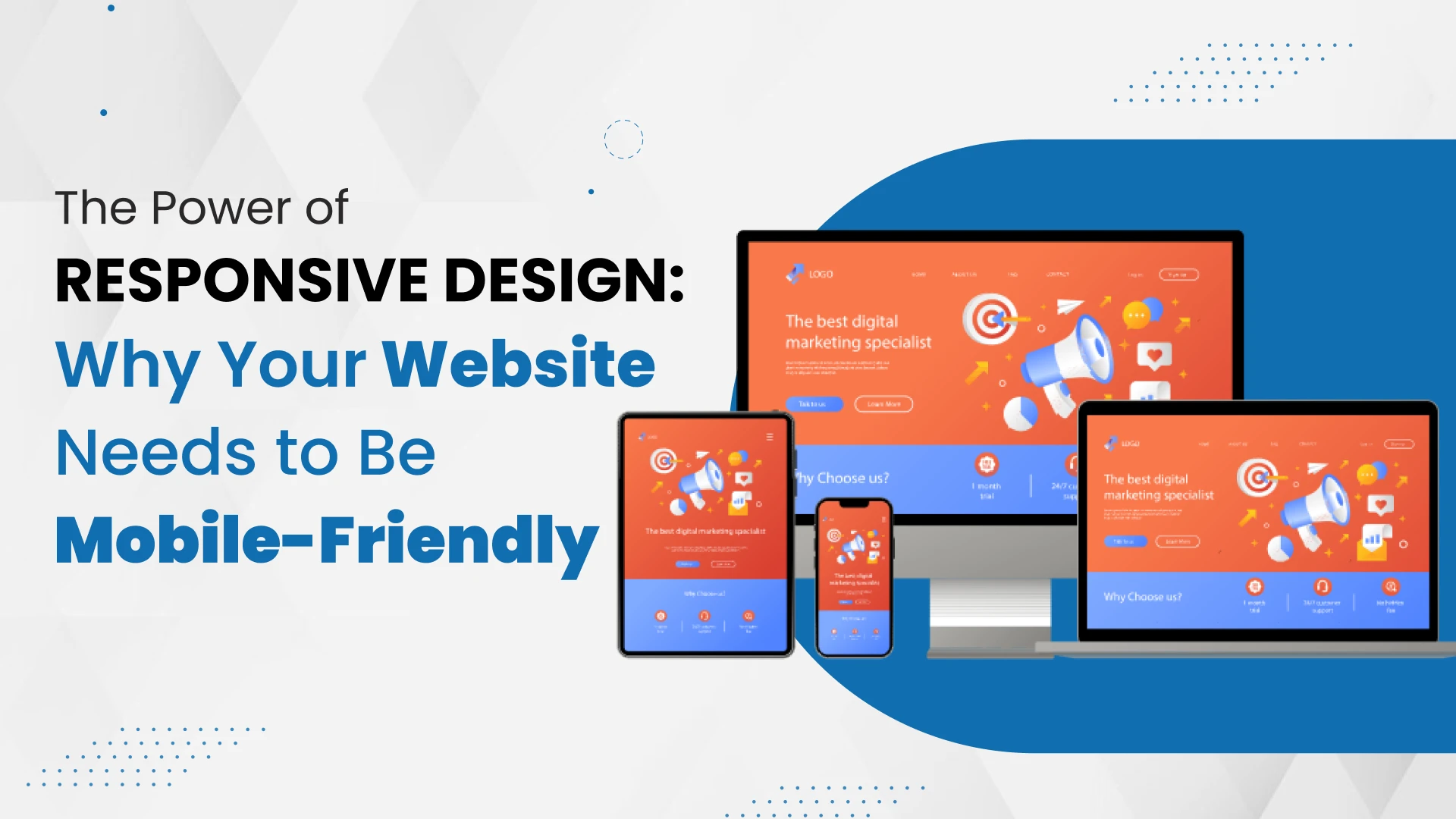
This is where responsive design comes into play. Responsive design isn\'t just a trend; it\'s a fundamental shift in web development philosophy that prioritizes user experience across all devices. Whether your visitors are browsing on a desktop, a smartphone, or a tablet, responsive design ensures that your website adapts seamlessly to provide an optimal viewing experience.
In the past websites were designed only for desktop users. With the proliferation of mobile devices, users expect websites to be accessible and functional regardless of their screen size. Therefore, understanding the power of responsive design and its impact on your website\'s performance is essential to remain competitive in today\'s digital landscape.
Importance of Mobile-Friendly Websites
1. Improved User Experience:
Mobile-friendly websites provide a seamless browsing experience, allowing users to navigate effortlessly and access content without frustration. With responsive design, text is easy to read, buttons are easy to tap, and images load quickly, enhancing overall user satisfaction.
2. Higher Search Engine Rankings:
Search engines like Google prioritize mobile-friendly websites in their search results, boosting rankings compared to non-mobile-friendly sites. By optimizing your website for mobile devices, you increase your chances of appearing higher in search engine results pages (SERPs) and reaching a broader audience.
3. Expanded Reach:
With the increasing use of smartphones and tablets, more people are accessing the internet on mobile devices than ever before. A mobile-friendly website ensures that you can reach these users effectively, regardless of the device they\'re using, thereby expanding your potential audience and increasing your website\'s visibility.
4. Reduced Bounce Rates:
Mobile-friendly websites tend to have lower bounce rates compared to non-mobile-friendly sites. When users have a positive experience on your website, they are more likely to stay longer, explore additional pages, and engage with your content. This leads to lower bounce rates and higher levels of user engagement.
5. Competitive Advantage:
In today\'s competitive online landscape, having a mobile-friendly website can set you apart from your competitors. By providing a superior user experience across all devices, you can attract and retain more visitors, generate leads, and ultimately, outshine your competition in the digital realm.
Benefits Of Mobile-Friendly Websites For Your Business
1. Increased Conversion Rates:
Mobile-friendly websites are more likely to convert visitors into customers. With easy navigation and a seamless user experience, mobile users are more inclined to make purchases, fill out forms, or take other desired actions, leading to higher conversion rates and increased revenue for your business.
2. Enhanced Brand Reputation:
A mobile-friendly website reflects positively on your brand and demonstrates that you prioritize customer experience and accessibility. By providing a mobile-friendly experience, you enhance your brand\'s reputation and credibility, leading to increased trust and loyalty among your target audience.
3. Better Engagement Metrics:
Mobile-friendly websites typically experience higher levels of engagement, including longer session durations, more page views, and lower bounce rates. By keeping users engaged and interacting with your content, you can build stronger relationships with your audience and increase brand awareness.
4. Accessibility to On-the-Go Users:
With a mobile-friendly website, you can cater to users who are on the go and accessing the internet from their smartphones or tablets. Whether they are commuting, waiting in line, or travelling, mobile users can easily engage with your website, making it convenient for them to connect with your brand anytime, anywhere.
5. Adaptation to Changing Consumer Behavior:
As consumer behaviour continues to evolve, mobile devices have become the preferred choice for internet browsing and online shopping. By investing in a mobile-friendly website, you adapt to changing consumer preferences and ensure that your business remains relevant and accessible in today\'s mobile-first world.
Mobile devices have become the preferred choice for browsing the internet, making it necessary for businesses to adopt them. The leading web development company in India understands the importance of mobile optimization. Which provides many benefits for your business. From increased user engagement and better search engine rankings to higher conversion rates and enhanced brand reputation, a mobile-friendly website can take your business to new heights in the competitive online landscape.
Conclusion
In conclusion, the power of responsive design cannot be overstated in today\'s digital landscape. With the majority of internet users accessing the web on mobile devices, having a mobile-friendly website is essential for providing an optimal user experience, improving SEO performance, and driving higher conversion rates for your business. By embracing responsive design principles and ensuring that your website is optimized for mobile, you can stay ahead of the competition and maximize your online presence.
FAQ
1. Why is responsive design important for websites?
Responsive design ensures that websites adapt to different screen sizes and devices, providing an optimal viewing experience for users. This adaptability is crucial in today\'s mobile-centric world, where users access the internet on various devices such as smartphones, tablets, and desktop computers.
2. How does responsive design benefit user experience?
Responsive design enhances user experience by making websites easy to navigate and interact with on any device. It ensures that content is displayed correctly, buttons are easy to tap, and images load quickly, leading to higher user satisfaction and engagement.
3. Does having a mobile-friendly website affect search engine rankings?
Yes, search engines like Google prioritize mobile-friendly websites in their search results, especially for users searching on mobile devices. Having a mobile-friendly website can improve your search engine rankings and increase your visibility to potential customers.
4. What are the key elements of responsive design?
Key elements of responsive design include flexible grid layouts, fluid images and media, mobile-friendly navigation, and fast loading speed. These elements ensure that websites adapt seamlessly to different screen sizes and devices, providing a consistent and enjoyable user experience.
5. How can a mobile-friendly website benefit my business?
A mobile-friendly website can benefit your business in several ways, including increased conversion rates, enhanced brand reputation, better engagement metrics, accessibility to on-the-go users, and adaptation to changing consumer behaviour. By investing in responsive design, you can improve user experience, reach a broader audience, and ultimately, drive more success for your business online.


Sign in to leave a comment.