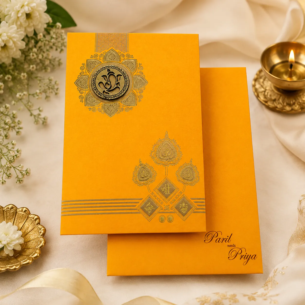


Reva spent three evenings scrolling through wedding card catalogues before she figured out what was bothering her. Every sample her mother had shortlisted was red and gold, technically beautiful, but they all looked the same stack of cards she'd seen at a dozen other weddings that year. Then a cousin sent her a photo of an invitation with a round Ganesha motif on a warm yellow base, and something clicked. It wasn't louder or fancier than the others. It just felt like it belonged to her wedding specifically, the haldi function included, instead of reading like a generic template with her name typed in.
That instinct is worth paying attention to, because color choice on an invitation isn't decorative trivia. It's the first signal a guest gets about what kind of wedding they're being invited to, and yellow carries a very specific weight in Indian wedding culture that red and gold don't automatically cover.
The Real Problem: Matching the Card to the Occasion, Not Just the Budget
Most people planning a wedding treat card color as an aesthetic decision made late in the process, after the venue, the caterer, and the photographer are locked in. That ordering causes a real mismatch. A Hindu wedding typically spans several functions — haldi, mehendi, sangeet, the wedding itself, reception — and each one has its own visual language. Turmeric-yellow suits the haldi invite because it echoes the paste actually used in the ceremony. Reds and maroons suit the wedding day. Pinks and greens tend to carry the mehendi. When a family picks one card design and stretches it across every function because it's simpler to order, the invitation stops communicating anything specific, and guests can't tell at a glance which event they're being asked to attend.
The second version of this problem shows up even when someone has correctly picked yellow: they can't find a design that reads as celebratory rather than plain. A flat yellow card without the right symbol, paper texture, or printing finish can look unfinished instead of intentional.
Key Factors That Actually Drive the Design
A few things determine whether a yellow card looks rich or looks cheap.
Color symbolism.
Yellow is considered auspicious across Indian tradition, tied to prosperity and new beginnings, which is part of why it's become the default shade for haldi ceremony invites specifically, distinct from the reds and golds of the main wedding card.
Religious symbols.
Lord Ganesha, worshipped before any new undertaking as the remover of obstacles, appears on the vast majority of Hindu wedding cards for exactly that reason — couples want the invitation itself to carry a blessing, not just an announcement. A round Ganesha paste-up or embossed motif is one of the more traditional placements, often mirrored on the envelope through a die-cut window.
Paper weight.
250 GSM is the standard baseline for Indian wedding cards; anything above 300 GSM has a noticeably firmer, more premium feel in the hand, and guests do notice the difference even if they can't name it.
Printing method.
Silk screen printing, UV or raised printing, and foil work all produce different textures on the same yellow base. Silk screen tends to hold single or dual colors cleanly and works well on colored stock; foil catches light and reads as more formal; UV/raised printing adds tactile dimension without the cost of foil.
Practical Tips for Getting It Right
Order a physical sample before committing to a bulk print run.
Screen colors and printed colors rarely match exactly, and yellow is one of the trickier shades to get consistent between a monitor and matte cardstock.
Keep the envelope and card in conversation with each other.
A window cut into the envelope that reveals the Ganesha motif on the card underneath creates a small moment of anticipation before the envelope is even opened.
Match inserts to the card's color family
rather than defaulting to plain white — two coordinated inserts in a matching yellow tone keep the whole set looking deliberate.
Decide the printing technique based on how the card will actually be handled.
Foil photographs beautifully but scuffs if cards are stacked loosely in transit; UV printing holds up better for high-volume mailing.
Budget the inserts and add-ons early, not after the base card price.
RSVP cards, thank-you cards, and address labels each add incrementally, and five functions can turn one modest card order into a much larger one.
Common Mistakes Worth Avoiding
The most frequent misstep is choosing a design purely from a catalogue photo without checking the actual paper stock in hand — colors and finishes shift under studio lighting versus daylight. A close second is over-foiling: gold foil on a Ganesha motif looks striking, but adding it everywhere on the card competes with itself instead of drawing the eye to one focal point. Families also tend to underestimate how many inserts they'll actually need, ordering a base quantity and then scrambling for a reprint mid-season when extra guests get added. And a surprising number of orders skip requesting a sample altogether, trusting a digital proof completely, which is where most of the "this isn't the yellow I picked" complaints originate.
Choosing the Right Card: A Simple Framework
Start with the occasion, not the catalogue. If it's specifically for the haldi function, lean into the turmeric-yellow palette rather than forcing the main wedding card's red-and-gold scheme onto it. From there, decide how much religious symbolism you want front and center versus subtle. A card like the Yellow Wedding Card that Madhurash offers pairs a round Ganesha paste-up with a matching envelope window and two plain inserts, which is a reasonable template for anyone weighing tradition against simplicity — enough symbolism to feel intentional, without so much detail that it overwhelms the base color. Whatever vendor you go with, request the actual card stock in hand, confirm the GSM, and only then finalize print quantity. Madhurash's catalogue, like most established Indian stationers, also lets you compare printing add-ons (foil, silk screen, UV) against the base card before committing, which is the order most people wish they'd followed the first time.
Conclusion
A yellow wedding card isn't just a color preference. It's shorthand for a specific moment in the wedding calendar, and getting the paper weight, the symbol placement, and the printing finish right is what separates a card that photographs well in a haldi reel from one that just sits in a drawer. Treat the sample stage seriously, keep the envelope and insert coordinated with the card, and let the occasion — not the catalogue page — decide the shade.
FAQs
Is yellow only appropriate for the haldi ceremony, or can it be used for the main wedding card too?
Yellow is most strongly associated with haldi specifically, since it echoes the turmeric paste used in the ritual, but nothing stops a family from using it for engagement or other pre-wedding invites too. It's less conventional for the main wedding day card, where reds and golds still dominate.
How much does GSM actually matter if guests are just going to glance at the card once? More than people expect. A 250 GSM card feels standard; 300+ GSM has a noticeably sturdier, more premium feel, and it's one of the few upgrades guests consciously register even without knowing the technical term for it.
Foil or silk screen — which one holds up better for a large guest list?
Honestly, silk screen tends to be the safer choice for bulk orders since it's more forgiving in transit and cheaper per unit at scale. Foil looks striking but is worth reserving for smaller quantities or cards that won't be jostled around much before delivery.
Can the Ganesha motif be swapped for something else if the family prefers a different symbol?
Yes — Om, Kalasha, and floral motifs are common alternatives, and most stationers offer several symbol options within the same base card design, so the yellow palette isn't locked to one specific religious image.






















Sign in to leave a comment.