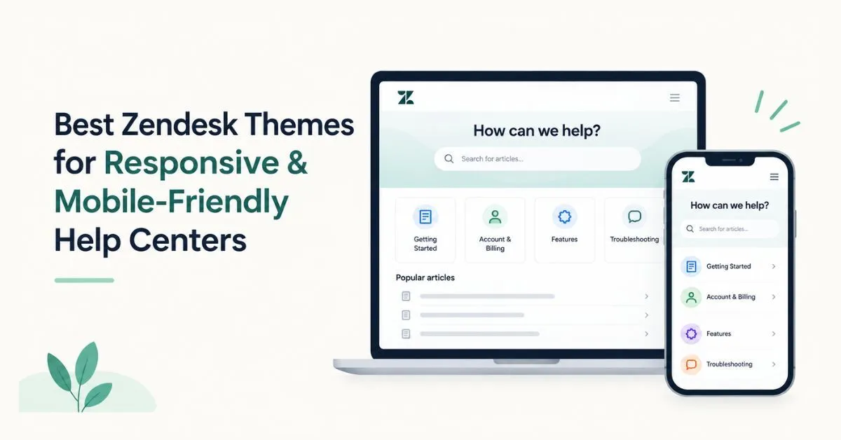

Customers expect support to be easy to access, whether they are using a desktop, tablet, or smartphone. A Help Center that works well on all types of screens makes it easier for customers to search for answers, read articles, and solve common issues on their own. This is where the right Zendesk themes can help. A simple layout, easy navigation, clear content, and a simple search experience can make a Help Center more comfortable to use on smaller screens.
In this guide, we look at five themes worth considering for businesses that want a Help Center that is easy to use on mobile devices: Panatha Gen 2.0, Flatrock, Vertio, Indigo, and Stockholm.
Key Highlights
- Panatha Gen 2.0 is a modern option for businesses looking for a responsive Help Center experience.
- Flatrock provides a clean layout that can support a straightforward customer self-service experience.
- Vertio combines a structured design with a responsive Help Center layout.
- Indigo focuses on clear organization and an easy-to-navigate support experience.
- Stockholm offers a polished and professional experience across desktop, tablet, and mobile devices, making these Zendesk themes worth considering.
Zendesk Themes That Make Support Easier on Mobile
Not all customers visit a Help Center from a desktop computer. Many people look for support using a smartphone or tablet, especially when they need a quick answer. A responsive Help Center adjusts its layout to different screen sizes, making it easier to read articles and navigate without unnecessary zooming or horizontal scrolling. A design that works well on mobile devices also makes important features, such as search and navigation, easy to access on smaller screens.
When comparing mobile-friendly Zendesk themes, focus on how easily customers can find information and move between different parts of your Help Center. A responsive layout should support the customer journey rather than simply make the page fit a smaller screen.
Panatha Gen 2.0 by Diziana
Panatha Gen 2.0 is a good option for teams that want a modern Help Center with a responsive design. Its organized layout helps customers move through categories, sections, and articles more easily.
For companies that are growing and building up their knowledge base, it's especially important to have clear organization. Customers should be able to find the information they need without having to navigate through a complicated interface.
Panatha Gen 2.0 also lets businesses create a support portal that matches their brand and provides a useful experience on desktop and mobile devices. Businesses can explore Panatha Gen 2.0 through the Zendesk Marketplace when comparing theme options.
Flatrock by Lotus Themes
Flatrock from Lotus Themes is another option for teams looking for a clean and responsive Help Center design.
A simple layout is especially helpful on mobile devices because their screens are smaller and it's harder to navigate. If you make important support content easy to access, customers will be able to find answers more quickly.
Flatrock is a good option for businesses that want a professional support portal with a simple design and an easy-to-use experience on different screen sizes. It can also be considered by teams comparing mobile-friendly Zendesk themes for a growing knowledge base.
Vertio by Grow Shine Services
Vertio is designed for businesses that want a modern and organized Zendesk Help Center. Its layout helps organize support content while maintaining an experience that works across different devices.
People often visit a Help Center on their phones because they need a quick solution. If you can easily find what you're looking for, you'll be happy.
Vertio is a good option for businesses that want a modern look and easy-to-use Help Center navigation. It is also worth considering when evaluating Zendesk themes for mobile and the type of experience they provide on smaller screens.
Indigo by Zenplates
Indigo from Zenplates is another theme to consider when creating a professional and easy-to-navigate Help Center.
It's especially important to have a clear content structure on mobile devices. With less screen space available, customers benefit from navigation that makes categories and support information easy to understand.
Indigo can help businesses provide a consistent experience across different types of devices. Teams can also compare its design with other options available through the Zendesk Marketplace before selecting a theme.
Stockholm by Premium Plus
Premium Plus's Stockholm is a polished option for businesses looking for a professional Help Center design that works well on different devices.
Its layout adapts to any device, so customers can access knowledge-base content from any device without needing a separate experience for each one.
If your business cares about how things look and how easy they are to use, you should think about Stockholm when you're choosing Zendesk Help Center themes. It can also be included when comparing Zendesk themes for mobile for customers who frequently access support from smartphones.
Why Responsive Design Matters for a Zendesk Help Center
Customers use different devices throughout the day. Someone might start searching for information on a laptop and later access the same Help Center from a smartphone. The right Zendesk themes can help create a responsive experience that adjusts to different screen sizes, making content easier to read while keeping navigation, search, and other important elements accessible across devices.
Responsive design also supports a better self-service experience. If customers can easily search, browse, and read support articles without struggling with the layout, they are more likely to find the answers they need on their own. This can make the Help Center more useful and reduce the need to contact a support agent for simple questions.
For this reason, mobile-friendly Zendesk themes should focus on more than appearance. The theme should help customers complete common tasks quickly, whether they are browsing from a desktop or looking for an answer on a phone.
Key Features of Mobile-Friendly Zendesk Themes
When choosing Zendesk themes for mobile, it's important to consider more than just how the design looks on a smartphone. You should also think about how customers will use the Help Center.
- Easy Mobile Navigation: Menus and navigation should be simple and easy to use on smaller screens. Customers should be able to reach important information without unnecessary steps.
- Readable Content: Article text should remain comfortable to read on smartphones and tablets. Good spacing, clear headings, and an organized structure can make longer articles easier to follow.
- Accessible Search: Customers should be able to find the search function easily and use it without difficulty on mobile devices.
- Clear Content Structure: Categories and sections should be organized logically, especially for larger knowledge bases. A clear structure helps customers find the information they need.
- Consistent Branding: Look for customization options that allow your Help Center to match your brand through logos, colors, fonts, and other supported design elements.
- Room to Grow: Choose a theme that can support additional content and changing customer needs as your Help Center grows.
When reviewing Zendesk themes for mobile, test the navigation, search, article pages, and category structure on actual smartphones and tablets. This gives you a better idea of how customers will experience the Help Center.
How to Choose the Right Zendesk Themes
The best Zendesk themes depends on your customers, content, and Help Center goals. First, think about the size of your knowledge base and how customers will use it. A smaller Help Center may work well with a simple layout, while a larger knowledge base needs clear navigation, strong search, and an organized content structure. It's also important to check how the theme looks and works on smartphones, tablets, and desktops.
It's also important to consider how easy it is to use and how customizable it is. Choose a theme that lets you change things to match your brand, but also makes it easy to use the navigation, search, and article content. A theme may look good, but the best choice is one that helps customers find answers quickly and provides a smooth experience on different devices. If you are comparing themes from the Zendesk Marketplace, check their available layouts, customization options, and overall usability before making a decision. This will help you choose a design that works for your current content and will meet your future Help Center requirements.
Conclusion
A Help Center that responds to user input can make it easier for customers to find the support they need on their desktops, tablets, and smartphones. The right design should make it easy to find your way around, the content should be easy to read, and important support features should be easy to access.
When comparing Zendesk themes for a Help Center that works well on both desktops and mobile devices, consider Panatha Gen 2.0, Flatrock, Vertio, Indigo, and Stockholm. Before making a final decision, test each theme with your actual content and check how it performs across different devices. The best choice is the one that combines ease of use, a responsive design, branding, and a structure that can support your Help Center as it grows.
FAQs
1. What makes a Zendesk theme mobile-friendly?
A Zendesk theme that works well on mobile devices will look good on any screen size. It should be easy to use on smartphones and tablets.
2. Which Zendesk themes are good for responsive Help Centers?
Panatha Gen 2.0, Flatrock, Vertio, Indigo, and Stockholm are five themes that businesses should consider if they want a Help Center that works well on mobile devices.
3. Why is responsive design important for a Zendesk Help Center?
Responsive design helps customers access support content easily on desktops, tablets, and smartphones. It can also make browsing and self-service easier.
4. What should I look for in a mobile-friendly Zendesk themes?
Look for easy navigation on mobile devices, content that is easy to read, a search engine that is easy to use, a clear structure for the content, options for customization, and a layout that looks the same on different devices.
5. Can a responsive Zendesk theme improve the customer experience?
Yes. A responsive theme makes it easy for customers to find what they're looking for without any problems with the website's design or functionality.



















Sign in to leave a comment.