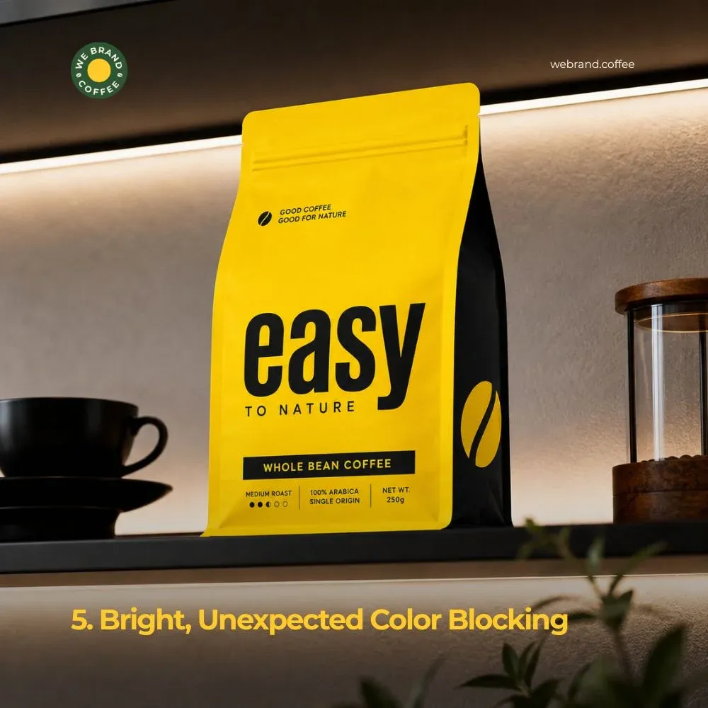

You have spent weeks, maybe months perfecting your coffee packaging design. The colours feel right, the coffee logo pops, the tasting notes are printed in a beautiful little serif font.
It's tempting to hit "send to print" the moment the design looks good on screen. But packaging is one of those rare design projects where a single overlooked detail can turn an entire print run into an expensive mistake.
Unlike a website, where a bug can be fixed in minutes, a packaging error only gets discovered after hundreds or thousands of units have already been printed, filled, and sealed.
Before you send your files to the printer, run through this checklist to catch the issues that are easy to miss on a screen but painfully obvious once they're in your hands.
1. Check Your Bleed, Margins, and Dielines
This is the single most common reason packaging print runs go wrong. A bleed is the extra margin of your design that extends beyond the actual cut line, ensuring there's no thin sliver of white edge if the cutting blade shifts even slightly during production. Without proper bleed, any background colour or pattern that's meant to run edge-to-edge can end up with a visible white border once the bag or box is trimmed.
Just as important is the dieline, the template that shows exactly where the packaging will be cut, folded, and sealed. If you are designing a stand-up pouch, box, or label, your printer should provide this template before you start designing, not after.
Make sure every critical design element of your logo, brand name, and tasting notes sits safely within the "safe zone," away from fold lines, seal areas, and edges where it could get cut off, obscured by a crimp, or hidden behind a resealable zipper. It's worth requesting a flat proof or 3D mockup from your printer specifically to check how elements land once the package is assembled, not just how they look as a flat file.
2. Confirm Color Accuracy with a Physical Proof
What you see on your monitor and what comes out of a printing press are often two different things. Screens display colour using RGB (red, green, blue) light, while most commercial printing uses CMYK (cyan, magenta, yellow, black) ink, and the translation between the two isn't always exact. Deep browns, rich golds, and matte blacks (all common in coffee branding) are particularly prone to shifting in tone or looking muddier once printed.
If your brand relies on a specific, consistent colour, say, an exact shade of terracotta or forest green tied to your identity, consider specifying it as a Pantone (PMS) spot colour rather than leaving it to standard CMYK conversion. This gives you a far more predictable, repeatable result across print runs, which matters a lot if you're printing more stock every few months.
Before committing to a full production run, always request a physical printed proof, not just a digital PDF preview. Screens lie; paper and foil don't. Viewing a physical sample under different lighting conditions will also reveal issues digital proofs simply can't show.
3. Verify Regulatory and Labeling Information
It's easy to get so absorbed in the visual identity of a package that the legally required information gets treated as an afterthought, squeezed into a corner in tiny type. But depending on your market, coffee packaging is typically required to include specific details: net weight, ingredients (if applicable, such as flavoring), country of origin, roast date or best-before date, and contact or business information.
Different countries and regions have different requirements, so if you're selling internationally or through multiple retail channels, double-check what's mandatory where your product will be sold. Beyond legal compliance, make sure this information is genuinely legible, not just present. A tiny gray font on a dark brown bag might look elegant, but if a customer can't actually read the roast date, it undermines trust rather than building it. Have someone unfamiliar with the design try to find and read this information as a quick real-world legibility test.
4. Test Material and Barrier Performance
Coffee is highly reactive to its environment. Oxygen, moisture, and light all degrade flavor and freshness over time, which makes the packaging material itself a functional decision, not just an aesthetic one. Before finalizing your print files, confirm the bag or box material you've chosen has adequate barrier properties; most specialty coffee bags use a foil-lined or metallized film layer specifically to block oxygen and moisture.
If your packaging includes a one-way degassing valve (standard for whole bean and fresh-roasted coffee), make sure it's correctly positioned in the design and won't be obstructed by other printed elements or folds. It's also worth checking how your chosen finish matte, glossy, soft-touch, or kraft will affect both the visual outcome and the durability of the packaging during shipping and shelf handling. A design that looks perfect in a rendering can behave very differently once it's been through a warehouse, a delivery van, and a customer's pantry shelf.
5. Do a Final Full-Team Review
The last step before printing shouldn't be a solo check. Get fresh eyes on the final files, ideally from someone outside the design process entirely, like a founder, a marketing lead, or even a friend unfamiliar with the project. Typos, misspelled ingredient names, incorrect weights, or an outdated logo version are the kind of small errors that are shockingly easy to miss after staring at the same file for weeks.
Cross-check every SKU if you're printing multiple flavors or roast levels at once; it's common for a single detail, like a tasting note or roast level label, to get copy-pasted incorrectly across variants. Confirm file formats, resolution, and colour profiles match exactly what your printer has requested, and get written sign-off from everyone who needs to approve the design before the print order is placed. A short delay for one more review is always cheaper than reprinting an entire batch.
Conclusion
Printing coffee packaging is one of those moments where attention to detail directly protects your budget, your timeline, and your brand's credibility. A checklist like this one won't replace a skilled designer or an experienced printer, but it will catch the kind of small, expensive mistakes that are painfully common in packaging production. Slow down before you hit print, your future self and your print budget will thank you.





















Sign in to leave a comment.