Roller banners are one of the most effective and affordable tools for promoting a business, event, or product in the United Kingdom. They grab attention instantly, work in all types of indoor environments, and allow even small brands to stand out in busy spaces. Many beginners feel confused about how to design a roller banner that truly attracts people, but the process becomes very simple once you understand the right steps and design principles.
A great roller banner communicates your message in the quickest and clearest way possible. It uses strong visuals, readable text, high quality printing, and clean layout to guide the viewer’s eyes. When your banner delivers one message with confidence, people stop, look, and remember your brand. That is the real purpose of an eye catching roller banner.
What Should You Decide Before Designing a Roller Banner?
Before you begin designing, it is important to decide what the banner must achieve. Every roller banner should have one main message. This could be announcing a discount, promoting a service, showcasing an event, or highlighting a brand. When the message is clear, the design becomes straightforward and the entire process of Roller Banner Printing becomes much easier to manage.
Think about where you will place the banner. A roller banner used at an event needs bold colours to compete with visual noise. A banner used inside a shop may require a softer design that blends with your interior. You should also consider who will read your banner. If customers will view it from a distance, the banner must use larger text and fewer elements. If customers will stand close to the banner, you can include a little more information.
Design experts often say that simplicity is more powerful than decoration. As the London Signage Experts explain, a roller banner works best when it focuses on clarity first and design second because people only spend a few seconds looking at it.
How Do You Choose the Right Size and Orientation?
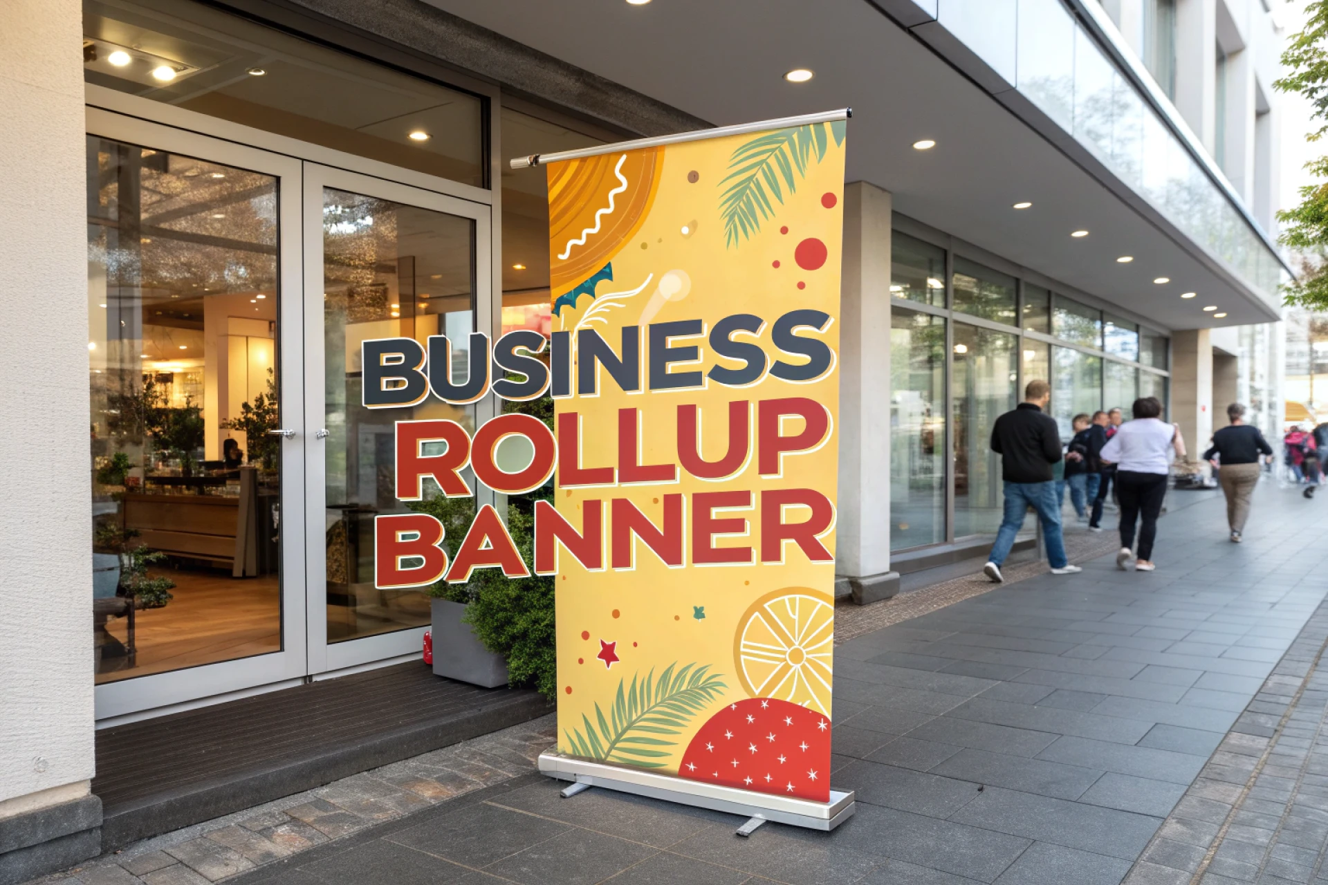
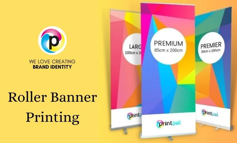
Roller banners come in different sizes, and choosing the right one depends on the space you are working with. Standard roller banners are tall and narrow, which makes them perfect for doorways, reception areas, trade shows, and retail counters. Larger roller banners attract attention from a greater distance, while smaller banners are ideal for compact spaces.
The orientation should usually stay vertical because people naturally read content from top to bottom. A vertical layout also makes the banner look professional and easy to scan quickly.
When selecting the size, imagine your customer’s journey. Think about where they will stand, how far they will be, and how quickly they need to understand your message. This small visualization exercise helps you choose a size that matches real life conditions.
How Do You Use Colour in a Way That Attracts Attention?
Colour plays a major role in capturing attention. The goal is not to use as many colours as possible but to use the right colours in a smart way.
Choose colours that match your brand identity. People should immediately associate the banner with your business. Use contrast to make the main message pop. For example, a dark background works well with bright text, while a light background works well with bold colours.
Colour psychology also influences emotional response. Blue creates trust, red creates energy, green creates calmness, and yellow creates optimism. When you use colours thoughtfully, the banner not only looks attractive but also communicates the right feeling.
Keep the colour palette simple. Too many colours can make the banner look crowded. A clean design feels premium, professional, and easy to read.
What Is the Best Way to Arrange the Content on Your Banner?
A roller banner follows a simple reading pattern. People start from the top, move to the middle, and then finish at the bottom. This is why your most important message should always be placed at the top where it grabs attention first.
Place your logo at the top so people know who is speaking. Next, include a clear headline that describes your main message. The headline should be short, strong, and easy to scan. Supporting information such as features, benefits, or event details should come in the middle. The bottom section is ideal for contact information, website links, QR codes, or social media handles.
The layout should feel breathable. Leave enough empty space around text and images so the banner feels organised. Remember that less is more. If your banner looks crowded, the viewer loses interest quickly.
How Important Are Images and Graphics?
Images and graphics can make your roller banner instantly more appealing, but they must be used with intention. Choose high resolution images so that they print clearly. Low quality images look blurry when enlarged and can damage your brand impression.
Use graphics that support your message rather than distract from it. Icons are helpful for illustrating quick points. A single strong image often performs better than multiple unrelated images. If you are promoting a product, show it clearly. If you are promoting a service, choose visuals that express the result or the feeling you want customers to experience.
Avoid using too many stock photos that do not match your brand. Authentic visuals feel more trustworthy, and trust is a major factor in converting viewers into customers.
What Font Should You Use for Maximum Readability?
Readability is the heart of effective banner design. No matter how beautiful your banner looks, it fails if people cannot read it easily.
Use clean, bold fonts that remain readable from a distance. Sans serif fonts are usually the best choice for roller banners because they look modern and clear. Use one or two font styles across the banner to maintain consistency.
Font size should be chosen based on viewing distance. The headline should be large enough to read instantly even when someone walks past. Supporting text should be slightly smaller but still clear. Avoid long paragraphs. Use short, meaningful lines that communicate quickly.
What Type of Material Gives the Best Results?
Roller banners are usually printed on strong PVC material or premium non curl film. Both options have their own benefits.
PVC banners are durable, easy to transport, and suitable for regular use. Non curl film offers a smoother finish and resists bending at the edges. This material looks more elegant and professional for events or exhibitions.
The printing quality also matters. High resolution printing brings out vibrant colours and sharp details. If you plan to reuse the banner multiple times, invest in high quality printing because it keeps the banner looking new for longer.
How Do You Make Your Banner Stand Out in Busy Environments?
If your banner will be placed in a crowded environment such as a trade show, you need to add elements that make it stand out. A bold headline, a bright colour accent, or a powerful visual can catch attention quickly.
You can also use unique design elements such as angled lines, modern shapes, or a strong focal point that guides the viewer’s eyes. The goal is to create a banner that stops people for a few seconds. Those few seconds can turn them into potential customers.
Conclusion
Creating an eye catching roller banner does not require complex design skills. With the right message, simple layout, high quality visuals, readable text, and thoughtful material choice, any business can create a banner that attracts attention and communicates clearly.
A roller banner is more than a display. It is a marketing tool that works silently but effectively wherever you place it. When designed well, it becomes a long term asset that supports your brand, increases visibility, and helps you reach new customers.
Sign in to leave a comment.