User Interface (UI) design is at the heart of your ecommerce store’s success. The difference between a customer completing a purchase or bouncing off your product page often comes down to subtle UI decisions—button colors, layout changes, image placement, and micro-interactions.
But how do you know what actually works?
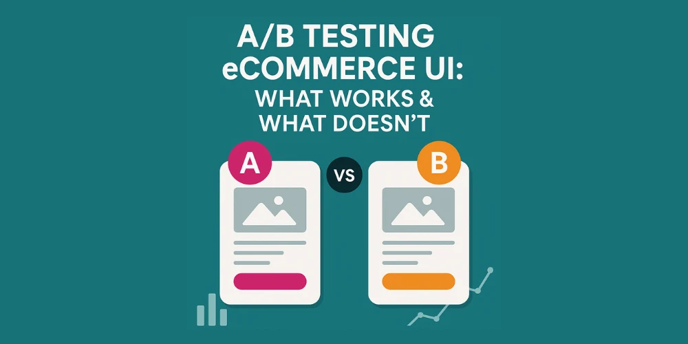
Enter A/B testing.
Also known as split testing, A/B testing is one of the most powerful tools in your ecommerce toolkit. It takes the guesswork out of design and gives you real-world feedback on what helps (or hurts) conversions.
In this guide, we’ll cover:
- What A/B testing is (and isn’t)
- UI elements worth testing on your ecommerce site
- What usually works—and what usually doesn’t
- How a professional ecommerce web design company approaches UI experimentation
- Tools, metrics, and timelines for better results
What Is A/B Testing?
A/B testing is the process of comparing two versions of a webpage, UI element, or flow to see which one performs better in terms of a specific goal—typically conversions.
You split your traffic between Version A (control) and Version B (variant) and collect performance data (clicks, add-to-carts, purchases, etc.).
What makes A/B testing powerful is that it’s data-driven, not opinion-based. Instead of debating design changes, you let your users decide.
Why A/B Testing Matters in eCommerce
Small changes in your ecommerce UI can lead to significant revenue shifts.
For example:
- A button color change increased one DTC brand’s conversions by 15%
- Reordering product thumbnails increased engagement by 30%
- A simplified checkout form dropped cart abandonment by 20%
Yet, without A/B testing, many of these improvements would never be identified.
Top-performing ecommerce brands—and every savvy ecommerce website design company—build testing into their ongoing optimization strategy.
What UI Elements Should You A/B Test?
While technically you can test anything, these are the highest impact UI elements worth testing on your ecommerce store:
1. Call-to-Action (CTA) Buttons
- Color, size, wording, and placement
- Example: “Add to Cart” vs. “Buy Now”
- What to track: CTR, add-to-cart rate, conversion rate
2. Product Page Layout
- Image position, description length, tabbed vs. stacked info
- Example: Does showing reviews before the fold increase conversions?
3. Navigation Menu
- Sticky vs. static menus
- Mega menu vs. dropdown
- What to track: bounce rate, session depth
4. Homepage Hero Section
- Static image vs. video
- Promotional banner vs. product carousel
- What to track: click-through rate, scroll depth
5. Checkout UI
- Single-page vs. multi-step checkout
- Guest checkout visibility
- Payment icons and trust badges
This is where working with an ecommerce web design company can truly accelerate your ROI—they’ve seen what works across different industries and can prioritize tests that matter.
What Usually Works (Proven A/B Testing Wins)
While results vary by brand, here are some UI tactics that often show positive impact across ecommerce verticals:
✅ Simplified Navigation
Too many links or dropdowns overwhelm users. Cleaner menus often reduce bounce and increase exploration.
✅ Clear CTAs
Buttons that contrast with the background and use active language (e.g., “Get Yours Now” instead of “Submit”) tend to convert better.
✅ High-Quality Product Photos
Larger, zoomable images with lifestyle context (vs. plain studio shots) boost add-to-cart rates.
✅ Urgency Messaging
Countdown timers, low-stock alerts, and delivery cutoffs add urgency and increase conversions.
✅ Trust Signals
Adding reviews, security badges, and “free returns” messaging near key action points reassures shoppers.
Professional ecommerce website design companies often bake these principles into their first round of A/B testing.
What Usually Doesn’t Work (or Hurts Performance)
A/B testing isn’t just about wins—it’s about finding what doesn’t work, too. Here are common pitfalls:
❌ Autoplay Videos Without Controls
These often spike bounce rates, especially on mobile.
❌ Overly Minimal Design
While clean design is good, hiding critical information (like pricing or shipping) behind tabs can hurt trust.
❌ Too Many Pop-ups
Exit intent pop-ups can be useful, but stacking pop-ups (newsletter, promo, survey) frustrates users.
❌ Trendy Design for the Sake of It
Dark mode, floating carts, or fancy animations don’t always work in ecommerce. Always test before going all-in.
These are the kinds of missteps a seasoned ecommerce web design company will help you avoid from day one.
How to Set Up an A/B Test (Step-by-Step)
- Identify Your Goal
- What are you optimizing? (Click rate, conversions, cart value?)
- Pick One Variable
- Test only one element at a time to isolate results.
- Create Version B
- Use design tools, custom code, or A/B platforms (like Google Optimize or VWO).
- Split Your Traffic
- 50/50 is typical, but small sites may use 70/30 to learn faster.
- Run the Test
- Run for at least 2 weeks or until statistically significant.
- Analyze & Implement
- If the variant outperforms, push it live. If not, test again.
Metrics to Track
- Conversion Rate
- Click-Through Rate (CTR)
- Add-to-Cart Rate
- Bounce Rate
- Scroll Depth
- Time on Page
- Revenue Per Visitor (RPV)
An expert ecommerce web design company will help you connect these results to business KPIs—not just vanity metrics.
Tools for A/B Testing Your Ecommerce UI
You don’t need to reinvent the wheel. Here are tools commonly used for split testing:
- Google Optimize (sunsetting, but still in use)
- VWO (Visual Website Optimizer)
- Optimizely
- Convert.com
- Hotjar (for pre-test insights)
- Shopify A/B Test Apps like Neat A/B or Intelligems
Many ecommerce website design companies also integrate A/B testing into custom headless builds via frameworks like React or Vue.
Final Thoughts: Test with Purpose, Design with Data
A/B testing isn’t a one-time project—it’s a continuous optimization mindset. With user expectations rising and competition fierce, guessing is expensive. Data is your safest bet.
The best-performing stores constantly iterate, test, and refine their UI based on real customer behavior.
If you want real growth—not just a pretty redesign—partnering with an ecommerce web design company that deeply understands UI/UX testing can fast-track your success.


Sign in to leave a comment.