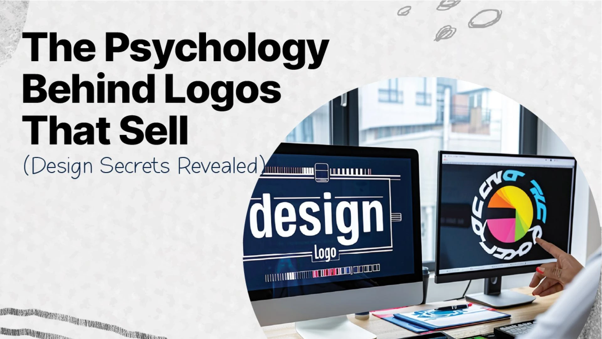
If you’re starting a new business or rebranding an existing one, one of the first things you’ll need is a logo. But not just any logo—what you need is an attractive logo design that captures attention, builds recognition, and communicates your brand identity instantly.
While it might seem like a simple graphic, your logo is a powerful psychological tool. It can build trust, evoke emotions, and even drive customer loyalty when done right.
So, what makes a logo truly attractive? Let's dive into the design psychology, branding secrets, and practical steps behind creating a logo that does more than just look good—it performs
1. Understand Your Brand Before You Design
Before putting pencil to paper or mouse to screen, the first step is clarity. A great logo starts with a deep understanding of your brand.
Ask yourself:
- What is your brand’s vision and mission?
- What values do you want to communicate?
- Who is your ideal customer?
Your logo is not your brand—it's a symbol of your brand. An attractive logo design must reflect what your brand stands for, not just what it sells. Without this clarity, you risk designing something that looks nice but says nothing.
2. Research Your Industry and Competitors
Successful logo designs don’t live in a vacuum. Study your competitors to understand common themes—and then look for opportunities to stand out.
- What colors and fonts are overused?
- Which logos feel outdated?
- What can you do differently?
This research helps you avoid clichés and identify gaps in visual branding. It also gives you insight into how to differentiate your logo while staying relevant to your industry.
3. The Key Elements of an Attractive Logo Design
To make your logo resonate, each design choice needs to be intentional. Let’s break down the elements:
Typography
Fonts set the tone of your brand. Serif fonts suggest tradition and reliability, while sans-serif fonts feel modern and clean. Custom typography can make your logo unique and instantly recognizable.
Color Psychology
Color influences perception. Here’s a quick guide:
- Red: Passion, urgency
- Blue: Trust, professionalism
- Green: Growth, nature
- Black: Sophistication, power
- Choose 1–3 brand colors and stick to them across all platforms for consistency and recall.
Shapes and Icons
Shapes evoke emotions too. Circles feel inclusive, triangles indicate motion, and squares express stability. An icon (if used) should be relevant and symbolic, not just decorative.
4. Sketch First, Design Later
Never jump straight into software. Start by sketching multiple concepts on paper. This frees your creativity and helps explore different directions quickly.
Once you have a few promising options, move them into digital design tools and start refining. Use your brand research and mood board as a guide.
Test your design at various sizes, on light and dark backgrounds, and across mockups like business cards, websites, and social profiles to ensure versatility.
5. Refine Until It’s Just Right
Even the best logo ideas need polishing. As you refine:
- Keep it simple: An attractive logo design should be clear and identifiable at a glance.
- Make it memorable: Avoid generic icons or fonts.
- Ensure it’s scalable: It should work on a billboard and on a mobile screen.
Avoid these common mistakes:
- Using too many elements or fonts
- Following design trends that will age quickly
- Copying competitors (this can even lead to legal issues)
6. Get Feedback and Iterate
Before finalizing your logo, share it with team members, potential customers, or mentors. Ask:
- What emotion does it evoke?
- Is it easy to remember?
- Does it look professional?
Constructive feedback helps ensure your design works not only for you but also for your target audience.
Conclusion: Design That Speaks Without Saying a Word
An attractive logo design isn’t just about aesthetics—it’s about psychology, strategy, and clarity. It’s your brand’s first impression, business card, and visual handshake rolled into one. Done right, it becomes a powerful asset that builds recognition and trust over time.
If you're unsure where to begin or struggling to translate your brand into a visual identity, you're not alone.
At Four Pillars Media Agency, we specialize in creating brand-first logo designs that are not only beautiful but effective. Let us help you craft a logo that reflects your vision, resonates with your audience, and stands the test of time.
Ready to make your brand unforgettable?
Contact us today for custom logo design solutions.
FAQs
1. What makes a logo attractive?
Simplicity, memorability, relevance, and emotional connection. A great logo is clear, aligned with your brand, and instantly recognizable.
2. How long does it take to design a logo?
It typically takes 1 to 3 weeks, depending on the complexity and number of revisions.
3. Should I follow logo trends?
Not necessarily. Trends fade, but timeless logos last. Focus on clarity, purpose, and uniqueness.
4. What are the main types of logos?
- Wordmark (e.g., Google)
- Lettermark (e.g., IBM)
- Brandmark (symbol-based, like Apple)
- Combination Mark (text + symbol)
- Emblem (text inside a symbol)
- Mascot (character-based)


Sign in to leave a comment.