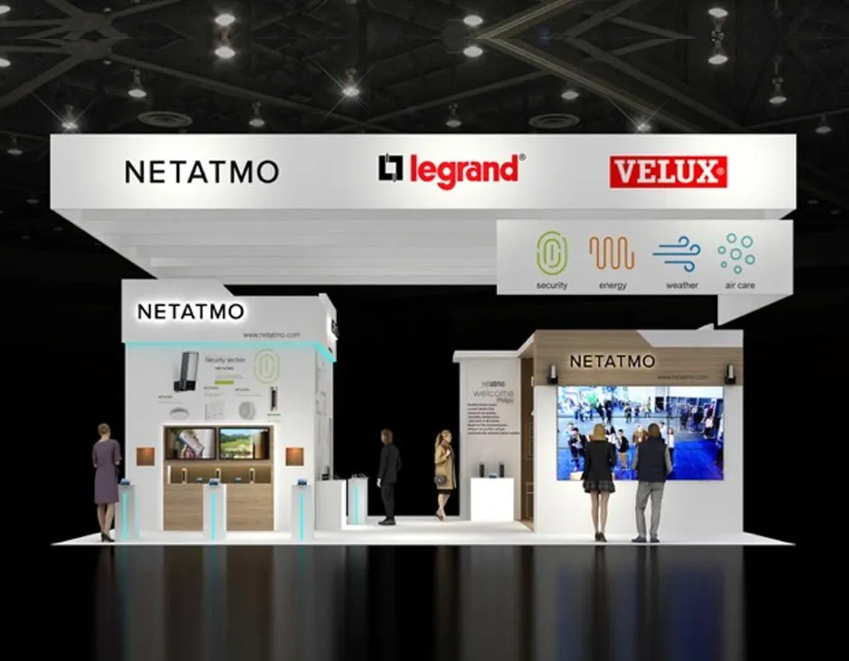

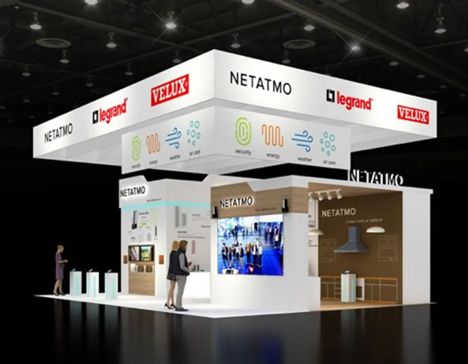
Stepping up to a 30x40 trade show booth rental should feel like a win, more space, more visibility, more room to make an impression. Instead, many exhibitors walk onto the show floor and get the opposite reaction: a booth that looks hollow, underused, and less energetic than the 20x20 they had the year before. At 1,200 square feet, empty space stops being a design choice and starts becoming a visible problem if it isn't planned for deliberately.
This is one of the most common complaints exhibitors have after their first large-format show, and it's almost always fixable with better planning, not more furniture.
Why Bigger Booths Feel Emptier, Not Fuller
The instinct when moving into a larger footprint is to think you now have "extra" space to fill. In reality, a 30x40 exhibit booth simply has more visual real estate for attention to get lost in. A cluster of staff and furniture that looked substantial in a 20x20 can look sparse and scattered across 1,200 square feet if it isn't positioned deliberately. The problem isn't a lack of stuff, it's a lack of visual anchoring across a much bigger canvas.
Industry design guidance consistently points to roughly 40% open floor space as the right ratio for comfortable traffic flow, both in booth layout and in graphic design. The mistake exhibitors make in a 30x40 is treating that 40% as "leftover" space rather than as a deliberate design element. Left unplanned, that open space reads as empty rather than intentional.
Break the Footprint Into Zones, Not One Big Room
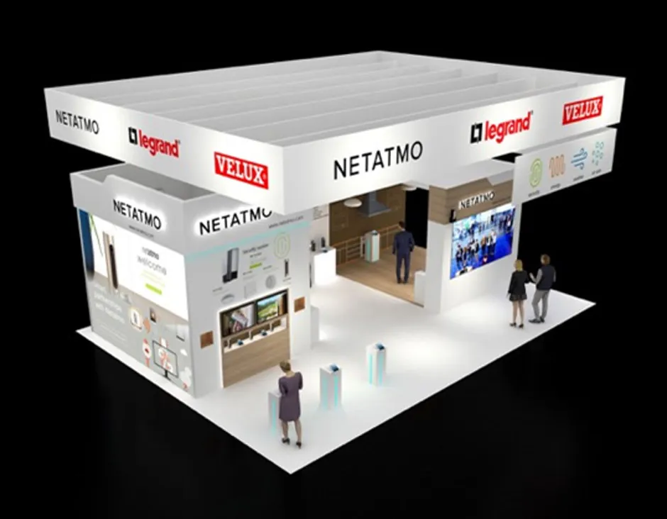
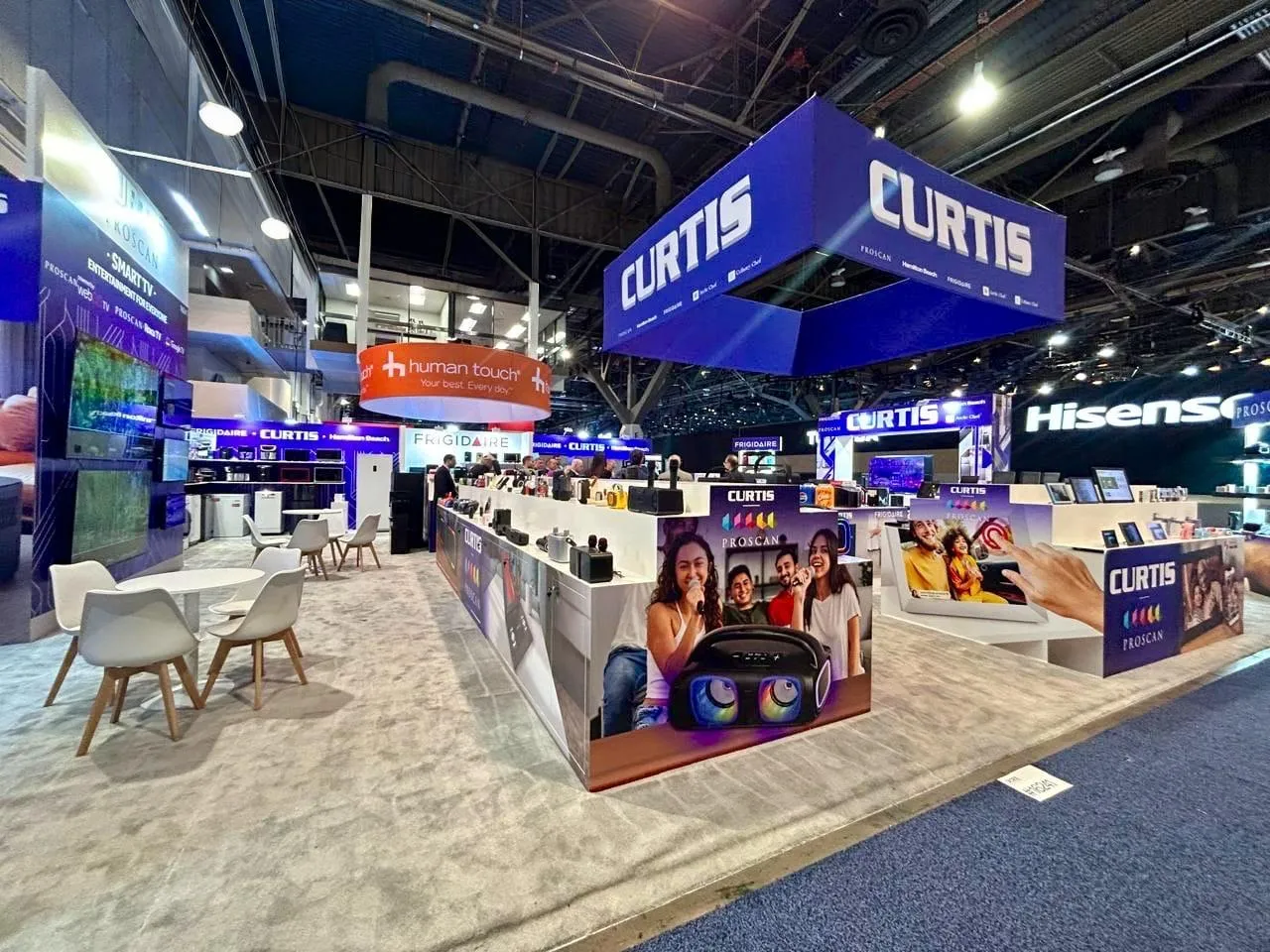
The single most effective fix for the empty-feel problem is refusing to treat your 30x40 booth design as one continuous open area. Instead, divide it into purposeful zones, each with its own visual weight:
- A welcome/reception zone near the entrance that immediately signals activity
- A demo or product zone with a clear focal point, a stage, a screen, or a hands-on display
- A conversation or lounge zone for longer, seated discussions
- A meeting room or private zone, if your sales process needs it
Each zone should feel complete on its own, with its own furniture grouping, lighting, and graphics. When visitors look across a 30x40 footprint, they should see a series of purposeful spaces rather than one large room with furniture scattered through it.
Use Vertical Elements to Fill the Space Without Cluttering the Floor
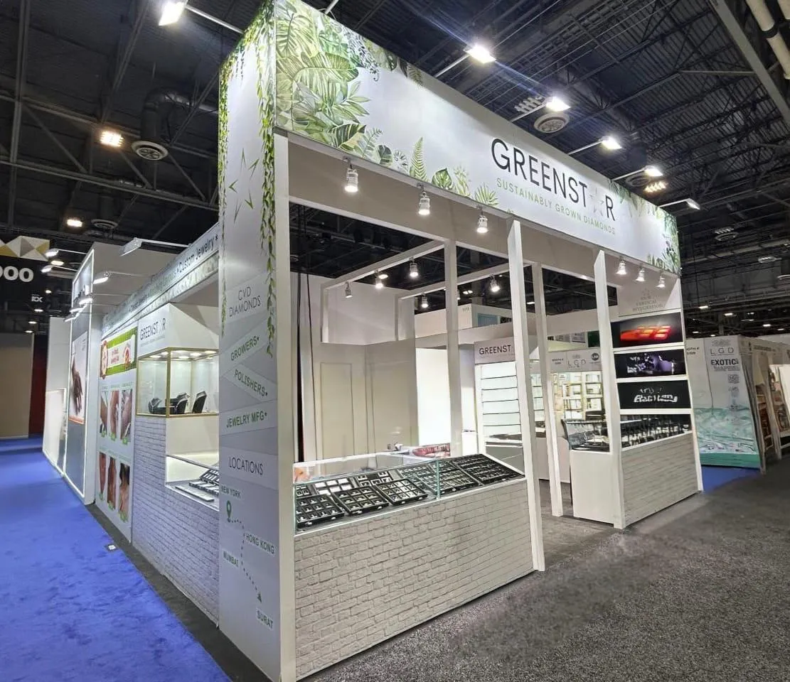
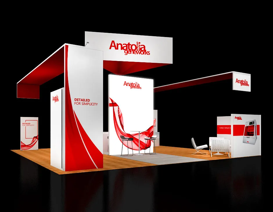
One of the most reliable ways to make 30x40 trade show displays feel substantial without overcrowding the floor is to build upward instead of outward. Tall structural elements, hanging signs, backlit towers, elevated graphics, draw the eye above eye level and make the booth feel anchored from across the aisle, without eating into the open floor space visitors need to move comfortably. A booth that only uses horizontal furniture at floor level will always feel flatter and emptier than one that also commands vertical space.
Keep the Center Open, Not the Perimeter
A common instinct is to place furniture and displays in the middle of the booth, leaving the edges bare. This does the opposite of what a large footprint needs. The better approach is to push functional elements, counters, seating, demo stations, toward the perimeter, and keep the center of the booth open and walkable. An open center reads as inviting and active rather than empty, because visitors can see clear sightlines through the space and a natural path to every zone around them.
Match Staffing Density to the Footprint
A 1,200 square foot booth with three staff members scattered across it will almost always look and feel deserted, regardless of how well it's designed. Staffing density needs to scale with square footage, not stay flat from your previous, smaller booth. If your team headcount hasn't grown along with your 30X40 Trade Show Booth, the space itself will visually expose the gap, wide-open areas with nobody in them are the fastest way to signal "empty" to a passing visitor, even if the design is otherwise strong.
Let Lighting Do Some of the Work
Uniform, flat lighting across a large footprint makes every part of the booth feel equally low-energy. Layered lighting, brighter, more dramatic light on focal zones like the demo area or reception, softer ambient light elsewhere, creates visual hierarchy and makes the booth feel active and considered rather than evenly, blandly lit. This is especially important in a rental booth, where lighting can often be adjusted more easily than structural elements.

Add Movement and Interaction, Not Just More Furniture
Static displays are the quickest way for a large booth to feel dead, no matter how much furniture fills the floor. Interactive elements, a touchscreen demo, a live product walkthrough, a short scheduled presentation, create visible activity that draws attention from a distance and gives visitors a reason to stop rather than glance and move on. A 30x40 footprint with one or two points of ongoing activity will consistently feel more alive than one filled with passive signage and empty seating.
The Quick Checklist
Before your next show, walk your 30x40 trade show booth rental floor plan and check for these five things:
- Is the space broken into distinct, purposeful zones rather than one open area?
- Are vertical elements pulling visual weight above floor level?
- Is the center of the booth open, with furniture pushed toward the perimeter?
- Does your staffing headcount match the size of the footprint?
- Is there at least one active, moving, or interactive element visitors can see from the aisle?
A large booth doesn't need to be filled to feel full, it needs to be organized so that every part of it reads as intentional. Get the zoning, verticals, staffing, and lighting right, and 1,200 square feet stops feeling empty and starts feeling like the upgrade it's supposed to be.















Sign in to leave a comment.