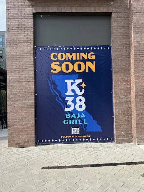

In a world full of visual noise, simply having a banner isn’t enough—you need one that commands attention and communicates your message instantly. Whether you’re promoting a grand opening, showcasing a sale, or representing your brand at an event, well-designed personalized banners can make the difference between being ignored and being remembered.
Below are practical, proven design strategies to help your banners stand out and deliver real results.
1. Start With a Clear Objective
Before diving into colors and fonts, define the purpose of your banner. Are you trying to drive foot traffic, promote a limited-time offer, or build brand awareness? Your goal should dictate every design decision.
A banner advertising “50% OFF THIS WEEKEND” will look very different from one focused on long-term branding. Keep your objective narrow and focused—clarity always outperforms clutter.
2. Keep Your Message Short and Impactful
People typically glance at banners for just a few seconds—especially if they’re driving or walking past. That means your message needs to be concise and easy to digest.
Aim for:
- A strong headline (5–7 words max)
- A short supporting line (optional)
- A clear call-to-action
Avoid overcrowding your banner with too much text. If your audience has to stop and read paragraphs, you’ve already lost their attention.
3. Use Bold, Readable Fonts
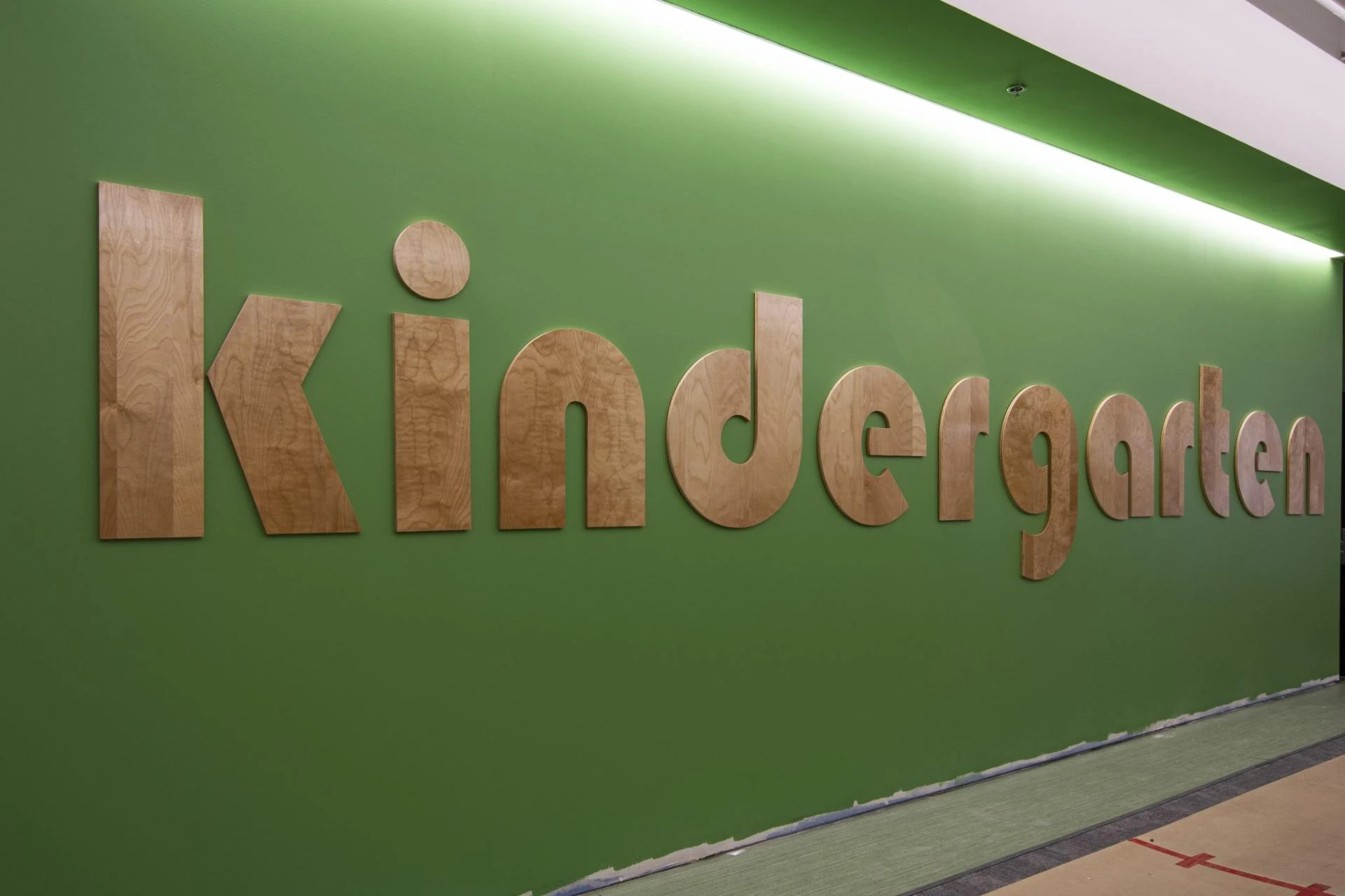
Typography plays a critical role in banner effectiveness. Decorative fonts might look appealing up close, but they often fail at a distance.
Stick with:
- Sans-serif fonts for readability
- Large font sizes for headlines
- Consistent font styles (limit to 1–2 fonts max)
Make sure your text can be read from the intended viewing distance. A good rule of thumb: every inch of letter height equals about 10 feet of readability.
4. Prioritize High Contrast Colors
Color contrast is what makes your message pop. If your text blends into the background, even the best message will go unnoticed.
Effective combinations include:
- Dark text on a light background
- Light text on a dark background
- Complementary colors that stand out
Avoid placing bright text on busy or patterned backgrounds. Simplicity and contrast always win when it comes to visibility.
5. Focus on Visual Hierarchy
Not all elements on your banner should have equal weight. Guide the viewer’s eye by structuring your design with a clear hierarchy:
- Headline (largest and boldest)
- Supporting message
- Call-to-action
- Logo or branding
This ensures that even a quick glance communicates the most important information first.
6. Incorporate High-Quality Images (When Necessary)
Images can enhance your banner—but only if they’re high resolution and relevant. Blurry or pixelated graphics instantly reduce credibility.
Use images to:
- Showcase products
- Create emotional appeal
- Reinforce your message
If the image doesn’t add value, skip it. A clean, text-focused banner is often more effective than one overloaded with visuals.
7. Don’t Ignore White Space
One of the most common mistakes in banner design is trying to fill every inch of space. White space (or negative space) is essential for readability and visual balance.
It helps:
- Separate key elements
- Improve comprehension
- Create a more professional appearance
A cluttered banner feels overwhelming, while a well-spaced design feels intentional and polished.
8. Include a Strong Call-to-Action (CTA)
Every banner should tell the viewer what to do next. Without a clear CTA, even the most eye-catching design won’t drive results.
Examples include:
- “Visit Us Today”
- “Call Now”
- “Shop Online”
- “Limited Time Offer”
Make your CTA prominent and easy to understand. Urgency can also improve response rates.
9. Optimize for Placement and Viewing Distance
Where your banner will be displayed matters just as much as how it looks.
Consider:
- Indoor vs. outdoor placement
- Viewing distance
- Lighting conditions
- Mounting height
For roadside banners, prioritize large text and minimal details. For indoor events, you can include slightly more information since viewers are closer.
10. Stay Consistent With Your Brand
Your banner should feel like an extension of your brand—not a one-off design. Use consistent:
- Brand colors
- Logo placement
- Tone and messaging
- Visual style
This reinforces brand recognition and builds trust with your audience over time.
Final Thoughts
High-impact personalized banners don’t happen by accident—they’re the result of intentional design choices that prioritize clarity, visibility, and audience engagement. By focusing on strong messaging, clean layouts, and strategic use of color and typography, you can create banners that not only get noticed but also drive action.
If your current banners aren’t delivering results, it may be time to rethink your design approach. A well-executed banner is more than just signage—it’s a powerful marketing tool that works for your business 24/7.


















Sign in to leave a comment.