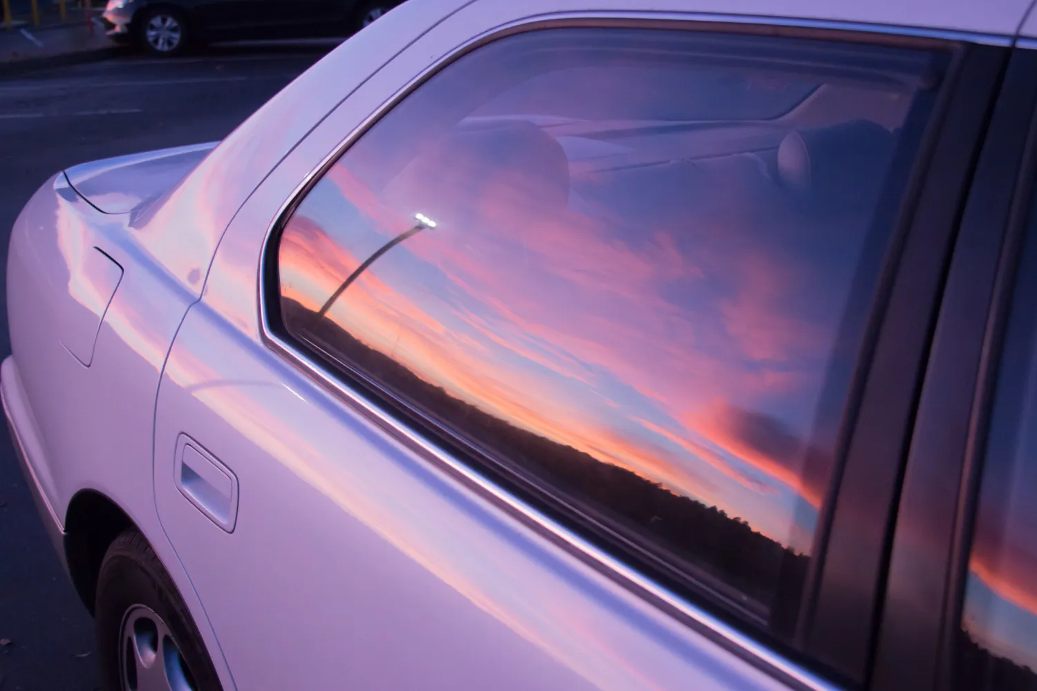

Colour can change how a car looks. It can also change how people see a brand on the road. This is why colour matters when you choose custom Car Rear Window Graphics in Sydney.
A good colour choice can make a design clear, bold, and easy to remember. The wrong mix can make the graphic hard to read. For businesses, this may affect how well people notice the brand.
From bright tones to soft shades, each colour can create a different look. Let’s explore how colour can shape your rear window graphics.
Why Colour Matters in Car Window Graphics
A rear window graphic has a small space to work with. Your design must be clear from a distance. Colour helps separate text, logos, images, and other design parts.
Strong colour contrast can help key details stand out. For example, dark text may be hard to see on a dark vehicle. A light colour can make the same text easier to read.
Colour can also set the mood of the design. Bright colours may feel fun and bold. Dark shades may give a more clean and smart look.
The best choice depends on your brand, vehicle, and target audience.
Bright Colours Can Grab Attention
Bright colours can help a vehicle stand out in traffic. Red, yellow, orange, and bright green can catch the eye fast.
These colours can work well for brands that want a bold look. They can also help important words or shapes stand out.
However, using too many bright colours can make the design look busy. A simple colour plan is often easier to understand.
For example, a company logo may use one bright colour with black or white text. This creates a clear design without too much visual noise.
Dark Colours Can Create a Strong Look
Dark colours can give car rear window graphics a clean and bold feel. Black, dark blue, grey, and deep green are common choices for modern designs.
Dark shades can work well with light text and simple logos. This creates strong contrast and makes key details easier to read.
Dark designs can also match vehicles with black, grey, or deep paint colours. Still, the graphic must have enough contrast with the rear window.
A professional design should always consider both the window and the vehicle colour.
Contrast Helps People Read Your Message
Colour contrast is one of the most important parts of a vehicle graphic.
Imagine white text on a black background. The text is easy to see. Now imagine dark blue text on a black background. The words may be much harder to read.
Good contrast helps people understand your message while your vehicle is moving or parked.
This is especially important for business graphics. Your company name, phone number, website, or short message should be easy to spot.
A clear design can help people take in your message in just a few seconds.
Think About Your Vehicle Colour
The colour of your vehicle can affect your graphic design. A graphic that looks great on a white car may look very different on a black car.
For light-coloured vehicles, darker graphics may create strong contrast. For dark vehicles, white or bright colours may work better.
You should also think about the rear window itself. Window tint can change how colours look. A shade that seems bright on a design screen may look darker once installed.
This is why it helps to plan the full design before printing.
Brand Colours Can Build Recognition
Businesses often have set brand colours. These colours may appear on their website, signs, uniforms, packaging, and social media.
Using the same colours on custom car rear window graphics can help create a consistent brand look.
For example, a local service business may use its main brand colour on the logo and contact details. People may then connect the vehicle with the business more easily.
Brand consistency also makes the design look more professional. Your vehicle becomes another part of your wider marketing plan.
Use Colour to Highlight Key Details
Not every part of a rear window graphic needs the same colour.
You can use one main colour for the background. Another colour can highlight the company name. A third shade can be used for small details.
This helps guide the viewer's eyes.
For example, you could make the business name bold and bright. The phone number could use a simple white shade. Supporting text could stay smaller and less bold.
This colour hierarchy helps people find the most important information first.
Keep the Design Easy to See
A rear window graphic should not look crowded. Too many colours, shapes, and words can make the design hard to follow.
Try to keep the colour palette simple. Two or three main colours may be enough for many designs.
Large text, clean shapes, and strong contrast can also improve visibility.
Remember that people may see your vehicle from far away. They may only have a few seconds to notice the graphic.
A simple design can often make a stronger impact than a complex one.
Colour and Your Target Audience
Think about who will see your vehicle graphics.
A children's service may use bright and friendly colours. A law firm may prefer a more simple and formal colour scheme. A fitness brand may choose strong and energetic shades.
There is no single colour that works for every business.
Your choice should match your brand style and the message you want to share. It should also fit the type of service you provide.
This makes the graphic feel more natural and connected to your business.
In Conclusion: Make Your Rear Window Graphic Work for You
A well-planned colour scheme can improve the look and function of your vehicle graphic. It can help your logo stand out, improve text visibility, and support brand recognition.
When choosing custom Car Rear Window Graphics in Sydney , think beyond the colour you like most. Consider contrast, vehicle colour, window tint, brand identity, readability, and the message you want to share.
A smart colour choice can turn a simple rear window into a useful branding space. With the right design, your vehicle can carry a clear and memorable message wherever it goes.
Freehand Vehicle Wraps can help businesses create eye-catching vehicle graphics that match their brand and design needs.

























Sign in to leave a comment.