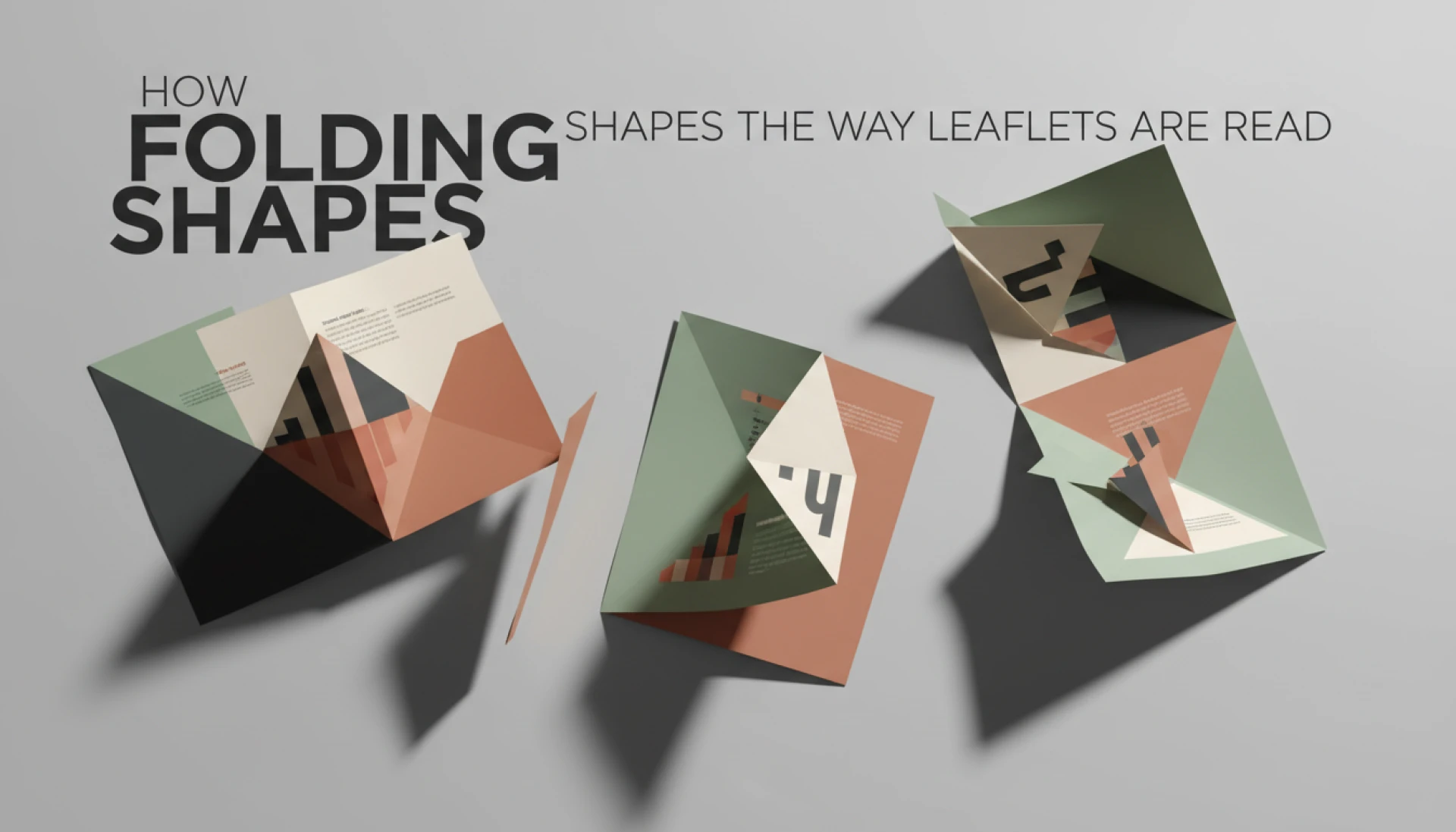
People often talk about leaflet design as if it starts and ends with visuals. Fonts, colours, images, paper. All important, yes. But the way a leaflet is folded quietly decides how it will be read long before any of those elements matter.
A folded leaflet is not consumed like a flat page. It is opened, paused, turned, partially unfolded, then either explored further or put away. That physical sequence shapes understanding, attention, and memory. If the fold works against the message, even the best design struggles.
This is why folding is not a production detail. It is part of communication.
Reading Behaviour Is Physical, Not Digital
When someone picks up a leaflet, they do not read it top to bottom. They respond to what is immediately visible.
The first panel they see sets expectations. The second panel confirms or breaks interest. The rest is earned.a
Folding introduces resistance. Each fold is a small decision point. Open further or stop. Continue or disengage.
Designers who forget this often overload internal panels, assuming everything will be read eventually. In reality, most readers only explore as far as the fold invites them.
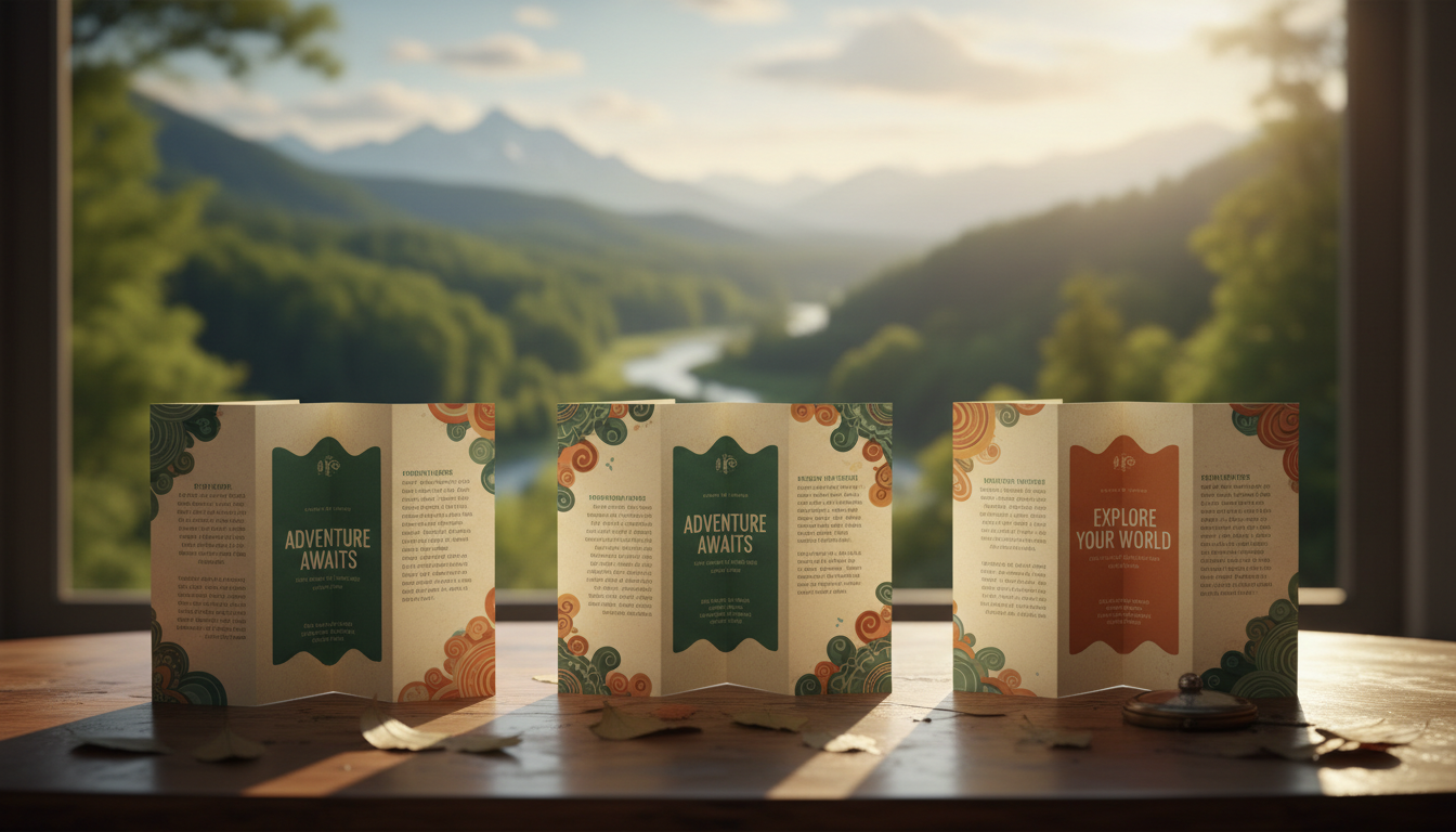
Bi Fold Leaflets and Linear Reading
Why Simplicity Often Wins

Bi fold leaflets are the most straightforward format. One fold, two main panels inside, front and back.
This format encourages linear reading. Front cover, inside spread, back panel. There is little confusion about order.
Because of this, bi fold leaflets work well for messages that need clarity rather than persuasion. Service explanations, event programmes, menus, introductions.
The risk comes when designers try to force complexity into a simple structure. Too much information inside a bi fold leaflet feels cramped and rushed. The reader senses this immediately.
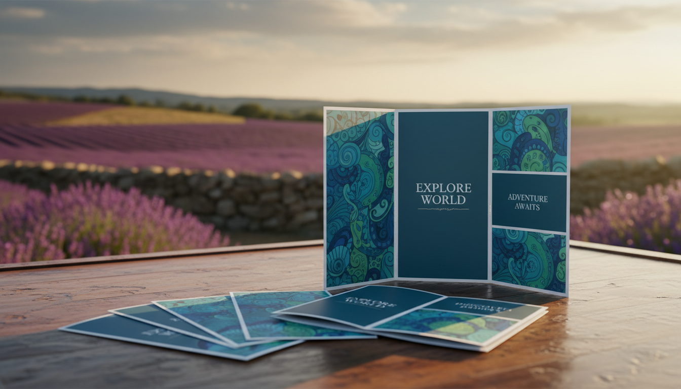
Tri Fold Leaflets and Controlled Discovery
The Illusion of Equal Panels
Tri fold leaflets look balanced on screen. In real use, they are not.
One panel becomes a narrow flap. Another becomes the natural entry point. The centre panel is only seen once the leaflet is fully opened.
This changes how information should be placed. The flap is not a headline space. It is a teaser. The centre panel is not for skimming. It is for detail.
When used correctly, tri fold leaflets create a sense of discovery. When used poorly, they scatter the message.
Why Panel Order Matters More Than Design
People often design tri fold leaflets left to right. Readers do not always open them that way. They follow curiosity, not layout logic.
Good tri fold leaflet design anticipates this behaviour and makes each panel capable of standing alone while still connecting to the whole.
Z Fold Leaflets and Non Linear Reading
Z fold leaflets open in a sequence, but they also invite skipping.
Readers can start at any panel, flip back, unfold halfway, or fully open the leaflet immediately. There is no enforced order.
This makes z fold leaflets powerful for modular information. Features, steps, options, comparisons.
It also makes them dangerous for storytelling. If the message depends on sequence, a z fold can break it.
Designing for this format means assuming the reader will not follow instructions.
Gate Fold Leaflets and the Power of Delay
Gate fold leaflets create anticipation. Two outer panels open to reveal the centre.
This pause is valuable. It gives weight to the reveal. It signals importance.
But gate fold leaflets only work when there is something worth revealing. If the centre panel does not reward the action, the fold feels unnecessary.
They are best used for premium messaging, launches, high value offers, or brand storytelling. Not for dense information or small formats.
How Size Changes the Way Folding Feels
A4 folded leaflets feel generous. Panels breathe. Text is comfortable.
A5 folded leaflets feel compact. Every decision is tighter. Margins shrink. Folding accuracy becomes more noticeable.
DL folded leaflets feel directional. They are often read vertically rather than horizontally, which changes hierarchy again.
The same fold behaves differently at different sizes. What works at A4 may fail at A5, even with identical artwork scaled down.
Folding Controls What Is Ignored
Not everything on a leaflet gets equal attention.
Back panels are skimmed. Internal folds are delayed. Outer covers carry more weight.
Designers often place legal text, secondary information, or contact details where they expect them to be ignored. That is not a mistake. It is an understanding of reading behaviour.
Problems arise when important content is accidentally treated as secondary because of fold placement.
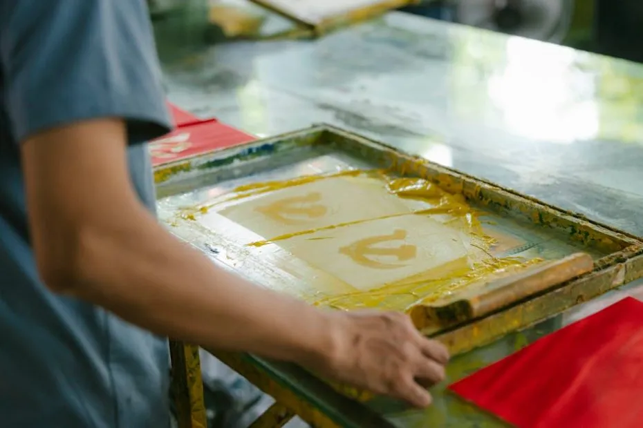
Print Reality Makes Folding Even More Important
Folds are physical. Paper has grain. Creases have limits.
Some designs look perfect flat but struggle once folded. Heavy ink coverage on fold lines cracks. Tight margins drift. Perforations weaken structure.
This affects how confidently a leaflet opens and closes. Readers feel resistance, stiffness, fragility.
A leaflet that opens smoothly feels professional. One that fights back feels cheap, even if the print quality is technically fine.
Why Templates Do Not Teach Reading Behaviour
Templates show where content can go, not how it will be read.
They do not explain hesitation points. They do not show where readers pause or stop. They do not warn you which panels are often ignored.
Using a template without understanding folding logic is like following a map without knowing the terrain.
Templates help with layout. Experience helps with communication.
Folding Is Part of the Message
Every fold communicates something before a word is read.
A single fold feels simple. Multiple folds feel complex. A gate fold feels intentional. A concertina feels informational.
Readers subconsciously respond to this. They adjust expectations based on how the leaflet behaves in their hands.
Design that works with this response feels natural. Design that fights it feels confusing.
Final Thoughts on Designing for How People Actually Read
Folded leaflets succeed when they respect human behaviour.
People skim. People hesitate. People stop early. People do not read everything.
Folding should guide attention, not demand it.
This is why experienced printers often ask about the fold before discussing colours or finishes. At I YOU PRINT, the folding decision usually comes early, because once the fold makes sense, the rest of the leaflet tends to fall into place naturally.


Sign in to leave a comment.