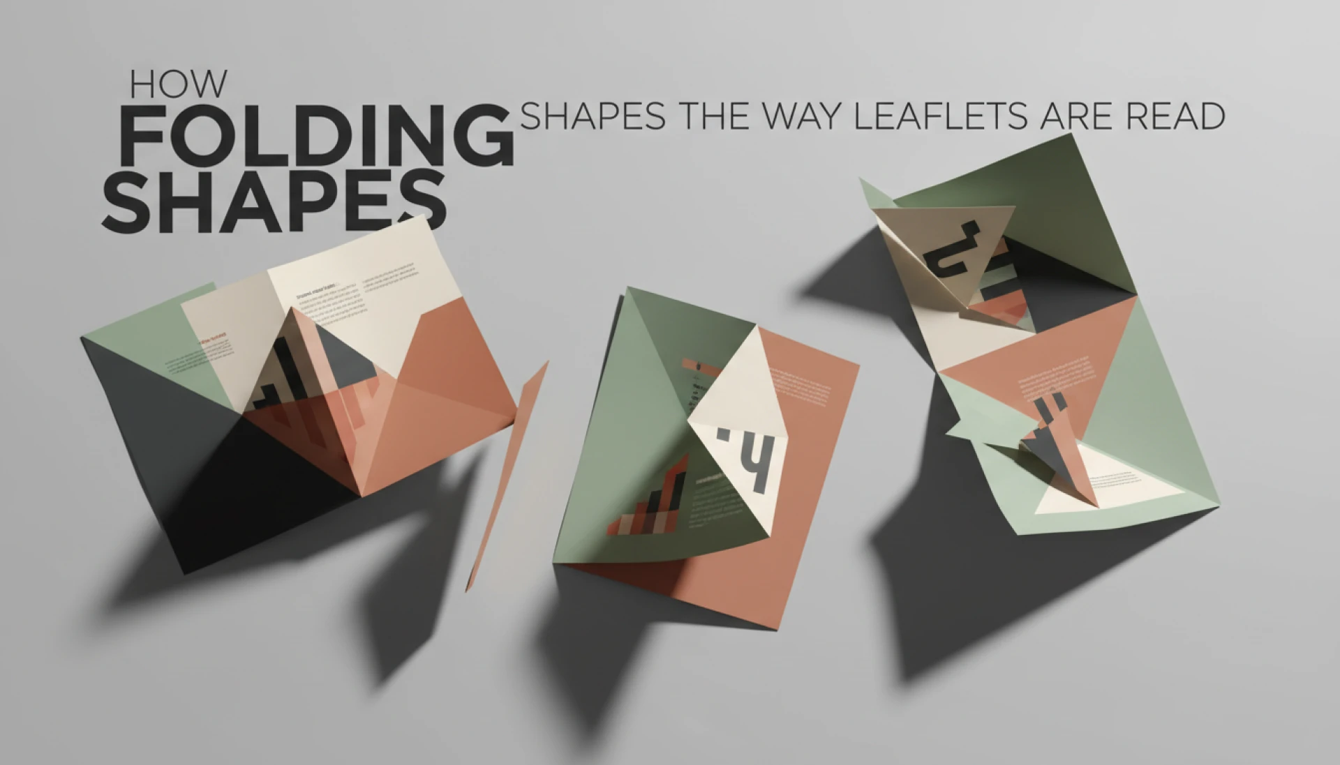
Most people think choosing a folded leaflet is a design decision.
It looks like one. It feels like one. Colours, panels, visuals, neat folds. Job done.
But the truth is, the fold you choose quietly controls everything else. How the leaflet is read. Where the eye lands. What gets ignored. What costs more. What prints smoothly. What ends up being reprinted.
And almost nobody talks about that part.
Folding decides the story, not the artwork
A folded leaflet is not read the way it is designed. That is the first thing people learn too late.
When a leaflet is flat on screen, everything looks balanced. Headings line up. Images flow. The layout feels logical. Then it gets folded, and suddenly the story breaks apart.
Panels that were meant to be read first end up hidden. Important information gets trapped inside a fold. A call to action ends up on the back where nobody looks. It is not bad design, it is bad folding logic.
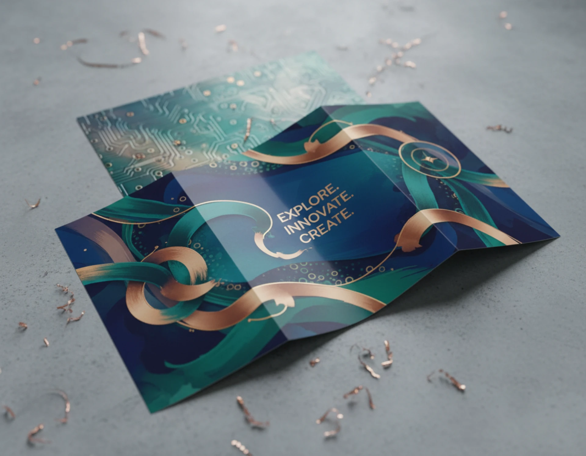
Bi fold leaflets, tri fold leaflets, z fold leaflets, gate fold leaflets, they all control reading order differently. And that order matters more than colour, typography, or even paper stock.
Most folded leaflet mistakes are not visual. They are structural.
A fold can make information disappear

This surprises people.
You can put the right message on the wrong panel and it may as well not exist.
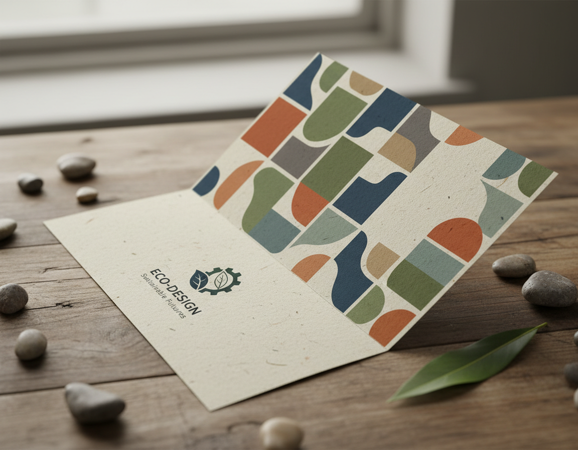
Tri fold leaflet designs are the most common example. On screen, the panels look equal. In real life, one panel becomes a narrow flap. That flap is not read like a main page. It is skimmed or ignored.
Businesses often place prices, offers, or key benefits on that flap because it “fits nicely.” Then they wonder why nobody mentions it.
Z fold leaflets behave differently again. They open in sequence, which sounds good, until you realise the reader can start anywhere. If the messaging does not stand on its own per panel, it falls apart.
The fold controls visibility long before design aesthetics do.
Not all folds suit all sizes
Another thing rarely mentioned is that certain folds only work properly at certain sizes.
A4 tri fold leaflets are forgiving. A5 tri fold leaflets are not. The panels get tight, text shrinks, folds stiffen, and suddenly everything feels cramped.
Gate fold leaflets look premium, but only when there is enough surface area to justify the reveal. On smaller sizes, the effect disappears and you are left with awkward creases and wasted space.
Concertina fold leaflets can handle more information, but only if the content is broken correctly. Otherwise they feel like a list, not a narrative.
People often choose a fold first and force the size to fit. It should be the other way around.
Folding affects print accuracy more than design software does
Design software makes folding look clean. Printing exposes reality.
Some folds are far less forgiving than others. Tight folds on thicker paper stocks crack if not creased correctly. Misaligned artwork becomes obvious on z fold and roll fold leaflets. Perforated folded leaflets introduce another layer of risk if margins are not respected.
This is where cheap folded leaflet printing often causes frustration. It is not always the print quality. It is the fold execution.
Creasing, grain direction, panel tolerance, these are invisible decisions that affect whether the finished leaflet feels professional or rushed.
Most buyers only notice this when holding the final piece in their hands.
Cost is rarely about paper alone
People ask how much folded leaflet printing costs as if the answer lives in a price list.
In reality, folding choices influence cost more than most expect.
A simple half fold leaflet is efficient. A tri fold leaflet is still economical. But add a gate fold, a cross fold, or perforation, and production changes. Setup time increases. Folding accuracy matters more. Waste increases if something goes wrong.
Express folded leaflets and same day folded leaflet printing push these costs further because there is no margin for correction.
That is why two folded leaflets printed on the same paper can have very different prices.
Templates are helpful until they are not
Free folded leaflet templates are everywhere. They are useful, but they come with assumptions.
Templates assume standard margins, ideal folding, perfect trimming. Real print does not always behave that way. If a template does not account for fold creep or panel adjustment, text can drift dangerously close to edges.
This is especially common with tri fold leaflet templates and z fold leaflet mockups. They look precise on screen but do not account for real-world tolerances.
Templates are a starting point, not a safety net.
Design trends do not always survive folding
Minimal designs look beautiful flat. They do not always survive being folded.
Large images crossing folds can distort. Full bleed backgrounds can shift. Fine lines can break at creases. What looks premium digitally can feel fragile physically.
Sometimes folded leaflet design needs restraint, not creativity. White space matters. Clear hierarchy matters. Predictable panel flow matters.
The most effective folded leaflets are often the least flashy.
The reader never unfolds everything
This is one of the hardest truths.
Most people do not fully unfold a leaflet immediately. They peek. They glance. They decide whether it is worth their time.
If the first visible panel does not speak clearly, the rest may never be seen.
That is why leaflet folding is not just about format, it is about intent. What is the first promise? What is the second? What earns the unfold?
Designers who understand this build leaflets that invite curiosity rather than demand attention.
Printers see patterns clients never do
Print shops see the same mistakes repeatedly. Panels overloaded. Fold lines ignored. Designs built for screens, not hands.
Good printers quietly adjust. They flag issues. They suggest alternatives. Not always because they want to upsell, but because they know what fails.
At I YOU PRINT, this conversation usually happens before anything goes to press. Not because the artwork is bad, but because folded leaflets behave differently once they leave the screen.
That perspective only comes from seeing thousands of jobs succeed or fail.
Folding is a decision, not a decoration
The biggest misunderstanding is treating folding as decoration.
A folded leaflet is a physical experience. It has weight. Resistance. Sequence. Reveal. Timing.
When folding is chosen last, problems appear late. When folding is chosen first, everything else aligns.
The people who get the best results are not the ones who pick the fanciest fold. They are the ones who ask how the leaflet will actually be used.
And that is the part nobody really tells you.


Sign in to leave a comment.