As we continue into 2025, Benjamin Moore has unveiled its highly anticipated Color Trends 2025 Palette, a curated selection designed to inspire interior designers and homeowners alike. Currently headquartered in Montvale, NJ, Benjamin Moore & Co. is known for its innovative approach, drawing on contemporary art, design trends, and shifting consumer preferences to craft its annual palette. The Benjamin Moore library now contains more than 3,000 colors.
This year’s collection features 10 warm, foundational colors that pair well together in a room, smoothly shifting between adjacent rooms and evoking feelings of peace and relaxation. The 2025 Color of the Year is Cinnamon Slate (2113-40), which is described as a blend of “Heathered plum and velvety brown.”
Understanding the Cinnamon Slate Palette
Key Features of the Palette
Cinnamon Slate is paired with four expertly curated hues to enhance its versatility. The two contrasting, lighter colors are Cloud Cover (OC-25), an off-white with a hint of gray, and Calm (OC-25), a soft white with a faint, lavender undertone. The two complementary colors are Porcelain (2113-60), a very light purple described as lilac, and Chambourd (AF-645), a dark, rich violet with brown undertones.
Cinnamon Slate is inspired by the popularity of reds and purples, offering a subtle option grounded by its earthy brown undertones.
Mood and Aesthetic
This palette is consistent with recent trends that reflect a transition from cooler to warmer colors, moving away from monochromatic schemes. Notably, Benjamin Moore’s Cinnamon Slate shares similarities with Behr’s Rumors (a deep red), its 2025 Color of the Year. Both colors rely on warm undertones to create depth and ambiance without overwhelming boldness.
Practical Applications for Home Design
Wall Colors and Accent Walls
Cinnamon Slate is an excellent option for a rich base wall color, particularly when paired with a neutral selection for the trim or base, like Cloud Cover (OC-25) and Calm (OC-25) for added contrast.
Accent walls are an effective means of adding a dynamic flair and creating balance, especially in living rooms or bedrooms. Depending on the intensity and direction of natural light, the combination of the base wall and accent wall colors often have a different appearance in the morning compared to the afternoon.
From the 2025 Benjamin Moore palette, Rosepine (461) is a popular accent wall color. Rosepine is described as the fusion of gray and forest green that evokes a natural, grounding effect, while the subtle hint of gray adds a touch of sophistication.
Furniture and Decor Integration
When blending with the Cinnamon Slate paint, consider accent rugs or window valances with some matching material. The Glacier White (OC-37) color might be an excellent contrast option for trim and molding if using the darker shades within the palette for larger walls.
Room-Specific Ideas
Living Room
Cinnamon Slate is ideal for the central wall of a living room, typically the focal point featuring large windows, a fireplace, and a mantle. To complement this rich tone, consider upholstered furniture in a lighter shade, such as soft gray or mauve, accented with throw pillows that incorporate hints of Cinnamon Slate to tie the space together.
Kitchens
Sea Salt (CSP-95), especially in a shiny, durable semi-gloss sheen, is a great fit from the palette for revitalizing kitchen cabinets. Containing a mix of pigments, Sea Salt is described as complex and fits well with many existing colors commonly found in kitchen flooring and countertops.
Bedrooms
Bedrooms offer an excellent chance to blend Paris Rain (1501), which is gray with hints of green, with complimentary window coverings or bedding materials. In the morning, maximize natural light to enhance the room’s ambiance, offering a soft, refreshed appearance.
Bathrooms
From the 2025 palette, Stained Glass (CSP-685) is a calm and soothing teal-like color that works well in bathrooms. Pair this color with a vanity in a Glossy White finish with a White Zeus Silestone countertop and either Polished Chrome or Champagne Brass hardware.
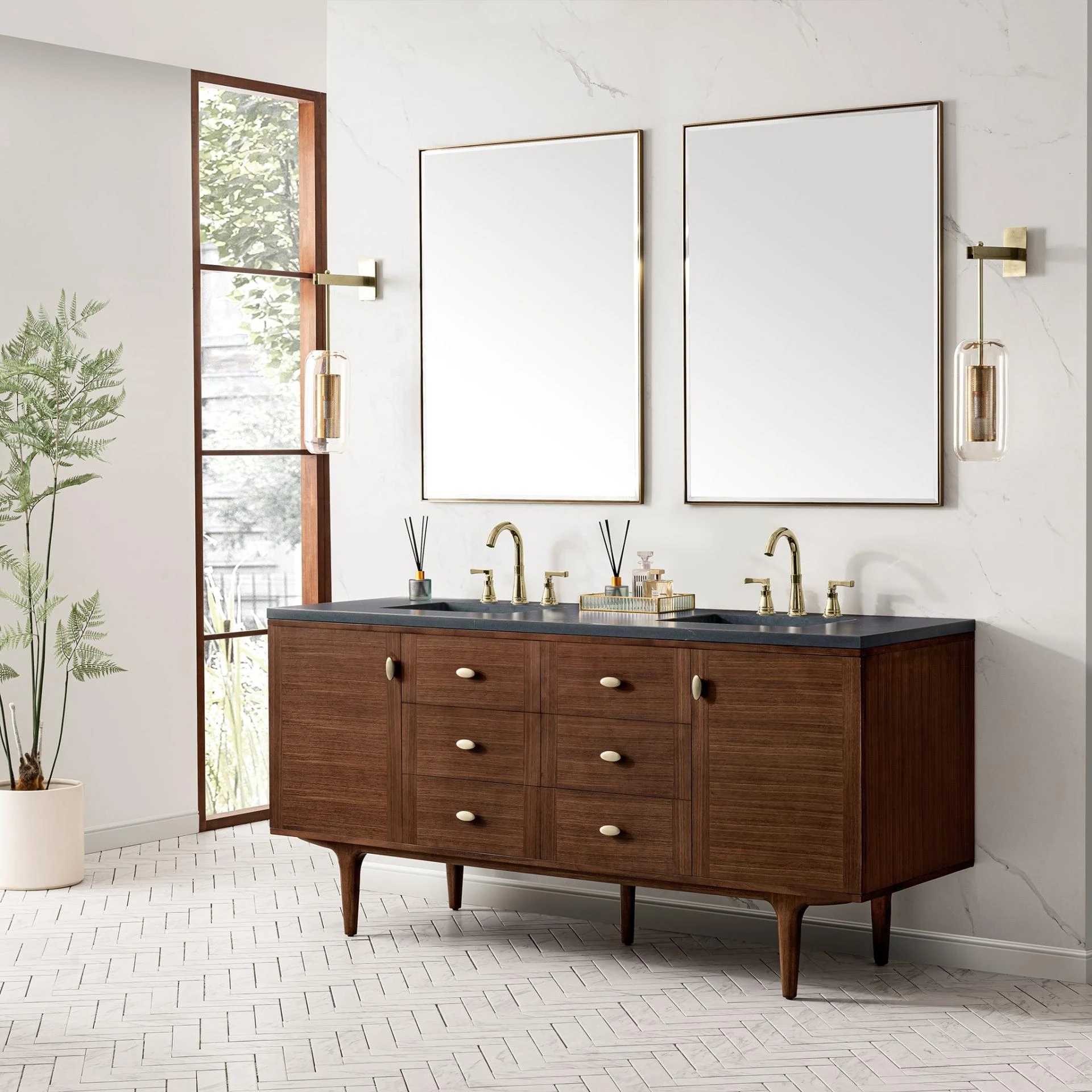
Chowning’s Tan (CW-195) or Leather Saddle Brown (2100-20) are excellent choices for pairing with bathroom vanities and mirrors that have a wood finish, such as Whitewashed Walnut, Country Oak, or Warm Cherry finish.
The bathroom is an excellent opportunity to use Tissue Pink (1163), which actually appears more orange. Benjamin Moore describes the color as a blush, fitting well with plush towels or other accessories in a similar hue.
Beyond Paint: Creative Uses of the Palette
Consider some of the following ways of working with the color palette instead of paint, particularly by adding texture and accessories:
- Look for furniture composed of reclaimed wood to add a modern farmhouse style.
- Texture is easily created by adding patterns such as plaid, striped, or floral material.
- Find a bathroom mirror with a frame that compliments the color scheme.
- Wall art is an excellent way of adding texture, such as warm and earthy wooden panels or slats or ironwork for an edgier touch.
- Use lighting to create ambiance or softness at night.
- Accessories, including vases and sculptures on shelves or inside cabinets with glass doors, are also effective ways of adding textures.
Benjamin Moore: 2025 Color Palette
The Color Palette of the Year is a perfect blend of versatility and sophistication, offering endless possibilities for any space in the home. From the rich depth of Cinnamon Slate to the soothing elegance of Rosepine and Stained Glass, these carefully curated hues inspire creativity and transformation in every corner.
Embrace the opportunity to experiment and make these colors your own, reflecting your unique style and creating spaces that are truly one of a kind.


Sign in to leave a comment.