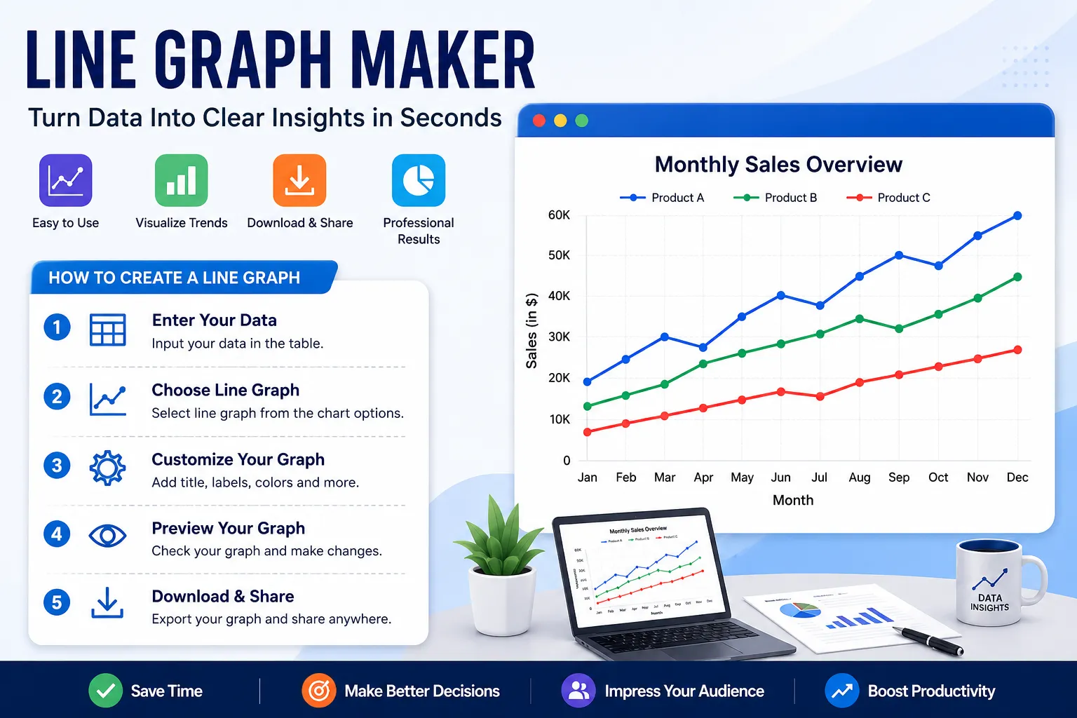

Working with numerical data can become difficult when information is spread across large tables, spreadsheets, or multiple datasets. Knowing how to make a double line graph can solve many comparison problems because it allows two related datasets to appear together in one clear visual. Instead of forcing readers to study every individual number, a well-structured line graph can reveal changes, patterns, increases, decreases, and relationships almost immediately. A reliable Line Graph Maker makes this process easier by allowing users to transform organized data into a readable visual representation without manually drawing every point and connection.
Why Data Problems Become Difficult to Understand
Numbers can provide valuable information, but raw numerical data is not always easy to interpret. A spreadsheet containing hundreds of values may be technically accurate while still being difficult for a student, researcher, business owner, or manager to understand. When values change across several periods, identifying the overall pattern by reading individual cells can require considerable time and attention.
Data visualization addresses this problem by turning numerical relationships into visual patterns. A line graph connects individual data points so that movement becomes immediately visible. An upward line can indicate growth, while a downward line can show a decline. Flat sections may indicate stability, and sharp changes can highlight unusual events or important developments.
The challenge is not simply creating a graph. The real challenge is creating a graph that represents the original information accurately and communicates its meaning clearly. Choosing the wrong graph type, entering incorrect values, using confusing labels, or selecting an unsuitable scale can make an otherwise useful visualization difficult to understand.
Problem 1: Choosing the Correct Graph Type
One of the first problems users encounter is deciding which type of graph is appropriate for their information. A basic line graph is usually effective when one variable needs to be tracked across an ordered sequence. Common examples include monthly revenue, yearly population, daily temperatures, weekly website traffic, or test results collected over time.
When two datasets need to be compared across the same categories, a double-line graph is often more useful. For example, a company might compare sales of two products during the same twelve-month period. Putting both datasets into one visualization allows the viewer to see where the lines increase, decrease, meet, or move apart.
Multiple-line graphs can also be used when more than two datasets must be compared. However, adding too many lines can create visual clutter. If the graph becomes difficult to follow, consider reducing the number of categories or separating the information into multiple graphs.
Problem 2: Comparing Two Sets of Data
Comparing two datasets manually can be surprisingly difficult. A table might show that Product A sold 2,000 units in January while Product B sold 1,800, but the same table may not make the long-term relationship obvious. After several months, it can become difficult to remember which product performed better during each period.
A double-line graph provides a practical solution by placing both datasets on the same horizontal timeline. Each dataset becomes its own line, allowing the viewer to compare their movement from one category to another. Crossovers between lines can also highlight periods when one dataset exceeded the other.
The most important part of creating a comparison graph is maintaining consistency. Both datasets should use the same categories and, where appropriate, the same measurement scale. Clear labels and a simple legend help viewers understand which line belongs to which dataset.
Problem 3: Understanding How to Build a Double-Line Graph
Creating a double-line graph becomes much easier when the data is organized before opening the graphing tool. Start by creating one column for the common categories, such as months or years. Then create separate columns for each dataset that you want to compare. Make sure every category has the correct corresponding value.
Once the information is organized, enter the category values along the horizontal axis and the numerical values along the vertical axis. Add the first dataset as one series and the second dataset as another. The graphing tool can then connect the values in their correct sequence to produce the visual comparison.
After generating the graph, check whether both lines are easy to distinguish. The title should explain what is being compared, while the legend should identify each dataset. Finally, compare the completed graph with the original data to make sure that no values were entered incorrectly.
Problem 4: Dealing With Large Differences in Values
Another common problem occurs when values in a dataset have very different ranges. For example, one series may contain values between 10 and 100, while another contains values between 5,000 and 10,000. Putting both series onto an unsuitable scale can make one line appear almost flat.
Before selecting the scale, examine the minimum and maximum values in the dataset. The vertical axis should provide enough space to display the important differences while remaining easy to read. If multiple variables have completely different units, consider whether placing them on the same graph is actually appropriate.
In some situations, multiple axes can help communicate datasets with different scales. However, additional axes should be used carefully because they can increase the cognitive load for readers. Every axis needs a clear label and should have an obvious relationship to the data it represents.
Problem 5: Understanding a 3-Axis Visualization
Some datasets contain several measurements that cannot be comfortably represented using one standard scale. In these situations, users may search for a 3 axis line graph to explore a more advanced visualization approach. Such a graph can be useful when three dimensions or measurements need to be considered, although it requires particularly careful labeling.
The most important consideration is clarity. Adding another axis does not automatically make a graph better. If the viewer cannot determine which scale belongs to which line or measurement, the additional information can actually make the visualization more confusing.
Before using multiple axes, ask whether the same analytical goal could be achieved with separate graphs. If three measurements genuinely need to be viewed together, make each axis clearly identifiable and explain the units in the graph title, labels, legend, or accompanying text.
Problem 6: Detecting Errors in Numerical Data
Graphs can be useful for finding errors that are difficult to notice in a spreadsheet. A single incorrect value may look ordinary when surrounded by hundreds of numbers, but it can appear as a dramatic spike or drop when represented visually.
Suppose monthly website traffic remains between 10,000 and 15,000 visitors for an entire year, but one month suddenly shows 150,000 visitors. The unusual point immediately attracts attention. It may represent a genuine event, such as a successful campaign, or it may indicate a data-entry problem.
After noticing an unusual point, return to the original dataset and verify the value. Do not automatically remove unusual information simply because it looks different. Outliers can sometimes contain important information and may represent genuine changes in behavior.
Problem 7: Making the Graph Easy to Read
A technically correct graph can still be ineffective if its design is confusing. Crowded labels, unclear titles, excessive data series, and poorly organized legends can prevent readers from understanding the main message.
Start with a meaningful title that describes the subject of the graph. Label the horizontal axis according to the categories being measured and label the vertical axis with the appropriate unit. If multiple lines are displayed, use a clear legend so readers can identify each dataset.
Avoid unnecessary visual elements that distract from the information. The purpose of a graph is to communicate data efficiently, not to overwhelm the viewer with decoration. A clean visualization usually makes patterns easier to identify.
Problem 8: Selecting the Right Time Period
Choosing the wrong time period can hide important trends. If you are studying seasonal changes in sales, looking at only two months may provide an incomplete picture. Similarly, displaying several decades of information may make short-term changes difficult to see.
Think about the question the graph is supposed to answer. For short-term analysis, daily, weekly, or monthly data may be appropriate. For long-term trends, quarterly or yearly information may provide a clearer overview.
A focused time range also makes the graph easier to read. Instead of displaying every available data point, select the period that directly supports the purpose of your analysis.
Problem 9: Avoiding Misleading Scales
The vertical scale can significantly affect how viewers perceive changes. If the scale is too compressed, meaningful differences may become difficult to see. If the scale is manipulated inappropriately, relatively small differences may appear much larger than they actually are.
Always review the starting point and intervals of the vertical axis. Make sure the numerical spacing is consistent and that the displayed range provides an honest representation of the data.
This is especially important when graphs are used in academic research, business presentations, reports, or public-facing content. A graph should clarify the information rather than unintentionally exaggerate it.
Problem 10: Handling Too Many Data Series
Multiple datasets can provide valuable comparisons, but adding too many lines to one graph can quickly become a problem. If ten or fifteen categories are represented by individual lines, the viewer may struggle to identify which line belongs to which category.
Start by determining which categories are most relevant to the question. If only three or four datasets are important, focus on those instead of displaying every available category.
When all datasets must be included, consider creating several smaller graphs. Dividing a complex dataset into logical groups can make the overall analysis easier without removing important information.
Problem 11: Organizing Data Before Creating the Graph
Many graphing problems actually begin before the graph is created. Poorly organized data can result in missing points, incorrect connections, duplicated categories, or inconsistent measurements.
Create a clean data table before entering information into the Line Graph Maker. Keep category names consistent and ensure that numerical values use the same units. Check for empty cells and unexpected characters that could interfere with the visualization.
Taking a few minutes to organize the source data can save much more time later. It also makes it easier to identify whether an unusual graph is caused by the visualization or by an error in the original information.
Using a Line Graph Maker to Solve Visualization Problems
A Line Graph Maker can simplify the entire graph creation process by reducing the amount of manual work required. Instead of drawing axes, plotting individual points, and connecting them by hand, users can organize their data and generate a visual representation more efficiently.
This is especially useful for students working on assignments, teachers preparing classroom materials, researchers presenting findings, and professionals preparing reports. A digital graph can also be adjusted more easily when the underlying data changes.
The key is to treat the graphing tool as part of the problem-solving process rather than simply a drawing application. First identify what you want to understand, then organize the relevant data, choose an appropriate visualization, generate the graph, and finally review it for accuracy and readability.
Improving Graphs for Presentations and Reports
A graph used in a presentation should communicate its main idea quickly. Someone viewing the graph for only a few seconds should be able to determine what is being measured and what the major trend appears to be.
Use descriptive titles rather than generic headings such as “Results” or “Data.” Instead, describe the actual information being presented. Clear axis labels and a simple legend are equally important when multiple series are displayed.
For written reports, consider adding a short explanation beneath the graph. Explain the most important trend or comparison instead of repeating every numerical value. The graph should provide the visual evidence while the surrounding text provides context.
Practical Steps for Solving Graphing Problems
A simple process can prevent most common visualization problems. Begin by identifying the purpose of the graph and determining exactly what question the data needs to answer. Next, organize the data into clear categories and verify that all values are accurate.
Choose a graph type that matches the structure of the information. Use a single line when tracking one series, a double-line graph when comparing two related datasets, and a multiple-line approach when several categories genuinely need to be viewed together.
After generating the graph, review the title, axes, scale, legend, data points, and overall layout. Look for anything that could cause confusion or create an inaccurate impression. Making these checks part of your normal workflow can dramatically improve the quality of your visualizations.
Read More:
https://logcla.com/blogs/1891822/How-to-Read-and-Interpret-a-Line-Graph-Understanding-Trends
Final Thoughts
Data becomes much easier to understand when it is presented in a meaningful visual format. Line graphs are particularly useful for identifying trends, comparing related datasets, detecting unusual values, and showing how measurements change across an ordered sequence.
Most graphing problems can be solved by combining accurate data preparation with the right visualization method. Whether you are creating a simple trend graph, comparing two datasets, or exploring a more advanced multi-axis visualization, careful organization and clear labeling remain essential.
A Line Graph Maker provides a convenient way to turn numerical information into understandable visual content. By selecting the correct graph type, checking the scale, organizing the data, and keeping the design readable, you can create graphs that communicate information clearly and help readers make better sense of complex datasets.
Frequently Asked Questions
1. What is a line graph mainly used for?
A line graph is commonly used to show changes in numerical data across an ordered sequence. It is particularly effective for displaying trends over time, such as monthly sales, yearly revenue, daily temperatures, website traffic, or experimental measurements.
2. When should I use a double-line graph?
A double-line graph is useful when two related datasets need to be compared across the same categories. For example, it can show the performance of two products, the temperatures of two cities, or the results of two groups over the same period.
3. How can I make a double-line graph accurately?
First organize the data into a shared category column and two separate value columns. Enter the common categories on the horizontal axis and add each dataset as a separate series. Finally, check the title, labels, scale, legend, and data points to ensure that the graph accurately represents the original information.
4. What is a 3 axis line graph used for?
A three-axis visualization may be considered when several measurements with different scales or dimensions need to be analyzed together. However, multiple axes can make a graph harder to interpret, so they should only be used when they provide a genuine analytical benefit.
5. How do I prevent a line graph from becoming confusing?
Avoid displaying unnecessary data series and use clear titles, axis labels, and legends. If there are too many categories, consider separating them into multiple graphs rather than forcing all information into one visualization.
6. Can a line graph help find errors in data?
Yes. Unexpected spikes, drops, gaps, or unusual patterns can become much easier to notice when numerical information is represented visually. Once an unusual point is identified, check the original dataset to determine whether it is a genuine result or a data-entry error.
7. Why are axis labels important?
Axis labels explain what the horizontal and vertical measurements represent. Without them, viewers may see the pattern but not understand the meaning or units of the values. Clear labels make the graph more useful and reduce the possibility of misinterpretation.
8. Can I use line graphs for business data?
Yes. Businesses can use line graphs to track sales, revenue, customer activity, website traffic, production, advertising performance, and many other measurements. Comparing multiple lines can also help identify which products, campaigns, or categories are performing differently.
9. What should I check before publishing a line graph?
Check that all data values are correct and that categories appear in the correct order. Then review the title, axis labels, scale, legend, and overall readability. It is also helpful to compare the finished graph against the original dataset before sharing it.
10. Why is an online Line Graph Maker useful?
An online Line Graph Maker can reduce the manual effort involved in creating graphs. It allows users to transform organized numerical data into visual representations more efficiently, making it useful for educational projects, research, business reports, presentations, and everyday data analysis.





























Sign in to leave a comment.