
More people open websites on their phones than on laptops. That one shift changed how every website should be built. If your site was designed for desktop first, you are already losing mobile visitors before they scroll past the first section.
Google ranks websites based on their mobile experience now. A slow or broken mobile site damages your search rankings, your credibility, and your sales.
Why Should Your Business Care About Mobile-First Design?
Most businesses still treat mobile design like a finishing step. They build the desktop version first and then try to fit it onto a phone screen. That thinking costs them traffic every single day, because mobile users leave fast when a site feels clunky or slow.
- Speed: A mobile-first site loads faster because it starts lean. The code is cleaner, images are smaller, and there is less to load. Users expect a page to open in under three seconds. If it takes longer, they leave and find someone else.
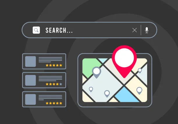
- Navigation: Designing for small screens first forces you to simplify everything. Every button and link gets placed with a reason behind it. Users find what they need quickly. That keeps them on your site longer and moves them toward taking action.
- Conversions: A smooth mobile experience builds trust. When users can browse and click without zooming in or fumbling around, they feel comfortable. That comfort turns into inquiries, purchases, and repeat visits.
Mobile design is really about function and trust, not just visuals. A site that works well on a phone tells people that you pay attention. It shows that you respect their time.
Businesses that invest in mobile design often see bounce rates drop and session time go up. The data backs this up every time.
The Connection Between Mobile Design and SEO
Google switched to mobile-first indexing a while back. This means Google looks at your mobile site first when deciding where to rank your pages. A poorly built mobile site will hurt your rankings even if your desktop site looks great.
Page speed is a real ranking factor. Google measures how fast your site loads on mobile and uses that to rank your pages. A slow site loses visibility in search results.
Content structure also plays a role. When your headers, paragraphs, and images are laid out properly for mobile, search engines read your content more clearly. That improves how your pages show up in results.
Businesses working with a digital marketing agency Toronto often learn this early. Mobile SEO is not a bonus feature anymore. It is the starting point for any serious online presence.
What a Mobile-First Redesign Actually Looks Like
A mobile-first redesign starts with the smallest screen. Designers figure out what matters most and build around that. Every element has to earn its place on the page.
Text becomes easier to read. Buttons get bigger so they are easy to tap. Images load fast without looking blurry or pixelated.
Forms get shorter. Long contact forms push people away. Cutting them down to just the key fields can increase submissions by a lot, and that one change alone is worth the effort.
Calls to action become harder to miss. On a small screen, there is no space to be vague. Everything gets direct and clear.
Key Principles We Follow in Every Mobile Redesign
Before we touch anything, we look at what is already there. Our team at MarkitMe reviews the existing site, spots what is slowing users down, and maps out a better path for mobile visitors before the design work begins.
- We check the current site for mobile speed and usability problems first, before any redesign work starts
- Our designers build every layout starting from the smallest screen size and then scale it up for larger devices
- We test every page on real devices all the way through the build, not just at the end
- We rewrite or restructure content so it fits how mobile users actually read, which is fast and in short bursts
At MarkitMe, we have helped businesses in many industries turn slow, outdated websites into clean and fast mobile experiences. Our process is simple and focused on your actual goals, not on what looks flashy in a portfolio.
Every project we take on is different. But the goal stays the same. Your site should work well for your audience, no matter where they are or what device they are using.
Is Your Current Website Costing You Customers?
If your site was built more than three years ago, mobile-first design was probably not part of the plan. Web standards moved quickly. Older sites carry bloated code, heavy images, and layouts that were never meant for a phone screen.
Google's PageSpeed Insights is a free tool you can use right now. Paste your URL and it will show you where your mobile experience is breaking down.
Then open your analytics. If your mobile bounce rate is above 60 percent, people are landing on your site and leaving without doing anything. That number tells you everything.
A focused website redesign services project can fix most of these issues without tearing everything down and starting from zero.
How We Approach Mobile-First Projects
We start every project by learning about your business. We look at your audience, your traffic, and what your current site is doing well or not doing at all. Our team need that full picture before we touch anything.
Our design, development, and strategy work happens together, not in separate handoffs between teams. That keeps the process moving and the results consistent across the whole site.
We track the numbers that actually affect your business. Load time, core web vitals, and time to interactive all get measured and improved throughout the entire project.
After your site goes live, we keep watching how users behave. We see where they click, where they stop, and what gets them to convert. That shapes what we improve next.
We treat every project like our own business depends on it.
Choosing the right team to build it makes all the difference between a site that looks good and one that actually grows what you built.


Sign in to leave a comment.