If you want people to notice your visual content, you can't just rely on luck. It's now more important than ever to make sure that your visuals are eye-catching. In a world where there is a lot of digital noise and people scroll quickly, poster design is very important in how people notice, understand and remember messages. Poster designs are great for promoting businesses, events, educational materials and branding. They can communicate more in a few seconds than a long piece of writing.
This guide looks at ways to make things look better by using layouts, fonts, images and storytelling. These ideas will help creative professionals and marketing teams make poster designs that are more than just ordinary – they will be visually powerful.
Why Visual Impact Matters in Modern Posters
If they like what they see, they will either stop and look, or scroll past. Strong posters attract the eye, create a connection and make information easier to take in. When the visual elements work well together, the message feels clear and well thought out, rather than messy.
Effective Poster Design also helps to build credibility. A well-made poster looks professional and clear, which helps audiences trust the message and the brand.
Core Elements That Improve Creative Visual Impact
1. Clear Visual Hierarchy
Visual hierarchy helps viewers understand what to read first, second and last. Without it, posters feel confused and overwhelmed.
Key hierarchy techniques include:
- Make the main messages stand out by using large, bold headlines.
- Supporting text in smaller sizes
- The sections are spaced strategically.
- There is a clear difference between the text and the background.
A good poster design will always guide the viewer's eye naturally, without making them have to think too hard.
2. Intentional Use of Color
Colour is both emotional and practical. It can create a sense of mood, highlight important details and make reading easier.
Best practices:
- Try to use just 2–4 main colours.
- Use different colours and shades to make the text stand out against the background.
- Pick colours that match the message.
If you use colours in the right way, they can make poster designs look better without making the words on the poster too hard to see.
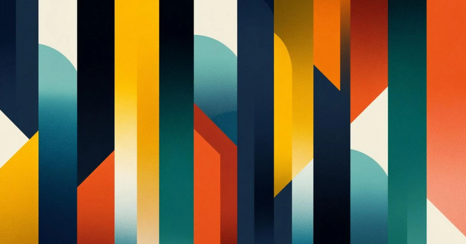
Creative Layout Ideas That Stand Out
3. Grid-Based Layouts for Balance
Grids provide structure while still allowing creativity. They help to arrange things neatly and make everything feel tidy.
The good things about grid layouts are:
- The composition is cleaner.
- It's easier to read.
- Make sure the spacing is always the same.
- Appear professional.
Many projects that involve designing posters rely on grids to help people be more creative and effective.
4. Asymmetrical Layouts for Energy
Asymmetrical designs are interesting to look at and can make things look more lively. When balanced correctly, it feels modern and dynamic rather than chaotic.
Here are some tips for asymmetrical layouts:
- Balance out heavy visuals by using negative space.
- Use images to hold the text in place.
- Don't put too many people on one side.
This approach makes poster designs more interesting, especially for creative or cultural projects.
Typography That Strengthens the Message
5. Limit Font Choices
Using too many different fonts can confuse readers. Using a limited font helps posters to be focused and easy to read.
Here are some guidelines for writing text:
- Use one font for headlines.
- Use this font for the main body of your text.
- Don't use decorative fonts for long texts.
Using clear fonts makes poster designs clearer and more professional.
6. Let Text Breathe
Spacing is as important as the text itself. Poster designs that are too busy can feel stressful and difficult to read.
Good spacing practices:
- Make the line spacing bigger so it's easier to read.
- Make sure there is a space on each side of the text.
- Use empty space to highlight the most important points.
Thoughtful spacing makes Poster Design feel intentional and calm.
Using Imagery to Create Emotional Impact
7. Choose Purposeful Images
Pictures should help readers to understand the message, not confuse them. Every visual element should have a clear reason for being there.
Here are some tips for choosing the right images:
- High-quality images
- The text is about the right thing.
- There are some strong focal points.
If the image and the message match, people will remember the poster more easily.
8. Mix Illustration and Photography
Adding pictures to photos can make them more interesting. This technique is especially good for posters that teach people about ideas or for posters that are used in schools.
Here are some ways to combine visuals:
- Pictures to go with ideas or themes
- The aim is to make the image look real.
- Add some subtle layers to blend things together.
This mix gives Poster Design a distinctive look.
Designing for Different Professional Uses
9. Posters for Marketing and Branding
Marketing posters should be clear and encourage people to take action. The idea is to understand things quickly and respond to them.
The most important things to think about:
- This is one strong call to action.
- Colours and fonts that match the brand
- The text is short and simple, with a strong visual element.
Strategic Poster Design makes sure that people see and remember marketing messages.
10. Posters for Events and Education
Poster designs need to be both creative and clear. Viewers should be able to see all the important details at a glance.
Best practices:
- Mark the important dates, times and places.
- Use icons to go with the text.
- Sort the information into different sections.
Poster design works well even when the content is detailed, as long as it is clear.
Common Mistakes to Avoid
Even creative posters can fail if basic mistakes are ignored.
Avoid:
- Don't put too much text on a page.
- The text and background are not easy to see against each other.
- The alignment is not consistent.
- The images are not very good.
If you avoid these issues, your poster design will look strong and professional.
Final Thoughts
The most creative images are the ones that stand out the most, and this is achieved by making careful decisions, not by making things more complex. When the design of a poster includes layout, colour, font and images, it can communicate a message more effectively. Strong Poster Design isn't about adding more – it's about choosing better.
If you apply these ideas consistently, you can create posters that attract attention, communicate clearly, and leave a lasting impression across professional projects.
Source & Reference
This article draws inspiration from GraphicMama’s guide on poster design ideas, which highlights creative layouts, visual balance, and practical design approaches for impactful posters.
FAQs
1. Why is Poster Design important for professional communication?
It helps convey messages quickly and visually, making information easier to understand in marketing, education, and branding contexts.
2. How does visual layout influence audience attention?
A strong layout uses spacing, contrast, and structure to guide the viewer’s eye and keep them engaged longer.
3. What makes a poster visually impactful?
Impact comes from the balance of visuals, typography, and spacing working together to deliver a clear message.
4. Can posters help improve brand recognition?
Yes, consistent visual styles and messaging help audiences recognize and remember a brand more easily.
5. How often should design trends be updated?
Trends should be reviewed regularly, but core design principles should remain consistent while adapting to modern preferences.


Sign in to leave a comment.