Every brand has a voice. Some shout. Some whisper. But the truly timeless ones? They speak a language that needs no translation.
That language is design — and at the heart of it lies the logo.
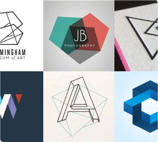
A logo isn’t just an icon. It’s the face of a brand, the first impression, the handshake before the conversation. Done right, it becomes a symbol of trust, emotion, and purpose.
It’s what makes a stranger feel familiarity, a user feel loyalty, and a customer feel proud to be associated with a name.
At Webnhubs, we understand how a logo can create an instant connection. Through thoughtful logo design and a deep understanding of your brand, we craft logos that don’t just look good but tell your story, making your business memorable and emotionally engaging.
Logos Aren’t Just Seen — They’re Felt
Ever wonder why people still get goosebumps when they see a simple logo?
It’s not because it’s fancy. It’s because it represents movement, motivation, and mastery. One simple stroke — and your brain recalls decades of commercials, iconic moments, and stories tied to that logo.
That’s the power of emotional branding.
A good logo doesn’t just remind us of what a company sells — it connects us with what that company believes. It taps into universal emotions that people can instantly relate to, making a deeper impact.
When we think of brands like Nike, we don't just see a swoosh. We feel the motivation to push our limits. When we see the Apple logo, it’s not just about the technology; it’s about innovation, simplicity, and cutting-edge design.
The Psychology Behind Shapes and Colors
Design isn’t just art for art’s sake. It’s science wrapped in creativity.
Shapes and colors influence how we perceive a brand, often without us realizing it. The wrong combination of these elements can turn people away, while the right choices can attract and even captivate.
➤ Shapes:
- Circles: Imply unity, community, and inclusiveness. They’re welcoming and soothing.
- Squares and Rectangles: Suggest stability, order, and reliability. They evoke a sense of trustworthiness.
- Triangles: Often signal direction, innovation, and energy. They can represent forward movement.
➤ Colors:
- Blue: Trust, calm, professionalism. It’s why so many banks and tech companies use it.
- Red: Power, urgency, energy. It's the color of passion and action, often used in fast-food branding.
- Green: Nature, health, growth. It’s the color of well-being, often found in eco-friendly or wellness brands.
- Black: Luxury, sophistication. Used in high-end brands to evoke elegance.
- Yellow: Cheerfulness, optimism. It’s a color that grabs attention and makes people feel happy.
These choices aren't random. They’re rooted in deep psychology, making them powerful tools in a designer’s toolkit.
Why Minimalism Wins in the Long Run
Look at your smartphone. How many logos are just clean lines, text, or icons with lots of white space?
Simplicity = memorability.
Minimalist logos are easier to:
- Recognize at a glance
- Scale across devices
- Print and place anywhere
- Emotionally associated with elegance and reliability
It’s not about eliminating detail; it’s about stripping away the unnecessary. The result is a design that is clean, timeless, and instantly recognizable. Think about the Nike swoosh, the McDonald's golden arches, or the Twitter bird. These logos are simple, but their impact is enormous.
A minimalist logo can transcend time and trends, becoming iconic in its own right. By reducing complexity, the focus is placed on what truly matters — the essence of the brand.
The Hidden Power of Storytelling in Logos
One of the most clever logos in modern branding is often recognized by its simplicity. At first glance, it looks simple. But look a bit closer, and you might find a hidden detail — a subtle symbol that communicates a deeper message about the brand’s essence.
This is not just a “cool trick.” It’s a message: a brand is always moving forward, always delivering.
For example, the FedEx logo has a hidden arrow between the “E” and the “x” that signifies speed and precision. The Amazon logo features an arrow that points from A to Z, symbolizing that the company offers everything from A to Z — all under one roof.
Such thoughtful detail becomes part of brand trust. It not only makes the logo memorable but also conveys a deeper, more meaningful message that resonates with the audience.
Cultural Context Matters
Symbols, colors, and typography carry different meanings across cultures. What works in one region may fail in another.
Example:
- Red = luck in China, but danger in the West.
- Green = prosperity in Islam, but jealousy in Western psychology.
- Blue = tranquility in the West, but mourning in some parts of the Middle East.
This is why global brands customize their logos for different regions. A logo that resonates in the US might not have the same effect in Asia. Respecting culture builds emotional relevance and connects brands to their diverse audiences on a deeper level.
From Sketch to Signature: How Logos Are Born
Every logo starts with a brief, but the real magic is in the research.
Designers explore:
- The company’s mission and vision
- Target demographics
- Competitive analysis
- Emotional goals
From brainstorming to sketches, from vector work to mockups — each phase brings the brand closer to a symbol that can last for decades.
This process requires both creativity and strategy. Designers have to dig deep into a company’s identity and capture its essence through visual language. Once a concept is established, the logo is tested across various mediums and platforms to ensure it remains effective in every application.
Logo Evolution: Brands Grow Up Too
Brands evolve — and so do their logos.
A logo must adapt with time, technology, and audience while staying rooted in its core identity.
If your business has evolved, your logo should reflect that growth. Just as your company develops new products, services, and approaches, your logo needs to evolve to stay relevant. This doesn't mean starting from scratch; instead, it’s about refreshing the design to better reflect the current state of the brand.
Some of the most iconic logos, like Coca-Cola, Apple, and Pepsi, have undergone subtle yet meaningful tweaks over the years to keep up with changing tastes and technology.
For Business Owners: Is Your Logo Telling the Right Story?
You’ve built something meaningful. Now ask yourself — does your logo do it justice?
At WebnHubs, we help brands go beyond pretty designs. We craft logo designs and branding strategies that tell stories, spark emotion, and build recognition.
Whether you're launching a new startup or thinking of a rebrand, our design team is ready to shape your vision into a lasting symbol. If you’re looking for business card design, we have you covered.
👉 Explore our design process and get a logo that doesn’t just look good — it speaks for your brand.


Sign in to leave a comment.