

Trust is not a feature you add to an ecommerce website. It is the outcome of dozens of small design decisions, each one answering a question the visitor was silently asking.
When a stranger arrives at your store for the first time, they bring with them every previous experience they have had of buying online — the delivery that never arrived, the product that looked nothing like the photograph, the customer service team that did not reply, the return that took three months to process. They are not suspicious of your store specifically. They are cautious about online shopping in general, because experience has taught them to be.
Every trust signal on your website is an answer to that accumulated caution. It is evidence that your store is different — that you are a real business, that your products are as described, that you will fulfil the order, that you stand behind what you sell. The visitor is conducting a rapid, mostly unconscious assessment of that evidence from the moment they land on your page. The stores that convert well are the ones that pass that assessment quickly and convincingly.
In 2025 and 2026, the stakes of this assessment have been raised by Google's updated guidelines. Google now evaluates ecommerce stores not just on the keywords they target but on how much genuine trust they have earned — through the credibility of the people behind the business, the quality and depth of their content, and the transparency with which they operate. A store that has designed trust into its pages deliberately and comprehensively does not simply convert better — it ranks better too.
This article examines the trust signals that every ecommerce website needs — not as a checklist of badges to display, but as a design discipline that runs through every page, every interaction, and every moment of the customer journey.
1. The Human Layer: Real People Behind the Brand
The single most powerful trust signal in ecommerce is also the most frequently absent: evidence that real, accountable human beings are behind the business. Not a logo. Not a brand voice. Not a mission statement. People — with names, faces, and a reason they built this particular store.
The psychology behind this is straightforward. It is much harder to distrust a person than to distrust a corporation. When a visitor can see who is behind a store — a founder with a genuine story, a small team with visible faces and names — the relationship shifts from transactional to personal. The visitor is no longer considering whether to trust an anonymous commercial entity. They are considering whether to trust a specific person who has made a specific claim about a specific product. That is a fundamentally different assessment, and it resolves in favour of trust far more often.
Google's quality guidelines evaluate the credibility of a site in part through the presence and verifiability of the people associated with it. A store with a named founder, a genuine background, and a clear reason for expertise in the product category is assessed differently from one with no visible human authorship. This is especially significant for stores in health, wellness, food, and financial product categories — areas where Google applies heightened scrutiny to the credentials of those making product claims.
The About Us page is the primary vehicle for this human layer, but it is not the only one. A founder's note on the homepage. A team photo in the footer. Product descriptions written in a voice that implies personal knowledge of what is being sold. Customer service responses signed with a real name. Each of these is a thread in the fabric of a store that feels human rather than automated — and humanness, in ecommerce, is a trust signal of the first order.
The About Us page that converts trust is not a brand manifesto. It is a specific, honest account of who built this store, why they built it, what they know about the product category, and what they stand for. Specific details — a founding year, a location, a reason the founder cared enough about this problem to start a business around it — carry far more weight than any general claim about values or commitment to quality.
2. Transparent Policies Written for Customers, Not Lawyers
Every ecommerce store has a returns policy. Most of them have been drafted by a lawyer, stored in a footer link, and never read by a customer until something goes wrong. This is a design failure. The returns policy is not a legal document whose purpose is to limit liability. It is a trust signal whose purpose is to reduce the perceived risk of purchase — and its effectiveness as a trust signal is directly proportional to how clearly, honestly, and accessibly it is communicated.
A returns policy written in plain language — not "the customer shall be entitled to initiate a return request within thirty calendar days" but "changed your mind? You have 30 days to return it, no questions asked" — communicates something beyond its literal content. It communicates that the business is confident in what it sells and comfortable making the return process easy. That confidence is itself a trust signal. Businesses that hedge their returns policies with qualifications and conditions are signalling uncertainty about their products. Businesses that make returns easy are signalling the opposite.
The placement of policy information matters as much as its content. A returns guarantee buried in the footer is invisible to the customer who needs it most — the one considering a purchase and calculating the risk. The same guarantee displayed as a single line beneath the Add to Cart button — "Free returns within 30 days" — is visible at exactly the moment the purchase decision is being made. The content has not changed. The conversion impact has changed substantially.
Beyond returns, the policies that most affect trust at the point of purchase are shipping transparency — when will this arrive, and how will I know? — and privacy clarity — what will you do with my email address and payment information? The privacy policy, like the returns policy, is a legal requirement in most jurisdictions. But it is also an opportunity to demonstrate that the business handles customer data with the same care it expects customers to place in it. A privacy policy that explains clearly what data is collected and why, in language a customer can actually understand, is a trust signal that most stores are not using.
Google's quality guidelines directly include policy transparency as a ranking signal. A store with clear, accessible, customer-friendly policies is assessed differently from one with policies that exist only to satisfy a legal requirement. The investment of rewriting policies in plain language and surfacing them at the relevant points in the customer journey is small. The trust and conversion return is disproportionately large.
3. Social Proof That Transfers Real Experience
Social proof works because it borrows trust that other people have already earned and spent. When a customer reads a review from someone who had the same concern they have and found it resolved by the product, they are not simply reading an endorsement. They are experiencing a vicarious version of the risk-taking they are about to do. The review tells them: someone like me tried this, and it worked.
The design question is not whether to display reviews but how to display them so they transfer maximum trust. The formats that perform best combine specificity, credibility markers, and scale. A specific review — one that describes a particular use case, names a particular feature, or resolves a particular concern — is more persuasive than a generic five-star statement. A review with a verified purchase badge, a name, a date, and optionally a photo of the reviewer is more credible than one with none of these. An aggregate rating that reflects hundreds or thousands of reviews carries more weight than a handful of curated quotes.
User-generated content — photos and videos submitted by customers showing the product in actual use — is the social proof format with the highest trust transfer value. Professional product photography shows the product as it is designed to look. Customer photography shows the product as it actually looks in a real home, on a real person, in real lighting. The gap between these two things is, for many customers, the gap between doubt and confidence. Stores that collect and display genuine customer imagery are closing that gap in a way that no branded content can replicate.
The Google dimension of social proof has become more significant with each update to its quality guidelines. Genuine customer experience signals — reviews from verified platforms, user-generated content, third-party ratings — are weighted differently from brand-generated content. A store that has built a body of authentic customer experience on its product pages is building both a conversion asset and a ranking asset simultaneously.
Review schema markup — implementing Product and AggregateRating structured data — translates this social proof into a visible signal in organic search results. Star ratings displayed beneath a search result before the customer has clicked through are among the most significant conversion signals available in organic search. The investment of implementing review schema correctly pays back every time a search result with stars outperforms one without.
4. Security Signals at the Moments They Matter
Security signals — SSL certificates, payment logos, security badges — are the trust signals most stores think of first, and often the ones they handle least effectively. The problem is not that these signals lack value. They carry significant value at specific moments in the customer journey. The problem is that most stores display them everywhere, or only in the footer, rather than at the moments where security concerns are highest and the signals therefore most persuasive.
The moments in the customer journey where security concerns are most acute are the ones involving personal and financial data: the checkout form where an address is entered, the payment step where card details are submitted, and — for account-holding customers — the login page. These are the pages where a visible SSL indicator, a recognised payment logo set, and a brief security reassurance message carry the greatest conversion value. On the homepage or a category page, the same badges are largely ignored because the visitor is not yet thinking about security.
Recognised payment logos — Visa, Mastercard, American Express, PayPal, Apple Pay, Google Pay — serve a dual purpose. They confirm that familiar payment methods are accepted, which removes a practical concern. They also signal that the store has been approved by these payment providers to process transactions, which implies a level of legitimacy that the store's branding alone cannot establish. A new store with no brand recognition that displays PayPal's logo is borrowing a small amount of PayPal's established trust. That borrowed trust is a real conversion asset.
Third-party security seals — Norton Secured, McAfee SECURE, Trustwave — were influential conversion signals a decade ago. Their effectiveness has declined as they have become ubiquitous and as customers have become less familiar with the underlying organisations. The payment provider logos and the browser's own SSL indicator now carry more trust weight for most demographics than third-party security seals. The design decision worth making is to prioritise recognisable logos over generic security badges, and to place both at the point of payment rather than distributed across every page.
HTTPS — the SSL encryption indicated by the padlock in the browser address bar — remains a Google ranking signal and a baseline customer expectation. A store without HTTPS is not simply a trust failure. It is flagged by most modern browsers as insecure, which means the customer's browser is actively displaying a warning about the store before any design decision the store has made can have an effect. HTTPS is the minimum viable security signal. Everything else is built on top of it.
5. Third-Party Validation: Borrowed Authority That Sticks
A brand can say anything about itself. A third party saying the same thing is evidence. This is the principle behind the trust value of press coverage, industry awards, accreditations, and external ratings — all forms of validation that originate outside the brand and therefore carry a credibility that self-promotion cannot replicate.
The "As featured in" bar — a horizontal row of media logos from publications that have covered the brand — is one of the most efficient trust signals in ecommerce. It is visually compact, immediately legible, and communicates a level of external validation that requires no explanation. A store featured in a publication the visitor has heard of has passed an external credibility test that the visitor did not have to administer themselves. The recognition happens automatically and the trust transfer is nearly instantaneous.
Industry accreditations and certifications — B Corp certification, organic or sustainability certifications, industry body memberships — carry a different kind of third-party authority. They signal not just that the store is legitimate but that it has met specific, externally verified standards in a domain the visitor may care about. For stores selling products in categories where credentials matter — health supplements, organic food, sustainable goods, financial services — these certifications are among the most important trust signals on the page and should be treated accordingly in the design.
Independent review platform ratings — Trustpilot scores, Google Business ratings, verified review aggregates — provide a form of third-party validation that is directly linked to customer experience rather than editorial opinion. A Trustpilot score of 4.7 from 3,000 reviews is not just a data point. It is a summary of 3,000 customer experiences, each one a vote of sufficient satisfaction to leave a positive review. Displaying this score — with a link to the full review platform so it can be verified — is a trust signal with a specificity and scale that branded content cannot approach.
Google's assessment of a store's authority and credibility is directly informed by third-party validation signals. A store that is referenced, reviewed, and accredited by credible external sources is assessed differently from one that exists only within its own ecosystem. Building third-party validation is not just a marketing activity. In 2025 and 2026, it is a direct input into the ranking signals that determine organic visibility.
6. Contact and Accessibility: The Trust Signal Nobody Thinks About
There is a specific anxiety that every online shopper has encountered at some point: buying from a store and then, when something goes wrong, discovering that there is no way to reach a human being. No phone number. No email address. A contact form that leads to an automated response. A social media account that has not been updated in six months. This experience — or even the anticipation of it — is a reason not to buy from a store that appears to offer no accessible means of contact.
A visible, specific, working contact method is a trust signal precisely because it demonstrates accountability. A store with a phone number in the header is a store that has decided it is comfortable being called by its customers. A store with an email address that receives responses within 24 hours is a store that has committed to being reachable. These are signals of a business that expects to stand behind its products — and that expectation is reassuring to a customer making a first purchase.
Live chat — when it is staffed by real people rather than automated chatbots that cannot answer specific questions — is among the highest-converting trust tools in ecommerce. Not because all customers use it, but because its presence signals availability. A visitor who sees a live chat option knows that, if they have a question that the product page has not answered, help is immediately available. That knowledge reduces the activation energy required to proceed to purchase even for customers who never open the chat window.
Physical address information — a registered business address, a postal address for returns — is a trust signal that carries weight even for businesses that operate entirely online with no customer-facing premises. A business with a verifiable physical address is a business that has a legal existence in a specific place. It can be located, contacted, and if necessary held accountable. The absence of any physical address is, for a cautious online shopper, a mild but real indicator of potential unreliability.
Google's quality guidelines include contact information and business transparency as components of how a store is evaluated. A store with a clearly identified business name, a physical or registered address, and working contact details is assessed differently from one that provides none of this. The investment of displaying this information prominently — in the header, the footer, and the About Us page — is minimal. Its contribution to both customer trust and search visibility is not.
7. Consistent, Professional Visual Design as a Trust Signal
Visual design communicates trustworthiness before a single word has been read. A visitor who lands on a page with inconsistent typography, misaligned elements, broken images, or a colour scheme that clashes registers a signal — not consciously, but viscerally — that the business behind this page has not taken care. And a business that has not taken care of its own appearance may not take care of its customers either.
This is not an argument for expensive or elaborate design. It is an argument for consistent, coherent, attentive design. A simple store with consistent typography, aligned elements, a coherent colour palette, and images that load correctly communicates professionalism more effectively than an elaborate store that has been assembled without a consistent system. The visitor cannot always articulate what makes a site feel trustworthy, but they are consistently more likely to buy from a site that appears to have been built with care.
The specific visual elements that most affect trust assessment are typography — consistent use of readable, professional fonts at appropriate sizes — imagery quality and consistency, colour palette coherence, and the absence of elements that signal low production values: stretched logos, pixelated images, inconsistent button styles, mismatched icon sets, or sections that appear to have been added from a different template. Each of these individually is a small thing. Together they define whether the store looks like a business that takes itself seriously.
The relationship between visual consistency and Google's quality evaluation runs through the Helpful Content System. A store with a polished, consistent design is implicitly signalling investment — someone cared enough about this store to build it properly. That signal of investment correlates with, though does not guarantee, the other investments that make a store worth visiting: accurate product information, reliable fulfilment, responsive customer service. Google's quality evaluators are looking for these correlations, and visual design is one of the first signals they encounter.
8. Product Information Depth as a Trust Signal
The depth and accuracy of product information is a trust signal that is underestimated almost universally. Most ecommerce businesses treat product descriptions as a marketing task — write something engaging that makes people want to buy. The customer, however, is using the product description for a different purpose: to verify that the product is what they think it is, that it will do what they need it to do, and that the seller knows enough about it to be trusted.
A product description that contains specific, accurate information — dimensions, materials, compatibility, weight, country of manufacture, care instructions, limitations — communicates expert knowledge. It signals that the person who wrote this has handled the product, understands it, and is confident enough in their knowledge to be specific. A description that is vague, generic, or obviously recycled from a manufacturer's data sheet communicates the opposite: that the seller does not know the product well enough to describe it specifically, which raises the question of how well they will handle any issues that arise after purchase.
FAQ sections on product pages — answering the questions that customers most commonly ask about a product — serve a similar trust function. They demonstrate that the store knows what customers care about and is proactively addressing their concerns. A FAQ that answers the questions a cautious buyer would ask — what is your return policy for this item, how do I know this will fit, what is this made of, is this compatible with — is not just useful content. It is evidence of a business that understands its customers and has chosen transparency over the risk of a question going unanswered.
Google's Helpful Content System rewards product pages with depth and genuine expertise. The distinction the system makes is between content written by someone who truly knows the product — based on real experience, real handling, real understanding — and content written to fill a page. Product descriptions that demonstrate genuine knowledge strengthen the overall quality signals Google uses to evaluate a store. They also convert better, because a customer who feels informed is a customer who feels confident, and confident customers buy.
9. Post-Purchase Trust: Delivering on the Promise
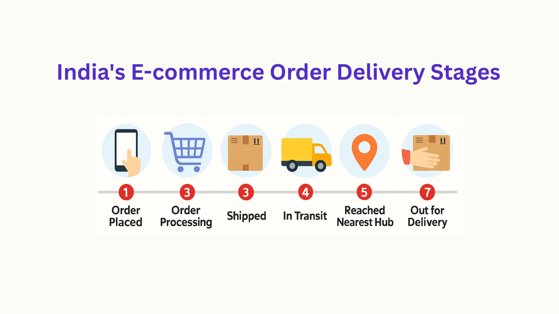
Trust is not fully established at the point of purchase. It is completed when the order arrives as expected, when the product matches its description, when the packaging reflects the care the brand claims to embody, and — if something goes wrong — when the customer service response is as good as the sales experience was. Post-purchase trust is the trust that turns first-time buyers into repeat customers and converts satisfied customers into the most powerful marketing channel a brand can have: word of mouth.
The design of post-purchase trust begins on the order confirmation page, continues through the shipping confirmation email, and culminates in the delivery experience. Each touchpoint is an opportunity to reinforce the trust the customer placed in the brand at checkout. An order confirmation email that provides a clear summary, a realistic delivery window, tracking information, and an explicit invitation to make contact if anything is not right is doing trust-building work as well as transactional work.
The handling of problems is the most significant post-purchase trust signal. A customer who encounters an issue — a damaged item, a late delivery, a product that does not match expectations — and receives a prompt, generous, genuinely helpful response becomes a more loyal customer than one who had a perfect experience. The resolution of a problem, when it is handled well, generates more trust than the absence of any problem. This is a counter-intuitive truth that the best ecommerce brands have built their customer service cultures around.
The indirect Google dimension of post-purchase trust is the review ecosystem it creates. Customers who receive a good post-purchase experience are more likely to respond to review requests, and their reviews reflect the full experience rather than just the product. A store with reviews that mention fast shipping, easy returns, and responsive customer service is a store that has earned the kind of authentic social proof that Google's quality evaluation is designed to identify and reward.
10. Trust Architecture: Designing the Signals Into the Journey
Individual trust signals are necessary but not sufficient. A store with a strong About Us page, genuine reviews, a clear returns policy, and recognised payment logos, but with these elements scattered randomly across the site, is not building trust as effectively as a store that has thought through the customer journey and placed each signal where the doubt it addresses is highest.
Trust architecture is the practice of mapping the customer journey from first visit to completed purchase, identifying the moments of highest doubt at each stage, and designing specific trust signals to address each moment. On the homepage, the primary doubt is: is this store legitimate and relevant? The trust signals that address this are brand identity, third-party validation, and a clear value proposition. On the product page, the primary doubts are: will this product work for me, and can I trust the description? The signals that address these are specific product information, customer reviews, and user-generated imagery. At the payment step, the primary doubt is: is it safe to give this store my payment details? The signals that address this are payment logos, security indicators, and returns guarantees.
This architecture is not complicated, but it requires a deliberate design process rather than an instinctive one. Most ecommerce stores have assembled their trust signals without a framework — adding them where they were convenient to add, or where another store displayed them, rather than where they do the most work. The result is a store where trust signals exist but are not doing their full job.
The practical exercise worth doing: walk through your own store as a first-time visitor. At each stage — homepage, category page, product page, cart, checkout, payment — write down the doubt you are feeling. Then check whether any trust signal on the page is directly addressing that doubt. The gaps between the doubts and the signals are the places where trust architecture work is needed. Close those gaps, and you are not just improving your conversion rate. You are building a store that genuinely earns the trust it is asking for.
Trust Is the Product
Every ecommerce business believes its product is what it sells. In a deeper sense, what every ecommerce business sells is trust — trust that the product is as described, that the transaction is secure, that the order will arrive, that if something goes wrong it will be made right. The product is the thing the customer receives. Trust is what they agree to when they press Place Order.
Google's 2025 and 2026 guidelines recognise this. At their core, they are a framework for identifying stores that have genuinely earned the trust they are asking customers to place in them. The Helpful Content System rewards stores that offer genuine value rather than manufactured impressions. Core Web Vitals reward stores that respect the customer's time and device. These are not technical hurdles to clear. They are descriptions of what a trustworthy ecommerce store looks like.
The stores that invest in trust — that build it deliberately into every page, every policy, every customer interaction, and every design decision — are building something that compounds over time. Every satisfied customer is a trust signal for the next one. Every genuine review is evidence that the trust was warranted. Every smooth return is proof that the promise the store made at the point of purchase was not a performance.
Build the trust signals into the design from the beginning. Place them where the doubt is. Earn them honestly. The conversion rate will follow.


Sign in to leave a comment.